Most people who generate AI images for a brand have the same hidden problem: every image looks fine on its own, but lined up together they look like they came from five different companies. One is warm and filmic, the next is cold and clinical, a third has a teal color cast nobody asked for. AI image brand consistency isn't a prompt-quality problem — each prompt might be excellent. It's a systems problem. You're treating every generation as a fresh one-off request instead of one output from a repeatable machine.
That inconsistency quietly costs you. A shopper scrolling your feed or product carousel forms a judgment about whether a brand is "put together" in under a second, and mismatched imagery reads as amateur even when each individual image is gorgeous. This guide is about building the machine: a brand reference set, a reusable prompt template, the right anchoring features, and a shared library so that the tenth image and the hundredth still look like they belong to the same brand. If you haven't yet nailed the fundamentals of a single strong prompt, read how to write AI image prompts first — this guide assumes you can already describe one image well, and shows you how to make every image consistent.
Why AI image brand consistency breaks — and what it costs you
The root cause is randomness, and it lives in three places at once.
First, the model fills gaps you didn't specify. If your prompt says nothing about lighting, the model picks lighting — and it picks differently every time. Every unspecified variable (palette, mood, lens, framing, post-processing) becomes a silent dice roll. A prompt that's 80% specified still leaves 20% to chance, and that 20% is exactly where brand identity lives.
Second, the seed changes. Most generators randomize the seed on each run, which means even an identical prompt produces a meaningfully different image. Great for exploration; terrible for consistency.
Third — and most common — the prompts themselves drift. You write each one from scratch in the moment, so Monday's prompt emphasizes "cinematic moody lighting" and Thursday's says "bright airy daylight" because that's what the brief felt like that day. Nobody's enforcing a shared vocabulary, so the brand has no shared look.
The business cost is real and measurable in the places that matter:
- Lower trust and conversion. Visual coherence is a proxy for competence. When a product page mixes a moody hero shot with a flat over-lit detail image, shoppers hesitate, and hesitation is lost sales.
- Weaker recognition. Brands compound. A consistent look means a customer recognizes your post in the feed before they read the handle. Inconsistency throws that recognition away every single time.
- Slower production. Ironically, inconsistency is also slower. Every off-brand output is a reroll, a tweak, a debate. A system makes the on-brand result the default, not the lucky exception.
The fix isn't a better model or a longer prompt. It's removing randomness everywhere you can and replacing it with deliberate, reusable decisions. The rest of this guide is how.
Building your brand reference set: what to collect and how many
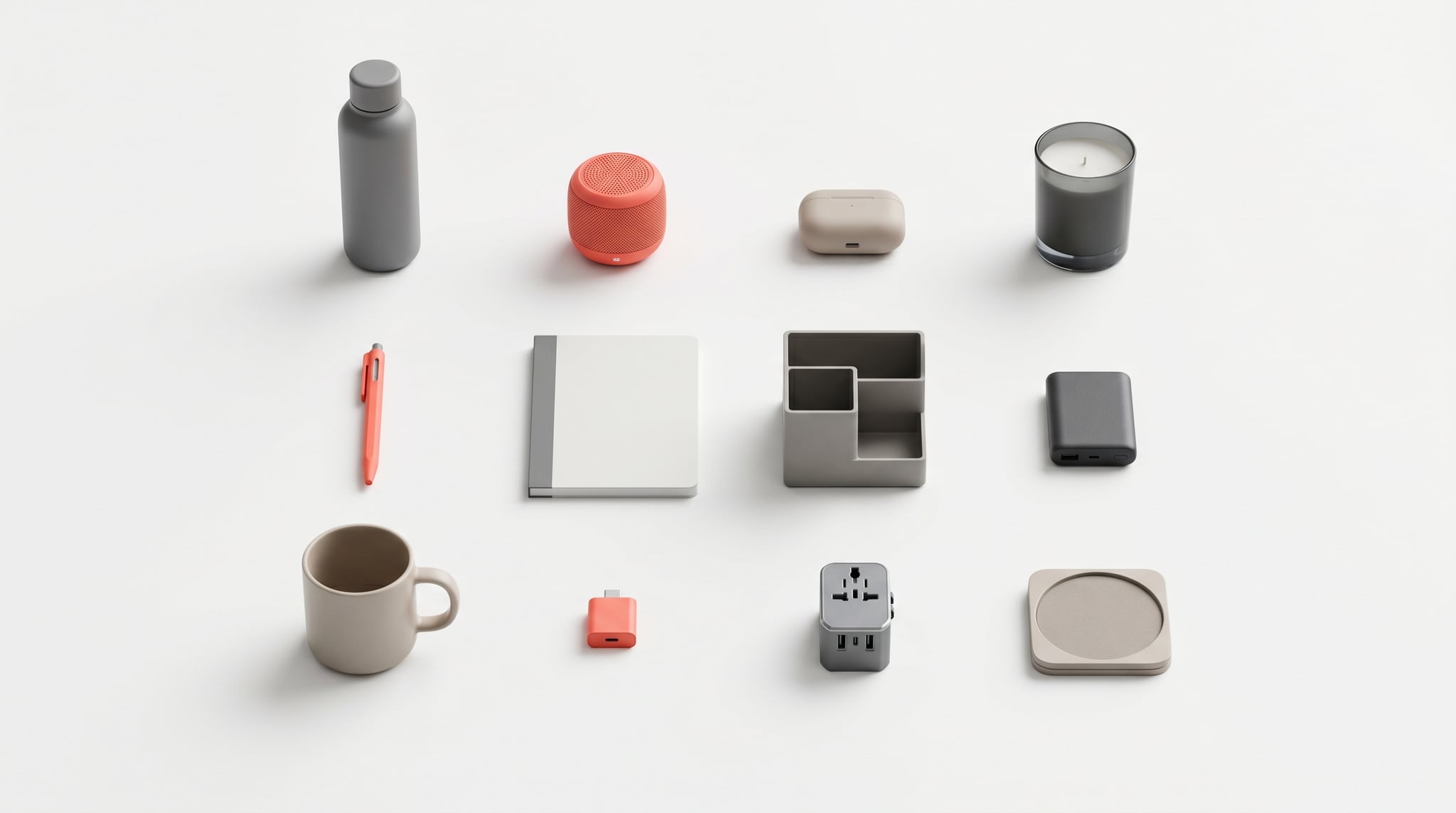
Before you write a single prompt, you need a reference set: a small, curated collection of images that defines what on-brand looks like for you. This is the ground truth everything else is measured against — both for the AI and for the humans reviewing its output.
You don't need many. Aim for 8 to 15 images, not a hundred. The goal is a tight, opinionated definition of your look, not an exhaustive archive. Too few and the style is ambiguous; too many and it becomes contradictory. Curate ruthlessly: if an image is "kind of us," cut it.
What to include:
- Hero examples (3–5). Your single best, most on-brand images. These are the north star — the ones you'd point to and say "make it look like this."
- Color references (2–3). Images or swatches that nail your exact palette, including brand hex codes written down. Don't trust "blue" — specify the blue.
- Lighting and mood references (2–3). Examples that capture how your brand is lit: soft and airy, hard and editorial, warm golden, clean and neutral.
- Composition references (1–2). How you frame things — tight and minimal, with generous negative space, centered, or off-grid.
- Product or subject references (as needed). If you're generating real products, include sharp, high-resolution shots of each SKU so its shape, logo, and color stay accurate. (We go deep on product accuracy in the companion guide on AI lifestyle product images.)
As you collect, write down why each image is on-brand. "Soft side light, muted sage and cream palette, lots of negative space, 50mm shallow depth of field." That sentence is the seed of your prompt template — you're reverse-engineering your style into language a model can reuse. The reference set is half images, half written description, and the written half is the part most people skip and later regret.
Crafting a reusable prompt template: the anatomy of a brand-locked prompt
A one-off prompt describes one image. A brand-locked template separates what stays constant (your brand) from what changes (the subject), so every image inherits the brand automatically.
Think of a prompt in two halves: variable (different every time) and fixed (your brand DNA, identical every time).
[VARIABLE — the subject and scene]
+ [FIXED — your brand style block]
The fixed block is the heart of the system. Build it once, from your reference set, covering the dimensions a model would otherwise randomize:
- Lighting: "soft natural side light, gentle shadows"
- Palette: "muted sage-green and warm cream tones, low saturation"
- Composition: "minimal composition, generous negative space"
- Lens / camera feel: "shot on 50mm, shallow depth of field"
- Finish / mood: "calm, premium, editorial; subtle film grain"
Now writing any new image is just swapping the variable half:
❌ One-off (drifts): "A scented candle on a table, cozy vibes, nice lighting"
✅ Brand-locked (consistent): "A scented candle on a light oak surface" + your fixed block → "A scented candle on a light oak surface, soft natural side light with gentle shadows, muted sage-green and warm cream tones, low saturation, minimal composition with generous negative space, shot on 50mm with shallow depth of field, calm premium editorial mood, subtle film grain"
The second prompt isn't more creative — it's more disciplined. And here's the key: tomorrow, when you generate a tote bag instead of a candle, you keep the entire second half identical and change only "a scented candle on a light oak surface." The two images will feel like siblings because they share the same brand DNA word for word.
A few rules that keep templates honest:
- Be specific, not poetic. "Warm cream tones" beats "inviting atmosphere." The model can act on the first and only guess at the second.
- Always specify what you care about. Anything you leave out, the model decides. If palette matters, name it every time — even when it feels repetitive.
- Keep one canonical template per brand line. If you run two distinct visual styles (say, a premium line and a playful one), maintain two separate fixed blocks, clearly labeled. Don't blend them mid-batch.
- Version it. When you refine the look, save the old block. You'll sometimes need to regenerate older assets to match, and you can't if the recipe is gone.
This is the layered-prompt discipline from the prompt-writing guide, applied at the brand level: instead of crafting five layers fresh each time, you freeze four of them and vary only the subject.
Anchoring style: seeds, reference images, and IP-adapters
A great template gets you 80% of the way. The last 20% — true visual lock — comes from features that anchor the model to something concrete rather than to words alone. Words describe a style; these features show it.
Reference images
The most powerful tool you have. Instead of describing your aesthetic in text, you hand the model an actual on-brand image and say "look like this." Upload a hero shot from your reference set, and the model carries its lighting, palette, and feel into a new subject. This closes the gap between what you mean by "soft editorial" and what the model imagines — because now it's looking at your version, not a generic one. Use this whenever the brand look is hard to put fully into words (most brands).
Style reference vs. subject reference
There's an important distinction worth keeping straight:
- A subject reference preserves the thing — your actual product, its shape, logo, and color, dropped into new scenes.
- A style reference preserves the look — the lighting, color grade, and mood — while letting the subject change.
For brand consistency you often want both: a subject reference to keep the product accurate, and a style reference (or your fixed prompt block) to keep the treatment on-brand. Supplying multiple references at once — the product and a style anchor — assembles the image from real inputs instead of leaving the brand feel to chance.
IP-adapters and style transfer
Under the hood, the feature that lets a model absorb the style and identity of a reference image rather than just its content is often called an IP-adapter (image-prompt adapter). You don't need to operate it manually — what matters is the capability: the ability to feed an image and have its visual character transfer to new generations. When a tool offers "reference image" or "style match," this is typically what's powering it. For hands-on techniques around swapping backgrounds, adjusting colorways, and editing existing images while keeping the brand feel intact, see the AI image-to-image editing workflow guide.
Seeds
A seed is the random starting number that determines a generation's specific output. Randomize it and identical prompts diverge; lock it and you get repeatability. Two practical uses:
- Lock the seed to iterate. Fix the seed, then tweak one word at a time to see exactly what each change does — the rest of the image stays put.
- Reuse a "golden seed." When a seed produces a beautifully on-brand result, note it. The same seed with a related prompt tends to keep the same character, giving you a family of matching images.
Seeds aren't a magic consistency button — change the prompt enough and the look shifts regardless — but for tight series (a set of matching social posts, a product line shot the same way) a locked seed plus a locked template is the closest thing to guaranteed coherence.
Building a shared prompt library for teams: structure and tools
Everything above works for a solo creator. The moment a second person generates images for your brand, consistency collapses unless the system is shared, not stored in one person's head. A prompt library is that shared system.
At its simplest, a brand prompt library is a single source of truth containing:
- The fixed brand style block(s) — copy-paste ready, versioned.
- The reference image set — the actual files, plus the written description of why each is on-brand.
- Scene / subject templates — your repeatable variable halves: "product on oak surface," "held in hand," "flat-lay on linen," each ready to combine with the fixed block.
- Golden seeds and settings — noted aspect ratios, resolutions, and any seeds worth reusing.
- Approved examples and a do-not-do list — outputs that passed review, and a few that didn't, with a note on why.
A folder structure that scales:
/brand-visual-system
  /01-reference-set        ← the 8–15 defining images + a notes file
  /02-style-blocks         ← fixed prompt blocks (v1, v2…), one per brand line
  /03-scene-templates      ← reusable variable halves
  /04-approved-outputs      ← the growing library of on-brand results
  /05-rejected-examples    ← failures + why, so nobody repeats them
  brand-prompt-guide.md    ← the README: how to combine the above
The friction in any team library is the gap between where the rules live and where the images get made. If the style block sits in a doc and the generator is somewhere else, people copy-paste, get sloppy, and drift creeps back in. The tighter those two things are, the more consistency holds.
This is exactly the workflow Oxava is built for: your reference images, prompts, and generation all live in one studio, so the brand recipe is right there when you create — not in a separate file someone forgot to open. You upload your references, build on your saved prompt, and generate in the same place, which is what keeps a team's output coherent instead of each person reinventing the look.
Checklist: reviewing AI outputs for brand fit before publishing
Even a well-built system produces the occasional off-brand result. The final guard is a quick, consistent review before anything ships. Run every image through this — it takes thirty seconds and catches the drift that erodes a brand:
- Palette match. Do the colors sit inside your brand range, or has the lighting pushed a hue off? Compare directly against your color reference, not from memory.
- Lighting consistency. Same direction, softness, and mood as your reference set? A hero shot lit from the left and a detail shot lit from the right will fight each other in a carousel.
- Composition fit. Right framing and negative space for where it'll live? (Square for product cards, vertical for stories, room for text on banners.)
- Subject accuracy. If it's a real product, zoom to 100% and check logo legibility, true color, and edge geometry — the three classic AI failure points.
- Mood and finish. Does it feel like your brand — the same level of polish, grain, saturation, and energy as your approved examples?
- Side-by-side test. The decisive one: place the new image next to two existing on-brand images. If it looks like a sibling, it passes. If it looks like a cousin from another family, it fails — back to the template.
When something fails, resist the urge to hand-fix that one image. Ask why the system let it through — was a variable unspecified, the wrong reference attached, the seed loose? Fixing the recipe prevents the next ten failures; fixing one image prevents zero.
When an image passes, it earns a place in your approved-outputs library and becomes a new reference point for everything after it. That's the flywheel: the system produces on-brand images, the best of those feed back into the system, and the look gets tighter over time instead of drifting.
Putting AI image brand consistency to work
AI image brand consistency isn't about finding one perfect prompt — it's about building a small, boring, repeatable system so the on-brand result is the default instead of the lucky one. Curate a tight reference set, freeze your brand DNA into a fixed prompt block, anchor it with reference images and locked seeds, share it as one library, and review every output against the same checklist.
The fastest way to feel the difference is to do one full loop. Build your fixed style block from your three best images, then generate a small set of subjects against it in the Oxava studio — references, prompt, and generation in one place — and run the outputs through the checklist above. Once you see a batch come out looking like siblings instead of strangers, you'll never go back to one-off prompting. And if you want to sharpen the prompt-writing half of the equation, the AI image prompt guide pairs directly with this system.
Oxava Team
From the Oxava content team. Writing about the creative side of generating images and video with AI.
Related Articles
ALL POSTS
Subscribe to our newsletter
Be the first to hear about new techniques, model updates and ideas on AI generation.