

You wrote a careful prompt, you described the subject perfectly — and the image still came back in the wrong look. Too cartoonish when you wanted a photo. Too flat when you wanted depth. Nine times out of ten, the problem isn't the description. It's a missing style keyword. The model knew what to draw; it just didn't know how to draw it.
This guide is the cure. It's a pure-application library of AI image style prompts — copy-paste recipes sorted into three families: photographic, illustration, and 3D render. For each style you get the trigger keywords, a note on when to reach for it, and a ready-to-use prompt you can paste straight into any generator. We won't re-explain how to think about prompts here — that theory lives in our companion guide on how to write AI image prompts. This page answers a narrower, more practical question: which words produce which AI image style?
Part 1 — Photographic Styles
The prompt formula for photo styles
Photographic looks share a backbone. Once you internalize the order, every recipe below becomes a fill-in-the-blank exercise:
[Subject] + [lighting] + [lens / camera] + [film or photo style] + [quality tags]
The keywords that make it look like a photo rather than a painting are almost
always in the last two slots: lens choices (85mm, macro, wide angle),
camera language (shot on, shallow depth of field, bokeh), and explicit
photo tags (photorealistic, editorial photography, analog film). Drop those
and even a perfect subject description drifts toward illustration.
1A. Photorealistic / Product
Trigger keywords: photorealistic, studio lighting, product photography,
8k, sharp focus, softbox, clean background.
When to use it: e-commerce listings, catalog hero shots, anything where the object must look real and buyable. This is the workhorse style for sellers.
A matte ceramic coffee mug on a smooth concrete surface, soft diffused softbox lighting from the left, gentle reflection, clean neutral background, photorealistic product photography, 85mm lens, sharp focus, 8k.
1B. Cinematic / Editorial
Trigger keywords: cinematic, editorial, dramatic lighting, film still,
teal and orange, anamorphic, moody.
When to use it: campaign visuals, hero banners, storytelling shots where mood matters more than catalog neutrality.
A woman in a tailored coat standing on a city rooftop at dusk, neon glow from the street below, dramatic rim lighting, teal and orange color grade, cinematic film still, anamorphic lens, shallow depth of field, moody atmosphere.
1C. Analog / Film
Trigger keywords: analog film, 35mm, Kodak Portra, film grain,
light leak, vintage, faded colors.
When to use it: lifestyle and brand content that needs warmth and an imperfect, human texture instead of clinical sharpness.
A breakfast table by a sunlit window, croissant and a glass of orange juice, warm morning light, soft film grain, faded warm colors, shot on Kodak Portra 400, 35mm analog photograph, subtle light leak in the corner.
1D. Macro / Detail
Trigger keywords: macro photography, extreme close-up, 100mm macro lens,
fine texture, shallow depth of field, water droplets.
When to use it: ingredient shots, texture-forward product details, food, and anything where the appeal lives in the surface.
Extreme close-up of a dark chocolate bar breaking apart, glossy fracture, visible cocoa texture and crumbs, dramatic side light, shallow depth of field, macro photography, 100mm macro lens, photorealistic, sharp focus.
Part 2 — Illustration Styles
The prompt formula for illustration styles
Illustration drops the camera language entirely. Instead of lenses and film stock, you name the medium and the rendering of that medium:
[Subject] + [medium] + [line/shape treatment] + [color approach] + [artist or era reference, optional]
The single most important slot is the medium keyword. watercolor, flat vector,
ink line art, gouache — these words do most of the heavy lifting. The biggest
mistake is leaving photo tags in by accident: words like 8k or photorealistic
will fight your illustration intent and produce a muddy hybrid.
2A. Watercolor
Trigger keywords: watercolor, soft washes, bleeding edges, paper texture, hand-painted, loose brushwork.
When to use it: gentle, organic, editorial-feeling artwork — greeting cards, soft brand illustrations, nature subjects.
A red fox curled up among autumn leaves, soft watercolor washes, bleeding color edges, visible paper texture, loose hand-painted brushwork, warm muted palette, white background.
2B. Flat Vector / Minimal
Trigger keywords: flat vector illustration, minimal, geometric shapes,
bold flat colors, no gradients, clean, 2D.
When to use it: website heroes, app onboarding, infographics, icon sets — anything that needs to read instantly and scale cleanly.
A small city skyline with a sun setting behind it, flat vector illustration, bold geometric shapes, limited palette of teal, coral and cream, no gradients, clean minimal 2D design.
2C. Editorial / Conceptual
Trigger keywords: editorial illustration, conceptual, metaphorical,
textured shading, limited palette, magazine illustration.
When to use it: blog headers, opinion pieces, anything where the image should say an idea rather than depict a literal object.
A human figure climbing a staircase made of giant books toward a glowing lightbulb, conceptual editorial illustration, textured gouache shading, limited warm palette, magazine cover style, thoughtful and slightly surreal.
2D. Comic / Ink Line Art
Trigger keywords: ink line art, comic style, bold outlines, cel shading, halftone, cross-hatching, black and white.
When to use it: narrative panels, badges, merch graphics, bold stylized characters.
A determined astronaut planting a flag on an alien hill, bold ink line art, heavy black outlines, cel shading, halftone dot texture in the sky, dynamic comic book style, high contrast.
Part 3 — 3D Render Styles
The prompt formula for 3D styles
3D styles ask you to name the renderer and material as if you were lighting a scene in software. The keyword that flips a generator into "3D mode" is usually the engine or render reference:
[Subject] + [3D style / engine] + [material] + [lighting setup] + [render quality]
3D render, octane render, blender, clay, isometric — these establish the
dimensional look. Material words (matte clay, glossy plastic, subsurface scattering) then control how surfaces read. Studio lighting language carries over
from photography here.
3A. Clay Render / Claymation
Trigger keywords: clay render, claymation, matte clay material, soft studio lighting, stop-motion, cute, rounded shapes.
When to use it: friendly mascots, playful product explainers, soft tactile characters with a handmade charm.
A chubby corgi sitting and tilting its head, claymation style, matte clay material with subtle fingerprint texture, soft studio lighting, pastel background, rounded stop-motion shapes, 3D render, cute.
3B. Isometric 3D
Trigger keywords: isometric, 3D render, miniature diorama, 35-degree angle, soft shadows, tilt-shift, clean composition.
When to use it: product diagrams, app feature illustrations, tech and workspace scenes that benefit from a tidy bird's-eye geometry.
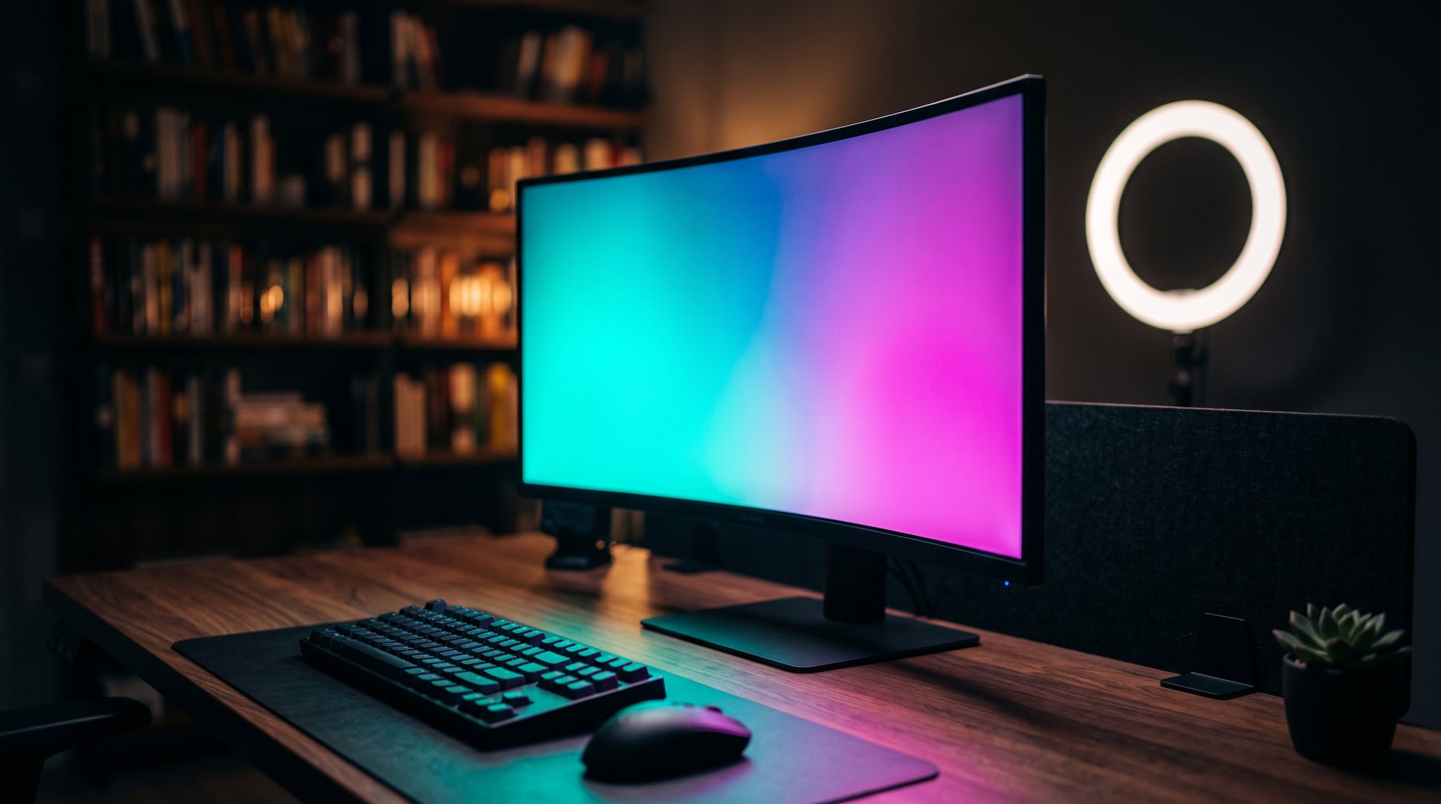
A cozy home office with a desk, monitor, plant and bookshelf, isometric 3D render, miniature diorama style, soft ambient occlusion shadows, pastel color scheme, clean composition, tilt-shift focus.
3C. Photorealistic 3D / Product Render
Trigger keywords: octane render, cinema 4d, photorealistic 3d,
subsurface scattering, glossy reflections, studio HDRI, ray tracing.
When to use it: premium product visuals before the product exists, packaging mockups, luxury and beauty rendering where you want photo-grade polish with full control.
A frosted glass perfume bottle with a gold cap floating above a reflective black surface, photorealistic 3D product render, Octane render, subsurface scattering, glossy reflections, studio HDRI lighting, ray tracing, 8k.
3D. Low Poly
Trigger keywords: low poly, faceted, geometric polygons, flat shading, minimal, game art, gradient sky.
When to use it: game-style assets, stylized landscapes, lightweight decorative scenes with a deliberate retro-3D feel.
A snow-capped mountain with pine trees and a small lake, low poly 3D art, faceted geometric polygons, flat shading, soft gradient sunset sky, minimal stylized landscape, clean background.
Quick reference: style keyword dictionary
Bookmark this table. When an image comes out wrong, scan the trigger column and add the keyword you forgot.
| Style | Trigger keywords | Best for |
|---|---|---|
| Photorealistic / Product | photorealistic, studio lighting, product photography, 8k, sharp focus | E-commerce, catalogs |
| Cinematic / Editorial | cinematic, film still, dramatic lighting, teal and orange, anamorphic | Campaigns, hero banners |
| Analog / Film | analog film, 35mm, Kodak Portra, film grain, light leak | Warm lifestyle, brand content |
| Macro / Detail | macro photography, 100mm macro, extreme close-up, fine texture | Food, ingredient, texture shots |
| Watercolor | watercolor, soft washes, bleeding edges, paper texture, hand-painted | Cards, soft organic art |
| Flat Vector / Minimal | flat vector, minimal, geometric shapes, bold flat colors, no gradients | Web heroes, icons, infographics |
| Editorial / Conceptual | editorial illustration, conceptual, metaphorical, gouache, limited palette | Blog headers, idea-driven art |
| Comic / Ink Line Art | ink line art, comic style, bold outlines, cel shading, halftone | Panels, merch, bold characters |
| Clay Render / Claymation | claymation, matte clay, soft studio lighting, stop-motion, rounded shapes | Mascots, playful explainers |
| Isometric 3D | isometric, 3D render, miniature diorama, soft shadows, tilt-shift | Diagrams, app features, workspaces |
| Photorealistic 3D | octane render, cinema 4d, photorealistic 3d, subsurface scattering, ray tracing | Product renders, packaging mockups |
| Low Poly | low poly, faceted, geometric polygons, flat shading, game art | Game assets, stylized landscapes |
Mixing AI image style prompts: when to blend and when to commit
Style stacking is tempting — and it's where most prompts fall apart. The reliable rule is simple: one dominant style keyword, plus at most one atmosphere or color modifier. Beyond that, the model starts averaging conflicting instructions and gives you mush.
Some blends genuinely sing because they live in the same dimension:
- Watercolor + editorial — a hand-painted look serving a conceptual idea.
- Cinematic + analog film — moody grading on warm grain; very on-trend.
- Isometric + flat color — geometric 3D with a clean, graphic palette.
And some combinations actively cancel each other out:
- Photorealistic + cartoon — the model can't be real and unreal at once.
- Flat vector + subsurface scattering — flat 2D and volumetric 3D contradict.
- Three or more styles at once — you'll get the worst average of all of them.
Mixing also matters beyond a single image. If you're producing a set of visuals — a product line, a social grid, a campaign — picking one style and sticking to it is what makes the work look intentional. For a deeper system on holding a look across many assets, see our guide on building AI brand visual consistency.
One more practical note: pinning down a style is only one axis of the image. The shape of the frame is the other. The same cinematic prompt feels completely different at 9:16 versus 16:9 — so once you've locked the look, lock the aspect ratio and composition to match where the image will live.
Frequently asked questions
How do I prompt for a specific named art style?
Lead with the explicit medium or movement keyword and place it early in the
prompt — watercolor, art nouveau, low poly, bauhaus poster. Then support
it with two or three reinforcing details (color approach, line treatment,
texture). Avoid stacking contradictory tags; one named style plus a couple of
modifiers is far more reliable than a long list of competing references.
Do these style prompts work in any AI image generator?
The vocabulary is largely universal — keywords like cinematic, flat vector,
and octane render are understood broadly because models trained on similarly
captioned data. That said, each model weighs them differently, so you'll tune the
emphasis a little per tool. The recipes here are a strong starting point in any
modern generator, including the text-to-image models inside Oxava.
What's the difference between photorealistic photo and 3D product render?
A photorealistic photo prompt uses camera language — lens, film, studio
lighting — to imitate a real photograph. A 3D product render prompt invokes a
rendering engine (octane render, cinema 4d) and material physics like
subsurface scattering. Renders give you cleaner, more controllable surfaces and
impossible setups (floating products, perfect reflections), while photo prompts
lean into natural imperfection. For most e-commerce, either works; renders win
when you need flawless polish.
How do I stop unwanted elements from showing up in a style?
Style prompts are about positive definition — telling the model what to make. When stray objects, extra limbs, or text creep in, that's a job for exclusion. Our full walkthrough on negative prompts in AI image generation covers how to remove unwanted elements and when positive framing beats a long exclude list.
Which style is best for e-commerce product images?
For clean catalog and marketplace listings, Photorealistic / Product is the default — neutral lighting, clean background, real-looking material. When you want premium polish or a product that doesn't physically exist yet, Photorealistic 3D / Product Render is the upgrade. For a complete shoot-style workflow, see our guide on AI product photography.
Start with one recipe
You don't need to memorize twelve styles. You need to copy one. Pick the look that fits what you're making, paste the recipe, swap in your subject, and generate — then refine from there.
The fastest way to test these is to run them straight through Oxava's text-to-image studio. Copy any of the 12 style recipes above, paste it into Oxava, and generate. Compare a couple of styles on the same subject and you'll quickly see which keywords carry the look. And if you already have an image and want to re-style it rather than start from scratch, our image-to-image editing workflow shows how to convert an existing photo into a new aesthetic. Once you're happy with the style, run the result through our AI image upscaling guide to bring it up to print or high-res export quality. The style was never the hard part — it was just the missing keyword.
Egemen Küpçü
Egemen Küpçü is the founder of Oxava, with 10+ years of hands-on experience in 3D and visual production. He writes about the craft of generating product, brand and campaign visuals with AI.
Related Articles
ALL POSTS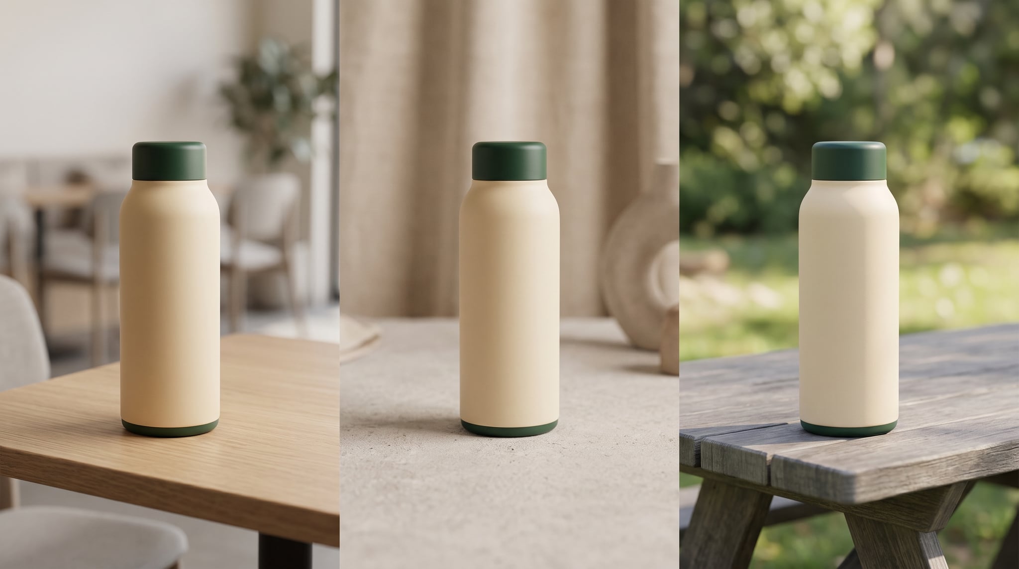

Subscribe to our newsletter
Be the first to hear about new techniques, model updates and ideas on AI generation.