
You upload the video, refresh analytics an hour later, and watch impressions climb while clicks flatline. The video is fine. The title is fine. The thumbnail is the thing standing between your work and an audience — a postage-stamp-sized image competing with a dozen others on a phone screen, judged in well under a second. Which is why so many creators pay a designer per upload, or lose an hour in a layout tool every time. Learning how to make a YouTube thumbnail with AI collapses that hour into minutes — but only with a real workflow behind it, not a lucky prompt.
Most AI thumbnail advice stops at "describe it and generate." That gives you a nice picture and a bad thumbnail. This guide covers the rest: what YouTube actually specifies, what genuinely earns a click, which models can bake bold typography into the image versus which ones to use for a photoreal face, and how to leave one session with three real variants ready for YouTube's own A/B test.
Why most "AI thumbnails" fail before they're even uploaded
Three failure modes account for almost all of it, and each has a specific fix.
The text comes out broken. Most successful thumbnails carry three to five big words. Ask a general-purpose image model for them and you often get confident-looking gibberish — a missing letter, a doubled stroke, a word that turns to mush at thumbnail scale. Creators see this once, conclude "AI can't do text," and go back to overlaying words elsewhere forever. That was true a couple of model generations ago. Today it's a model selection problem: some models are genuinely built for typography, most aren't, and the whole game is knowing which is which.
The face drifts from video to video. Channel recognition is built on repetition — same host, same mascot, same colors, until viewers spot your video from the corner of their eye. Generate "a creator pointing at something" from scratch each week and you get a different person every time. Each thumbnail may look great while the channel accumulates no recognition at all.
The specs get ignored. A beautiful 1:1 render doesn't fit a 16:9 slot, a heavy file gets rejected on a mobile upload, and plenty of new creators don't realize custom thumbnails require a verified account — so they produce a set they can't even use yet. Boring rules, but the cheapest failures to eliminate.
YouTube's actual thumbnail specs (read this before you generate)
These numbers become settings you reuse on every upload. YouTube publishes them in its official Help documentation, and they're simpler than most creator blogs suggest.
| Spec | What YouTube specifies |
|---|---|
| Aspect ratio — video | 16:9 |
| Aspect ratio — Shorts | 9:16 |
| Recommended resolution — video | 3840 × 2160 |
| Recommended resolution — Shorts | 2160 × 3840 |
| Minimum width | 640 pixels |
| File format | JPG or PNG |
| Maximum file size | 2 MB from mobile, 50 MB from desktop |
| Account requirement | Custom thumbnails require a verified account |
Two things to notice. First, the recommended resolution sits far above the minimum. Plenty of creators still export at the long-familiar 1280 × 720, which clears the 640-pixel floor comfortably — but generating larger keeps the image crisp on 4K TVs and desktop previews. If your model outputs below the recommendation, an upscaling pass closes the gap; our AI image upscaling guide covers doing that without smearing detail.
Second, the 2 MB mobile ceiling is the one that bites. A dense high-resolution PNG blows past it easily. Export photographic thumbnails as high-quality JPG, and save PNG for flat, graphic artwork where hard edges matter.
Video thumbnails vs Shorts covers
These are two images, not one image cropped twice. A 16:9 thumbnail squeezed into 9:16 loses its edges, its balance, and usually its text. If you publish both formats, generate each at its native ratio from the same look so the model recomposes the scene instead of chopping it. That principle runs well beyond YouTube — our aspect ratio and composition guide for every platform is the reference to keep open when one idea has to work in several shapes.
The composition rules the spec sheet doesn't mention
Specs describe the container. They don't tell you that YouTube stamps the video's duration over the lower-right corner, or that different surfaces render tiles at different sizes, so edges can get shaved. There's no official pixel-perfect "safe zone" for thumbnails — distrust any blog that quotes one to the pixel. Work qualitatively instead:
- Keep the lower-right corner clear. The duration badge lives there, and anything you park underneath it will fight for attention.
- Don't crowd the edges. Push subject and text inward with generous margin.
- Design for the small version first. Shrink the image to phone-tile size and look. If it isn't instantly readable there, full-resolution beauty won't save it.
What actually earns the click: the CTR fundamentals
Thumbnail performance is one of the more studied corners of creator strategy, and the principles that survive scrutiny are consistent and unglamorous.
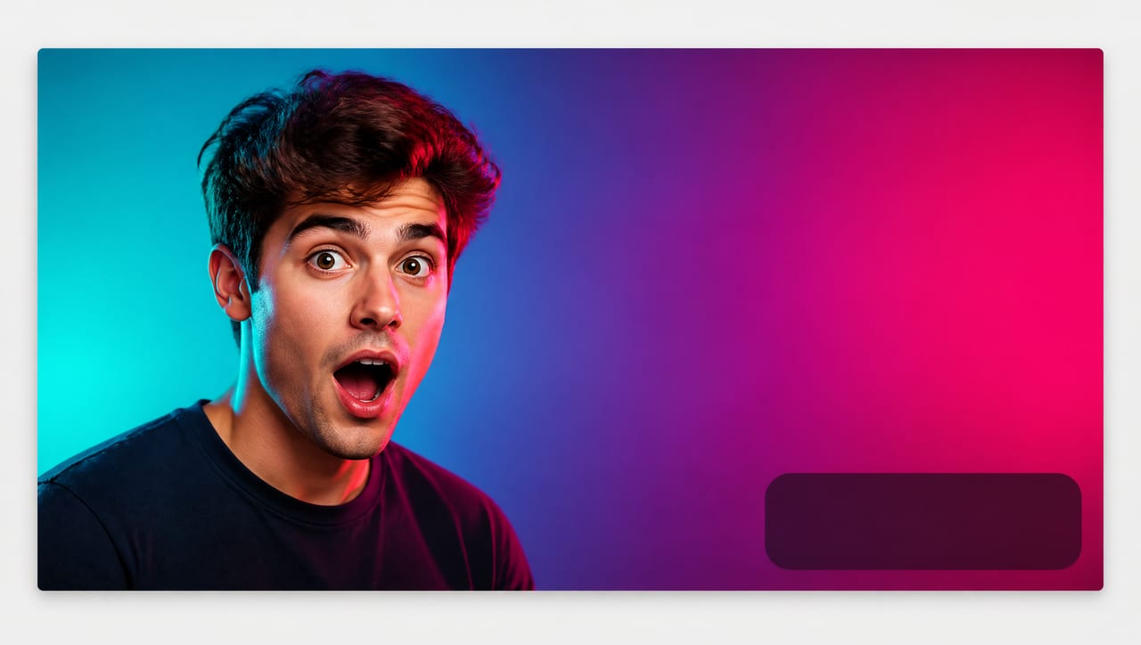
Contrast beats detail. Your thumbnail competes inside a wall of other thumbnails, most of them busy. Bright saturated color and clean subject-background separation win attention; muted, evenly-lit images disappear. This is the most repeated finding in thumbnail analysis and the easiest thing to control in a prompt — name the backdrop color, name the lighting direction, and ask for a rim light or hard color break to separate the subject.
A face with one unmistakable emotion. Faces pull the eye, but a neutral face does almost nothing. What works is a legible emotion — surprise, alarm, delight, skepticism — that reads instantly and matches the video's promise. So never prompt "a person looking at the camera." Prompt "wide-eyed, eyebrows raised, mouth slightly open in genuine surprise."
Three to five words, maximum, in a heavy font. Thumbnail text isn't a subtitle; it's a hook fragment adding what the image can't say. High-CTR thumbnails converge on the same discipline: a very short phrase in a thick typeface with enough weight and outline to survive being shrunk. "I Tried the World's Most Expensive Coffee Machine for a Week" is a title. "WORTH IT?" is a thumbnail.
The three-second scan test. Drop your thumbnail among five real ones from your niche, at actual size, and glance for three seconds. Can you tell what the video is about? Is the subject readable? Does the text land? This catches more problems than any checklist.
What counts as a "good" CTR
Creators chase a magic number that doesn't exist. Typical YouTube click-through rates land roughly in the 2–10% range, and your position inside it depends on niche, traffic sources, how many impressions come from subscribers versus browse, even video length. A 4% CTR can be excellent for one channel and mediocre for another.
The useful benchmark is simpler: beat your own channel average. Your history already controls for your niche and audience mix, so a thumbnail that outperforms it is genuinely working. Someone else's screenshot is noise.
The retention trap nobody mentions
Here's the caveat most "boost your CTR" content skips: you can raise CTR and still hurt the channel. A thumbnail promising something the video doesn't deliver — a shocked face over a mild story, a dramatic scene that never appears — earns the click and loses the viewer in thirty seconds. YouTube's recommendation system weighs whether people actually stay, so an oversold thumbnail buys a short-term bump and pays for it in reach. Your thumbnail can be the most dramatic honest version of the video, never a version of a different video.
The AI workflow: how to make a YouTube thumbnail with AI in one session
This is the production line, built for a channel that publishes repeatedly — setup is paid once and every future upload rides on it. We'll run it in Oxava, an AI thumbnail maker for creators where multiple models, your reference images, and your aspect ratio live in one studio. That matters here, because the goal is a finished thumbnail without exporting to a second tool.
Step 1 — Lock your channel identity once
Decide what stays constant across every video: the face (your host shot or channel mascot), the palette (two or three colors you own on the browse page), and the finish (photoreal and filmic, or flat and graphic — pick one).
The face is where AI usually falls apart, and the fix is mechanical: upload a clean, well-lit reference photo of yourself or your mascot and attach it to every generation, so the model builds new scenes around the same identity instead of inventing a new person. How many references to use, which prompt anchors hold identity steady, and what to do when a face still drifts are covered in our guide to AI character consistency without training.
Palette and finish belong in a fixed block of prompt text you paste into every generation, so only the subject changes week to week. That habit is the backbone of a recognizable channel and it's worth building properly with the AI brand visual consistency guide — the same system that keeps a brand's feed coherent is what makes thumbnails identifiable at a glance. If you also need channel art, community images, and Shorts covers from that identity, the social media visual kit workflow extends it into every other format.
Step 2 — Pick the right model for the job
This is the most valuable decision in the workflow and the one almost nobody explains. Image models aren't interchangeable for thumbnails, because a thumbnail wants two things that pull in opposite directions: crisp typography and a believable, expressive face. Some models are excellent at the first, others at the second.
| What this thumbnail needs | Reach for | Why |
|---|---|---|
| Big bold words rendered inside the image | GPT Image 2, Ideogram V4, Recraft V4.1 Pro, Seedream 5 Pro | Built for reliable text and layout — they can hold a short bold headline without garbling it |
| A photoreal face with a strong expression (text added later, or none) | Nano Banana 2 Pro, FLUX.2 Pro | Superior skin, lighting, and expression detail; treat any text they produce as unreliable |
| Flat, graphic, poster-style thumbnails built from shapes and blocks | Recraft V4.1 Pro, Ideogram V4 | Strong at clean, layout-driven, design-like compositions |
| Fast rough drafts to test framing before committing | Nano Banana 2 Lite, Ideogram V4 Fast / Instant, FLUX schnell | Quick passes for composition tests; re-run the winner on a stronger model |
The routine that falls out of the table: if the words are part of the image, start with a text-strong model. If a photoreal expression is the hero and text can be a separate layer, use a face-strong model and overlay type afterward.
Both are legitimate. Baked-in text finishes the thumbnail in one step — the whole appeal — but proof it at full size, letter by letter, before uploading. Overlaid text stays crisp and editable, which matters if you localize titles or swap hooks without regenerating art. A good default: let a text-strong model handle short, stylized words that are part of the artwork, and overlay anything you expect to revise. To go deeper on in-model typography, our Seedream 5 Pro guide for posters and text digs into what makes text prompts land.
Step 3 — Write a thumbnail-specific prompt
Thumbnail prompts aren't scene prompts. A scene prompt describes a world; a thumbnail prompt describes a poster. The structure that works, in order:
- Emotion and subject — who's in frame and what their face is doing
- Background — a specific, high-contrast color or environment
- The text — the exact words in quotes, plus style and placement
- Composition — where the subject sits, what stays empty
- Ratio and finish — 16:9, plus lighting and overall look
Three worked examples, in three different niches:
Tech review channel (text-strong model):
"Close-up of a man in his early thirties with a wide-eyed, jaw-dropped expression, holding a matte black smartphone beside his face. Bright electric-blue to violet gradient background with a strong cyan rim light separating him from the backdrop. Bold condensed sans-serif text reading 'IT BROKE' in white with a heavy black outline, upper-left quadrant. Subject on the right third, lower-right corner left completely empty. High contrast, sharp, punchy, 16:9."
Cooking channel (text-strong model):
"A golden roast chicken being pulled apart by two hands, steam rising, glistening skin, dramatic warm side light against a deep charcoal background. Bold cream rounded sans-serif text reading 'NO OVEN' stacked on two lines in the left third. Food occupying the right two-thirds, generous empty margin at the bottom-right. Saturated warm tones, crisp specular highlights, appetizing, 16:9."
Personal finance channel (flat/graphic model):
"A woman in her late twenties in a mustard-yellow sweater, arms crossed, one eyebrow raised in clear skepticism, standing on the left third against a flat deep-teal background. To her right, an oversized red downward arrow graphic. Bold white text reading '4 MISTAKES' in two stacked lines beside the arrow. Flat poster style, hard edges, very high contrast, clean empty space in the lower-right corner, 16:9."
All three share the same skeleton: explicit emotion, named background color, text in quotes with a placement, an instruction to keep the lower-right clear, and the ratio. Reuse it forever — you're swapping a subject and three words, not rewriting a prompt. For the broader craft of layering a description so the model delivers first try, the guide to writing AI image prompts is the deeper reference.
Step 4 — Generate three real variants, one variable apart
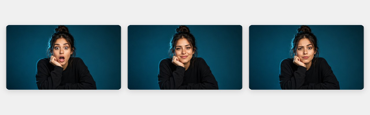
YouTube's own thumbnail test accepts three options, so produce three — properly. The mistake is generating three random thumbnails: when one wins you learn nothing, because they differed in ten ways at once. Change exactly one thing between variants:
- A vs B — expression. Same framing, background, and text; shocked face versus confident grin. A win tells you which emotional register your audience answers.
- A vs C — background color. Same subject, expression, and text; electric blue versus deep red. A win tells you what stands out in your niche's browse feed.
- Or composition. Tight close-up versus a wider shot with the object in frame. A win tells you how much context your audience needs.
Pick one axis per test. That's what turns three images into an experiment instead of three lottery tickets. Because your reference image and style block stay fixed, the variants come out as siblings — same person, same channel look — differing only in the variable you chose. It's the same test-and-scale mindset as our guide to creating AI ad creatives without a designer, applied to a thumbnail slot instead of an ad set.
Step 5 — Export against the spec
Thirty seconds of last-mile checking: ratio is 16:9 (or 9:16 for a Shorts cover), file is JPG or PNG, width clears 640 pixels with room to spare, and the file fits under 2 MB if you upload from your phone. If the generation landed below YouTube's recommended resolution, upscale before export — then run the shrink test one final time at phone size.
Try it now: open the Oxava studio, upload one clean photo of yourself or your mascot as a reference, set 16:9, pick a text-strong model, and paste one of the prompt skeletons above with your own three words. Re-run it twice, changing only the expression, and you'll leave a single session with three test-ready thumbnails sharing one face and one channel look — without opening a separate design tool.
Turning your three variants into a real experiment
Generating variants is half the value. YouTube Studio has a built-in Test & Compare feature that rotates thumbnail options on a live video and reports which performs best, so you're measuring on your real audience instead of guessing in a group chat.
What to know before relying on it:
- Three options is the cap — which is why the workflow above produces exactly three.
- It requires monetization eligibility. The feature is tied to the YouTube Partner Program, whose thresholds are 1,000 subscribers plus 4,000 valid public watch hours, or 10 million valid public Shorts views. Below that you can still test manually — swap the thumbnail after a set period and compare, accepting a rougher read because conditions shift over time.
- The winner is decided on click-through performance — exactly why single-variable variants matter, since the result is only interpretable if you know what differed.
- Give it one to two weeks. Tests need enough impressions to separate signal from noise, and two days on a fresh upload rarely gets there.
Then do the part that compounds: write the result down and carry it into the next upload. If warm backgrounds beat cool ones twice, that goes into your fixed style block. If surprised expressions beat confident ones, your default prompt changes. If close-ups keep winning, you stop generating wide shots. Ten videos later you're not guessing at thumbnails — you have a tested house style, and each new video starts from evidence.
One boundary worth stating plainly: the test itself runs in YouTube Studio, not in your image tool. Oxava's job is producing three genuinely comparable variants fast enough that testing every upload stops feeling like extra work.
Common AI-thumbnail mistakes that quietly kill CTR
Garbled text from the wrong model. The most common and most avoidable. If words live in the image, they must come from a model built for typography — and you must read them at full size first. One malformed letter reads as "low effort," even to a viewer who never consciously registers why.
A face that changes every week. Different host, different age, different hairstyle each upload. Fine in isolation, ruinous for recognition in a browse feed. Attach the same reference image every time.
Too much crammed in. Three subjects, two arrows, a logo, seven words. Rich at full size, static at phone size. One subject, one idea, three to five words — and if you can't decide what to cut, you have two thumbnails, not one.
Clickbait that outruns the video. It's on this list because it's the mistake that feels like it's working. Dramatic is fine; dishonest costs you distribution.
Composition that ignores the small screen. Text hugging the frame edge, a face where the duration badge lands, thin elegant type that vanishes at tile size. Design for the phone and the desktop version takes care of itself.
Frequently Asked Questions
What size should a YouTube thumbnail be?
Video thumbnails are 16:9, with YouTube recommending 3840 × 2160 and requiring a minimum width of 640 pixels; Shorts covers are 9:16 at a recommended 2160 × 3840. The file must be JPG or PNG and can't exceed 2 MB when uploaded from mobile or 50 MB from desktop. Note that custom thumbnails only become available once your account is verified.
Can I use AI-generated images as a YouTube thumbnail?
Yes — AI-generated visuals are widely used as thumbnails, provided the result stays within YouTube's Community Guidelines and its policies on misleading content, like any other image you upload. The responsibilities are yours rather than the tool's: don't misrepresent what the video contains, don't use a real person's likeness without the right to do so, and check YouTube's current policies directly, since platform rules on synthetic media keep evolving.
How many thumbnail variants should I A/B test?
Three, because that's the maximum YouTube's Test & Compare feature accepts — and a sensible number anyway. The bigger question is how they differ: three variants that each change one variable (expression, background color, or composition) teach you something reusable, while three unrelated designs only tell you which random image won that once. Run each test one to two weeks so it gathers meaningful impressions.
Does a higher CTR always mean a better video?
No, and that's the trap. CTR measures only whether people clicked, not whether they stayed. A thumbnail that oversells lifts click-through and then loses viewers in the first seconds — and because YouTube's recommendation system also weighs whether people keep watching, that combination can shrink your reach. Read CTR next to retention, and treat a CTR gain paired with a retention drop as a warning rather than a win.
Do I need a separate design tool to add text to my thumbnail?
Not necessarily anymore. Models built for typography — GPT Image 2, Ideogram V4, Recraft V4.1 Pro, and Seedream 5 Pro among them — can render a short bold headline directly inside the image, giving you a finished thumbnail in one step. The trade-off is that baked-in text can't be edited without regenerating, so if you localize titles or revise hooks often, generate with deliberate empty space and overlay the words instead.
Start designing thumbnails that get clicked
High-CTR thumbnails aren't a talent you either have or don't — they're the output of a system. Know the specs so nothing gets rejected. Apply the fundamentals that actually drive clicks: contrast, one legible emotion, three to five bold words, readable at phone size. Pick a model that matches whether you need typography or a photoreal face. Hold your channel identity steady with a reference image and a fixed style block. Then ship three single-variable variants into YouTube's own test instead of guessing. A few uploads in, you'll have something better than a good thumbnail: a documented house style backed by your own data.
The fastest way to internalize how to make a YouTube thumbnail with AI is to build one set today. Take a clean photo of yourself or your channel mascot into the Oxava studio, attach it as a reference so the face stays yours, set 16:9, choose a text-strong model, and generate your hook in three words. Then change one thing — the expression — and generate twice more. Three test-ready thumbnails, one face, one look, one session, no separate design tool in the loop. To go further, pair this with the brand visual consistency guide so your channel look compounds across every upload, and the character consistency guide so your host or mascot never drifts again.
Oxava Team
Egemen Küpçü is the founder of Oxava, with 10+ years of hands-on experience in 3D and visual production. He writes about the craft of generating product, brand and campaign visuals with AI.
Related Articles
ALL POSTS


Subscribe to our newsletter
Be the first to hear about new techniques, model updates and ideas on AI generation.