
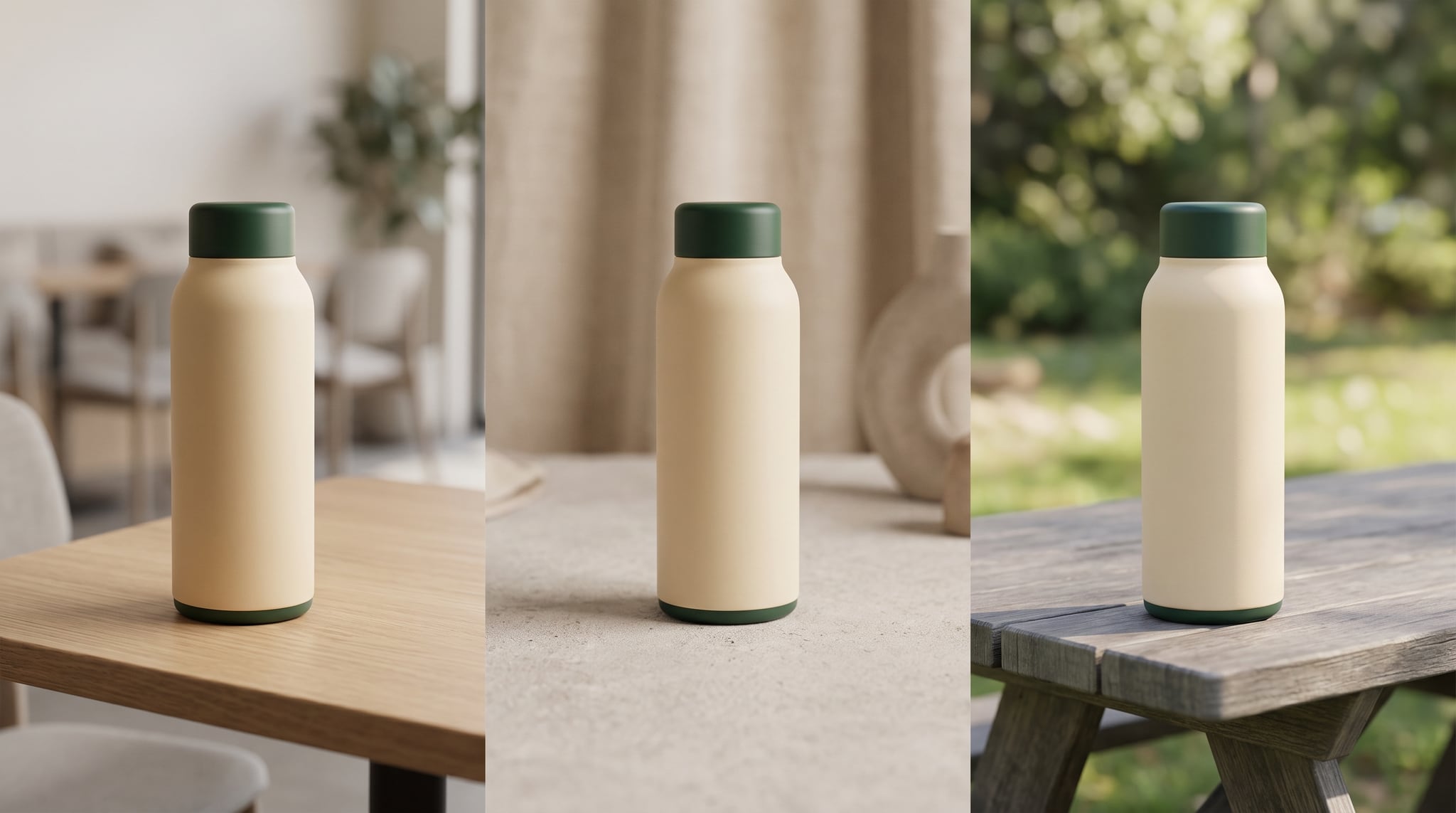
You have an approved product ad. Now you need a version for another market. Translating the headline is straightforward; deciding what the product should look like in context is harder. If you want to know how to localize ad creatives with AI, start with one question: which parts of this image are allowed to change?
The product's shape, packaging, and brand identity may need to stay fixed. The setting, supporting objects, and atmosphere may need to feel natural to a local audience. Meanwhile, translated copy still has to fit the final layout and make the same honest offer. This guide gives you a practical way to separate those decisions, create visual candidates, and review them before anyone publishes an ad.
What ad localization changes—and what it must preserve
Three jobs often get bundled under “localization,” although each needs a different check. Language adaptation changes the headline, call to action, disclosures, and offer wording. Visual adaptation changes the scene or context so the product feels relevant in a particular market. Brand preservation keeps the product and campaign recognizable across both versions.
Picture a reusable insulated bottle photographed on a clean studio surface. A market team might want one image in a compact urban commuter setting and another in a relaxed outdoor picnic setting. The bottle's silhouette, color, cap, label, and position in the visual hierarchy should remain recognizable. The supporting surfaces and background can change if local reviewers agree that they fit the campaign. Neither scene is automatically “authentic” for an entire country; each is a creative hypothesis to test with people who know the audience.
This is also different from resizing. Turning one ad into a square feed image and a vertical Story changes the canvas. Localizing it changes the meaning of the surrounding scene and message. If your main task is aspect ratios, use our guide to turn one image into multiple campaign formats. If you first need a brand reference system, start with the AI image brand consistency guide. Here, we assume you already have an approved product image and want to adapt its visual context for specific markets.
Airtable's localization play covers regional image changes and copy, with people comparing outputs. Adobe's production workflow overview combines approved imagery with local rules and review. A research paper on ad localization evaluation highlights the need to preserve text alignment and visual consistency. The practical lesson: connect image, language, and approval decisions, but check each separately.
Start with one approved master image and a market brief
Choose a master image that passed product and brand review. A sharp product with a clear outline is a better reference than a busy ad with overlapping copy. Keep the original untouched as your comparison point.
Next, write a short fixed-versus-flexible brief. This is the most important step because vague instructions such as “make it feel local” ask the model to guess both your brand rules and the market context. Separate what cannot change from what a regional team may change.
| Decision | Lock across markets | Decide with the local team |
|---|---|---|
| Product | Actual silhouette, colorway, cap, packaging, and visible features | Whether the approved product angle suits the local placement |
| Brand | Core palette, lighting character, logo treatment in final design, and prominence of the product | Which supporting colors or textures fit the approved palette |
| Scene | Product remains the clear subject; no invented accessories | Setting, surface, props, season, and atmosphere when relevant |
| Copy | Accurate product claim and campaign intent | Language, idiom, legal wording, offer, and call to action |
| Layout | Clear reading order and safe space for copy | Text length, direction, line breaks, and placement needs |
Then add a market note with enough specificity to guide a creative decision: target audience, channel, current product offer, likely use occasion, visual references approved by the regional team, and any settings to avoid. “Spain: make it Spanish” is a translation request. “Spanish-language commuter campaign for compact city travel; keep the same bottle and calm neutral palette; use an everyday café or transit-adjacent surface only if regional reviewers approve” is a usable image brief.
Avoid treating national flags, famous landmarks, or generic “local people” as shortcuts. A believable routine or interior may work better than a monument. Ask a regional reviewer what signals relevance for this audience.
How to localize ad creatives with AI while anchoring the product
Use the same master product image as the visual reference for each market. Choose a reference-capable image workflow, keep your aspect ratio consistent during the first comparison, and change only the scene variables listed in the market brief. Oxava's image studio can help you explore those text-free visual candidates from an approved product reference. Final copy, design composition, and approval still belong in your regular creative process.
Here is a reusable prompt structure. The first block is identical in every market; only the second changes:
Fixed block: Use the uploaded approved bottle photo as the product reference. Preserve the bottle's silhouette, cap design, color, material, and visible label placement. Keep the product as the dominant subject, at a similar angle and scale. Maintain a restrained cream-and-deep-green palette, soft directional daylight, realistic contact shadows, and clear negative space on the right for later copy. Create no readable text, new logos, flags, or invented product features.
Market A block: Place the bottle on a simple café table beside a folded commuter jacket. Show a contemporary everyday setting, with understated architecture out of focus. Keep props secondary and avoid identifiable landmarks.
Market B block: Place the same bottle on a neutral picnic table with a folded linen napkin and subtle greenery. Use warm but natural daylight. Keep the bottle at the same visual prominence and leave the same copy space.
This structure gives you a controlled experiment: one product, one brand system, two context hypotheses. You can compare whether the new background adds relevance without changing the offer. If the product angle changes, the label blurs, or a strap appears that your SKU does not have, reject the output. A reference image and a strong prompt reduce drift; they do not guarantee pixel-perfect packaging or readable labels.
Bad prompt: “Make this ad look Japanese and more premium.” It leaves the product, cultural cues, typography, and definition of “premium” open to guesswork. Better prompt: “Preserve the uploaded product exactly as the main subject. Create a quiet modern apartment setting with natural wood and generous negative space, using the approved cream-and-green palette. Add no writing or cultural symbols. A regional reviewer will confirm whether the setting fits the intended audience.” The second prompt describes an image direction while leaving cultural validation to someone qualified to make it.
Generate a few candidates per market, then inspect each at normal display size and close up. Reject product drift before refining the background. Keep the master, brief, prompt, and selected output together for review.
If you are still building the initial ad concept rather than localizing an approved one, our guide to creating AI ad creatives without a designer covers that earlier stage. Local adaptation works best when there is already something stable to preserve.
Keep local copy editable until the final design stage
It is tempting to ask an image model to translate a headline and paint it directly onto each generated ad. That can produce a persuasive preview, but it creates a fragile production file. A visually plausible word can be misspelled. A translated phrase can be correct yet too long for the original text box. A legal qualifier or offer can be wrong for the market. Even when the picture looks polished, someone still has to check the meaning and layout.
There are tools built specifically for in-image text translation. For example, Runway's Ad Localization guide describes uploading one ad, choosing a target language, and reviewing a visually integrated translation. It also advises a native speaker review when copy nuance matters. That is a tool-specific text workflow. For the Oxava process described here, make text-free visual variants first, then add approved localized copy as editable text in your design tool. This keeps translation corrections and layout changes possible without regenerating the product scene.
Give each market's copywriter or translator the product claim, tone, offer, and placement—not just the source headline. “Cold all day” might be a claim requiring evidence; “your daily companion” may be safer but less specific. The right line depends on product truth and local review, not on which sentence happens to fit the box. Leave flexible negative space in the image so a longer translation can wrap without covering the bottle. For languages with a different reading direction, have a designer review the entire reading order, including price, call to action, and disclosures.
Hand off the visual variant with localized words in editable design layers. Label the image with its market, version, and approval status. Record the source line, local line, and reviewer separately so a promotion change does not revive outdated copy.
Review each market version against the same five checks
An attractive image is not necessarily an approved ad. Compare every candidate with the master and brief, then ask a regional reviewer to assess context. This simple review order catches the highest-cost errors before you export channel formats.
- Product truth. Is it the same SKU? Check the silhouette, closure, color, label location, count of items, and any claim-implying detail. Zoom in. If packaging or a logo matters, use the verified source asset in final design rather than assuming the generated pixels are exact.
- Brand continuity. Does the product still lead the composition? Are lighting, palette, and image finish consistent with the campaign? The setting may change, but the ad should remain recognizable beside the master.
- Local relevance. Does the scene fit the intended audience and use occasion? Ask a local reviewer what feels natural, irrelevant, or stereotyped. Keep their decision attached to the asset rather than relying on a general country label.
- Copy and layout. Has a fluent reviewer approved the language and product claims? Can the headline, call to action, and required disclosures fit in the actual placement with clear reading order? Inspect mobile size, not only a large design canvas.
- Landing-page continuity. Does the ad show the product, color, and offer that the destination page actually contains for that market? A visually strong ad creates confusion if the click leads to a different item or outdated promotion.
The sources converge here: Airtable emphasizes comparing versions, Adobe combines approved inputs with local rules and human review, and the research paper examines text, layout, and style drift. Keep the input approved and give the right people a clear place to reject an output.
Once the visual and message are approved, produce channel sizes. That is when our multiple-format campaign workflow becomes useful. Changing aspect ratio earlier can make it harder to tell whether a difference came from the local setting or the crop. If the campaign also needs email, consult the AI images for email marketing guide for the distinct constraints of inbox rendering.
A two-market pilot you can run this week
Start smaller than a global rollout. Pick one SKU, one approved master image, and two markets with reviewers available. Write the shared fixed block once. Ask each local reviewer for one plausible scene direction and one scene to avoid. Create text-free candidates in the same aspect ratio, then select a single image per market that passes the product and brand checks.
Send those two visuals, together with the original ad and market briefs, to the local copy and design reviewers. Add editable local headlines and calls to action. Review the composed ads at their actual placements and compare each with its local landing page. Capture the reasons behind your approvals and rejections: “product label changed,” “background feels generic,” “headline crowds the product,” or “scene fits the use occasion.” Those notes make the next iteration more precise.
For broader campaigns, reuse the fixed prompt block and review checklist while changing market notes. Our AI social media visual kit guide can help you organize reusable brand assets. A local reviewer still decides whether each scene fits.
Frequently Asked Questions
Is translating ad copy enough to localize an image?
Sometimes. A product-on-white ad may need only an approved translation and layout adjustment. If the scene communicates a use occasion or lifestyle, review whether that context makes sense for the target audience too. Change only what the campaign needs.
Can AI keep my product and logo exactly the same in every market?
An approved reference image and specific prompt can improve consistency, but generated results still need visual inspection. Check packaging, labels, colors, and small features closely. When exact logo or legal-label fidelity is essential, place a verified product or logo asset in the final design and have the finished ad approved.
Should I generate localized text inside the ad image?
For the workflow in this guide, generate the visual without readable copy and add reviewed local text in a design file afterward. That lets a copywriter correct wording and a designer adjust line breaks without regenerating the scene. Specialized in-image translation tools exist, but their output still needs language and layout review.
How do I avoid stereotypes in localized AI ads?
Brief for a specific audience and use occasion rather than asking for a generic national look. Have a regional reviewer suggest references, inspect the outputs, and explain what feels appropriate. Avoid assuming that flags, landmarks, clothing, or one visual style can represent everyone in a market.
Do I need a separate prompt for every country?
Keep one shared block for product and brand constraints, then add a market-specific block for approved scene changes. This makes versions easier to compare and reduces accidental product drift. Revise the local block when reviewers find a better direction.
Create your first localized visual pair
Knowing how to localize ad creatives with AI starts with deciding what must remain true and what local teams can adapt. Use an approved product image, write a fixed-versus-flexible brief, create text-free scenes for two markets, then let regional copy and design reviewers finish the ads. Compare every result with the master, the market brief, and the local landing page before publication.
Ready to test the visual step? Open Oxava's image studio, upload your approved product image as a reference, and make one text-free scene variant for each of your first two markets. Bring the strongest candidates into your design and review process for localized copy and final approval.
Oxava Team
Egemen Küpçü is the founder of Oxava, with 10+ years of hands-on experience in 3D and visual production. He writes about the craft of generating product, brand and campaign visuals with AI.
Related Articles
ALL POSTS


Subscribe to our newsletter
Be the first to hear about new techniques, model updates and ideas on AI generation.