

Generating AI images for email marketing takes about ninety seconds. Getting one that actually renders in the inbox is a different job — email is the most hostile place a picture can land.
A hero with your headline baked into the artwork looks perfect in your design tool and delivers nothing in Outlook on the desktop, which still blocks images by default. A product cutout on a transparent PNG looks crisp on white, then grows a pale halo when Gmail's iOS app flips your email into dark mode. A tidy 600 px export looks soft on every retina phone in your list. And sooner or later someone will tell you Gmail clips emails over 102 KB so your images must be smaller — which is wrong in a specific, fixable way.
This guide is the render discipline: what breaks, and how to build the constraints into your prompt before you generate.
Why AI Images for Email Marketing Break in the Inbox
Every other channel gives your image a predictable canvas. Email hands it to dozens of rendering environments, several of which will actively change it. Two behaviors decide whether your artwork survives: whether the client loads it at all — documented in Litmus's guide to email image blocking — and what it does to color in dark mode, mapped in Campaign Monitor's dark mode in email guide.
| Client | Images by default | Dark mode | Design implication |
|---|---|---|---|
| Outlook 2007–2019, Windows desktop | Blocked | Partial — body background only, text untouched | Word-based engine, not a browser one; treat the blocked state as the real one |
| Outlook for Mac / Office 365 desktop | Blocked | Partial | Alt text has to carry the message |
| Outlook.com + Outlook mobile apps | Shown | Partial | Your light background can go dark under an unchanged image |
| Gmail, web | Shown | No forced full inversion reported | The friendliest Gmail surface |
| Gmail app on iOS | Shown | Full inversion of your HTML/CSS colors | The most aggressive — test every send here |
| Apple Mail (macOS/iOS) | Shown | No auto-inversion; supports prefers-color-scheme |
The one place you get real control |
| Yahoo Mail / AOL webmail | Shown / blocked | Varies — test it | AOL behaves like Outlook: design for no image at all |
Read it as two separate problems. The blocking rows mean a slice of your list experiences the campaign as live HTML text plus alt attributes — no artwork. The dark-mode rows mean that among readers who do see the artwork, it may be sitting on a background that is the opposite of the one you designed for. Client behavior also changes without announcement, so re-test your own template rather than trusting any published matrix, including this one, forever.
While we're here, kill the 102 KB myth. Gmail clips a message when its HTML and CSS exceed roughly 102 KB — as Litmus explains in how to keep Gmail from clipping your emails — and images are fetched separately, so their file size doesn't count toward it. Staying under about 75 KB of HTML gives you headroom. That's a template problem, not an image problem.
None of this argues for text-only email. It argues for images that degrade gracefully, which is a prompting decision more than a post-production one.
Rule #1: Never Bake Readable Text Into an Email Image
Your headline, offer, discount code, and CTA label do not belong inside the image file. This is the rule most often broken by people generating campaign visuals fast, and it's the one that costs the most.
- Blocked images take the message with them. If "40% off, this weekend only" lives in pixels, an Outlook desktop reader gets an empty rectangle and no offer.
- Screen readers can't read pixels. Text baked into artwork is invisible to assistive technology.
- Localization breaks. One English hero becomes five image files; live HTML text is a copy edit.
- Image-heavy, text-light email is a weak signal. An email that's essentially one big picture gives text-based filtering systems nothing to read, and image-to-text ratio is widely discussed as one of the things they weigh.
There's a practical reason too: models are inconsistent at small type. A subtly misspelled word at hero size isn't caught until it's in 20,000 inboxes.
The durable structure is boring. The image supplies atmosphere, product, and mood; the HTML supplies every word. Your headline is real text above or over the image, your button is an HTML button with a background color, and the artwork can go missing without taking the message with it.
Make that a fixed prompt clause — the same locking-phrase habit from our guide to writing AI image prompts:
Wide editorial hero banner for an email campaign: a single ceramic coffee cup on a
warm oak surface, soft morning light from the left, gentle directional shadow,
muted cream and clay palette, generous empty space across the right third of the
frame reserved for headline copy to be added later in HTML, photorealistic,
shallow depth of field,
no text, no lettering, no readable typography anywhere in the image,
no brand logos or trademarks.
The empty-space instruction matters as much as the text ban. If you're overlaying live HTML text, you need a genuinely quiet region for it — not a busy scene you'll fight with a text shadow later.
Prompting Compositions That Survive Dark Mode
Dark mode is where careful work quietly falls apart, and the biggest culprit is the transparent PNG.
The failure goes like this. You cut the product out, export it transparent, and place it on a white email background. In dark mode the client turns the page near-black, but your transparency doesn't change — so you get edge artifacts from anti-aliasing that assumed white, or dark details dissolving into a dark background. Black text inside a logo PNG is the classic version: legible on white, invisible on charcoal.
- Prefer a solid, opaque background. If the image carries its own flat backdrop, no client can drop it onto a surface you didn't plan for.
- Prompt for edge contrast on all four sides. A dark product on a dark background is a blob either way.
- Give small marks a plate or a stroke. A logo that must be transparent needs an outline or rounded solid backing to survive inversion.
- Don't rely on white. White is the value dark mode is most likely to flip; off-white, warm grey, or a soft brand tint behave more predictably.
| Format | Use for | Watch out |
|---|---|---|
| JPEG | Photographic heroes, lifestyle scenes, product modules | No transparency — in email that's a feature; compress so gradients don't band |
| PNG | Only when transparency is genuinely required, plus flat graphics and small marks | Preview against a dark background before sending; heavier files |
| WebP | Not for email | Support looks plausible on paper, but Gmail is reported to convert images to JPG and Outlook desktop has been inconsistent — see caniemail's WebP entry, then export JPEG or PNG |
If you built your logo as a vector — our logo SVG guide walks that process — keep the SVG for print and web and export a raster PNG for email, where vector support is patchy.
Product on a solid mid-tone background for an email module: [your product]
centered on a flat, evenly lit warm grey backdrop, no gradient and no pure white,
soft studio light with a subtle contact shadow, clearly defined product edges with
visible contrast against the background on all four sides, small even margin
around the subject, photorealistic, opaque background with no transparency,
no text, no lettering, no readable typography anywhere in the image,
no brand logos or trademarks.
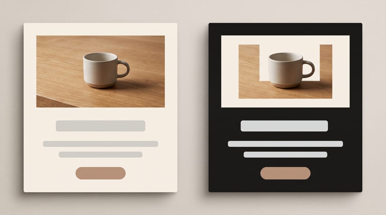
You still need CSS-side defenses — prefers-color-scheme, explicit background
colors on your table cells — but those live in your template. The image half of
the problem is solved at generation time, which is the cheapest place to solve it.
The Ratios and Pixel Sizes Email Actually Needs
Email has its own geometry, and it barely overlaps with social. If you're coming from a social workflow like the one in our AI social media visual kit guide, treat email as a separate build rather than a resize — the square that works on Instagram doesn't follow the same rules in an inbox.
Two numbers frame everything. 600 px is the body width convention, with modern guidance stretching to roughly 640 px per this email template size reference. And you export at 2× and display at 1×: a hero shown at 600 px is a 1200 px file constrained in your HTML. Then compress hard, because doubling both dimensions quadruples the pixel count.
| Placement | Displayed (600 px body) | Generate at @2x | Closest studio ratio |
|---|---|---|---|
| Wide hero banner | 600 × 200 (3:1) | 1200 × 400 | 4:1 on Nano Banana 2, or 21:9 — no exact 3:1 |
| Standard hero | 600 × 300 (2:1) | 1200 × 600 | 21:9, cropped slightly |
| Full-width lifestyle block | 600 × 400 (3:2) | 1200 × 800 | 3:2 — exact |
| Editorial portrait block | 600 × 750 (4:5) | 1200 × 1500 | 4:5 — exact |
| Two-column product cell | ~285 × 285 | 570 × 570 | 1:1 — exact |
| Three-column tile / avatar | ~180 × 180 or 120 × 120 | 360 × 360 or 240 × 240 | 1:1 — exact |
An honest note on that first row: the studio has no 3:1 preset. It has 21:9 (about 2.33:1) on most models, and on Nano Banana 2 the wider panoramic options including 4:1 and 8:1. So a 600 × 200 header has two clean routes — generate at 4:1 and crop the sides, or 21:9 and crop top and bottom. To expand instead of crop, turning one image into multiple formats covers outpainting a hero out to a wide 3:1 header. For general ratio theory, the aspect ratio and composition guide is the map; the email-specific rows are the ones above.
One workflow constraint before you plan around it: image upscaling on Oxava requires a Pro plan or higher. On Starter, generate at the largest size your model offers and size your modules to what you actually have. Either way, compose first and upscale last — our AI image upscaling guide covers doing it without smearing detail.
The square tile, since a product grid is the most repeated module in retail email:
Square product tile for an email grid: [your product] centered in frame, filling
roughly 70% of the square, flat warm-beige background, soft even light, one subtle
contact shadow, minimal props, consistent framing suitable for a repeating grid,
generous margin so nothing crops at the edges, photorealistic,
no text, no lettering, no readable typography anywhere in the image,
no brand logos or trademarks.
Generate the whole set in one sitting in the Oxava studio so every tile shares light direction and background tone. A grid where each cell came from a different day reads as a stock-photo collage.
Alt Text: What's Left When Images Are Blocked
For readers whose client blocks images, your alt text is the email — and it's the most neglected field in most campaigns.
Decorative images get empty alt text. Dividers, textures, background
flourishes: set alt="" so a screen reader skips them instead of announcing a
filename. An explicit empty attribute is a decision; a missing one is an omission.
Informative images get described. "Charcoal linen throw folded on a light oak
bench" beats "linen throw", and both beat hero_v3_final.jpg.
If your CTA lives in an image, the alt text must contain the call to action. Better still, don't put the CTA in an image. An HTML button with a background color renders when images are off, scales on mobile, and can be restyled without regenerating anything.
Alt text is also reported to be styleable with CSS in many clients, so the blocked state can look intentional rather than broken. Give it a little voice — but skip the manipulative version ("Your images are off — click for the surprise!"). Describe the image and let your copy do the selling.
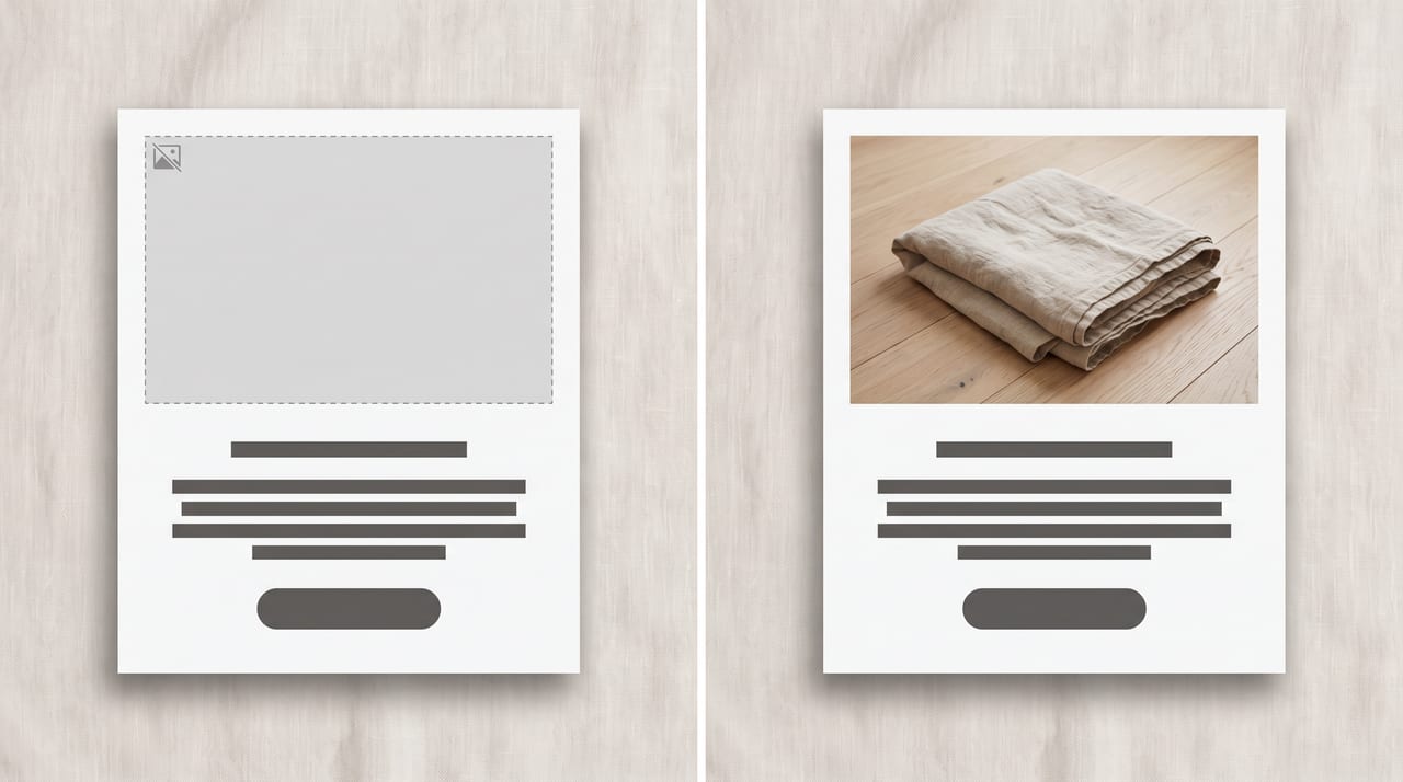
A useful test: open your own campaign with images disabled. If it still makes sense, still shows the offer, and still has a clickable CTA, you built it right.
From One Hero Image to the Whole Campaign
A campaign is rarely just an email. The same launch needs a landing header, social posts, often paid creative — and the version that converts is the one where they all look like the same moment, photographed once.
So build one hero and derive the rest, keeping subject, palette, and lighting direction fixed while the crop and canvas change. That's the reference-image workflow, available across multiple models in the studio: feed the approved hero back in and ask for the same scene at a different shape.
Using the reference image, rebuild the same scene as a wide horizontal banner:
keep the product, palette, lighting direction, and mood exactly as in the
reference image, extend the surface and background sideways, position the product
in the left third, leave the right side clean and uncluttered for headline copy,
no text, no lettering, no readable typography anywhere in the image,
no brand logos or trademarks.
Holding that family resemblance across a dozen assets is a systems problem more than a prompting one; our AI brand visual consistency guide is the deep dive on building a reusable style block. If the campaign also needs paid creative, AI ad creatives without a designer covers that side, and AI marketing visuals for small business is the wider overview this guide sits inside.
Build the email version first. Email is the strictest member of the family, so the social and landing crops derived from it inherit clean, textless, high-resolution source material. Start with a text-baked social square and you'll rebuild it.
What Oxava Does and Doesn't Do for Email
To be direct: Oxava is an AI image and video studio, not an email platform. There's no Mailchimp, Klaviyo, or Brevo integration, nothing syncs to a campaign, and the studio does not generate HTML email templates — no drag-and-drop builder, no responsive table markup, no dark-mode media queries written for you.
The real pipeline is short and manual: generate your hero and module images at 2×
display size, download them, upload them to your ESP's image library, then place
them in your template, where you set width, alt text, link, and background color.
Everything in this guide that touches code — alt attributes,
prefers-color-scheme, table widths, the 102 KB HTML budget — happens in your ESP,
not in the studio.
What the studio does is the half that used to need a photographer and a designer: textless, dark-mode-tolerant, correctly proportioned imagery in the shapes your template needs. The sending belongs to whichever ESP you already use, and you keep control of what actually goes out.
Frequently Asked Questions
Do AI-generated images get blocked in email the same way as regular photos?
Yes, identically. Once it's a JPEG or PNG on a server, a mail client has no idea how the image was made — blocking is about loading remote content, not provenance. So every rule here applies to AI output exactly as it applies to a studio photograph: no baked-in text, real alt attributes, retina-sized exports. The one AI-specific wrinkle is that models sometimes add lettering you didn't ask for, so check each generation before you send.
Should email product images be JPEG or PNG?
Default to JPEG for anything photographic — a product in a scene, a lifestyle frame, a hero band. It compresses photographs far better, and its lack of transparency is an advantage in email, because the image carries its own background into every dark-mode client. Use PNG only when you genuinely need transparency or you're placing a flat-color graphic or small mark, and preview it against a dark background first.
How many pixels should an email hero image be for retina screens?
Generate at twice your display width and constrain it in HTML. For the standard 600 px email body, that means a 1200 px-wide asset shown at 600 px — so a 3:1 hero is a 1200 × 400 file and a 3:2 lifestyle block is 1200 × 800. Compress aggressively afterward, since doubling both dimensions quadruples the pixels. If a generation lands under target, note that upscaling on Oxava needs a Pro plan or higher.
Does Gmail's 102 KB clipping limit include my images?
No, and this is the most useful misconception to drop. The roughly 102 KB threshold applies to the HTML and CSS of the message; images are fetched separately by the client and don't count toward it. Exceeding it gets your email clipped with a "View entire message" link, which typically hides your footer and can interfere with tracking. Keeping HTML under about 75 KB gives comfortable headroom.
Can I put my headline directly inside the AI image?
Technically yes, practically no. Readers whose client blocks images by default — the Outlook desktop family most notably — would receive your headline as an empty rectangle, screen readers can't read text inside a pixel grid, and every translation or offer change means regenerating a file instead of editing a line of copy. Put no text, no lettering, no readable typography anywhere in the image in every prompt and set the headline as live HTML.
Build an Email Image Set That Renders Everywhere
The discipline behind AI images for email marketing comes down to four habits. Keep every word out of the artwork and in the HTML. Bake an opaque background and real edge contrast into the image so dark mode can't hollow it out. Generate at double your display size and export JPEG or PNG, never WebP. And write alt text as if it's the whole email, because for part of your list it is.
Do that and one asset works in an Outlook desktop preview pane, a Gmail iOS dark-mode open, and an Apple Mail retina render — no separate versions, no fire drill on send day.
The practical move is one focused session: open the Oxava studio, generate your hero at 4:1 or 21:9 and your product tiles at 1:1 with the no-text clause in every prompt, then download the set, compress it, and place it in your template with proper alt text and explicit background colors. Send yourself one test with images turned off before the real one goes out — that single check catches more email image problems than any preview tool.
Egemen Küpçü
Egemen Küpçü is the founder of Oxava, with 10+ years of hands-on experience in 3D and visual production. He writes about the craft of generating product, brand and campaign visuals with AI.
Related Articles
ALL POSTS
Subscribe to our newsletter
Be the first to hear about new techniques, model updates and ideas on AI generation.