

If you run a café, a small boutique, a one-person consulting practice, or a craft business, you've felt this: the work is good, but the visuals don't show it. The question isn't whether AI can help you create marketing visuals without a designer for your small business — it can. The question is knowing which visual you need, when you need it, and how to keep it consistent.
Hiring a designer feels expensive, and learning Photoshop feels like a second job you don't have time for. So the Instagram grid drifts, the menu photo is three years old, and the new product launches with a phone snapshot.
Here's the reframe: not having a designer isn't a cost problem — it's a decision problem. AI tools have made producing a clean, on-brand image trivially cheap. What's left is the judgment layer. This guide is the map, not the manual. It won't teach you deep prompt craft or format engineering — it'll help you figure out what to make and point you to the right deep guide for each technique. Start here.
The Real Cost of Not Having a Designer (and What AI Changes)
Let's name the old math first. A freelance designer or a small studio on retainer typically runs a small business $3,000–$7,000 a year once you add up social templates, seasonal campaigns, the occasional menu refresh, and a few ad creatives. That's before the back-and-forth: a revision cycle that takes days, and a brief you have to write anyway because you're the one who knows the brand.
For most owners the bigger cost isn't even the invoice — it's the 10 to 20 hours a month lost to making do. Restyling a stock photo, re-cropping the same image for five platforms, waiting on a quote, settling for "good enough." That time compounds, and it's time you'd rather spend on customers.
What AI actually changed is subtler than "free images." It democratized the decision-making. You no longer need a design background to produce something that looks deliberate — you need a clear brief and a repeatable process. The model handles the rendering; you handle the judgment. That's a far smaller skill to build than learning a design suite.
One honest caveat, because the internet over-promises here: AI is excellent at applying a visual identity, but it's still shaky at defining one from nothing. If you don't yet have a logo, a chosen color palette, and a basic sense of your brand's mood, that first-time setup is the one place where an hour with a real designer (or a templated brand kit) still pays off. Once those anchors exist, AI can execute them across hundreds of images consistently. Think of it this way: a designer is great at the decision, AI is great at the repetition.
What Visuals Does Your Business Actually Need? (Scenario Map)
Most "AI for business" advice treats every company the same. It shouldn't. A café and a consultant need almost opposite things. Find your situation below — the point is to know your priority visual, the one that earns its keep, before you generate anything.
Local Café or Restaurant
Your visuals live on Instagram, Google Business, and a menu. Your priority is atmosphere over catalog: the warm morning light on a wooden table, steam off a cup, the mood someone wants to walk into. You need a steady stream of feed and story images that all feel like the same place, plus a few clean shots of signature items. This is where generative, "vibe-first" imagery shines — you're selling a feeling, and AI is very good at consistent feelings once you lock a style.
Priority order: (1) a repeatable atmospheric template for social, (2) a handful of hero shots for signature dishes/drinks, (3) seasonal variations (a holiday cup, a summer-menu mood).
Boutique or Product Seller
Your visuals are doing sales work, so accuracy matters more than mood. You need your actual products shown well — on clean backgrounds for listings, and in lifestyle scenes for ads and social. The technique here is product staging, not free generation: you start from a real photo and let AI rebuild the scene around it so the product stays true. That's a specific craft, and we cover it end to end in AI product photography — read that once your priority shots are scoped.
Priority order: (1) clean listing images of your bestsellers, (2) lifestyle/context shots for ads, (3) seasonal or campaign variants of the same hero.
Consultant, Coach, or Service Provider
You have no physical product, which is exactly why visuals are hard — and why most service businesses look generic. Your priority is a consistent personal/brand look: a recognizable color world, conceptual images for posts and slides (abstract "growth," "clarity," "process" visuals that don't feel like stock), and clean graphics for lead magnets and carousels. Consistency is your brand here, because there's no product to anchor recognition.
Priority order: (1) a defined color and mood you repeat everywhere, (2) conceptual post and carousel imagery, (3) presentation and lead-magnet graphics.
Artisan or Craft Business
You sit between the boutique and the café: you have real, often handmade products, but the story of the craft is half the sale. You need accurate product shots and atmospheric process imagery — the hands, the workshop, the texture. Like the boutique, your real-product shots should start from photos (image-to-image), while the mood and lifestyle pieces can be generated.
Priority order: (1) honest product shots that show craftsmanship, (2) process/story images, (3) lifestyle context that places the piece in a buyer's home.
Your Visual Decision Framework — Before You Open Any Tool
The most common mistake isn't a bad prompt — it's opening a tool with no decision made. Before you generate a single image, answer four questions. They take two minutes and save you an hour of aimless re-rolling.
- Where will this appear? A square feed post, a 9:16 story, a wide banner, a marketplace listing — the destination dictates the aspect ratio and crop before you write the prompt. Generating square then cropping for stories loses the composition.
- Is this one-and-done or recurring? A single seasonal banner is a quick one-off. A weekly social template is an investment — build it once, properly, because you'll reuse it fifty times.
- Real product or atmosphere? This decides your approach. A real product means image-to-image from a photo (accuracy). Atmosphere or concept means text-to-image from a prompt (freedom). Mixing these up is why so many AI product shots look "almost right but wrong."
- Do you need a commercial license? Anything that sells or advertises needs imagery you're clearly allowed to use commercially. Confirm it once for your tool, then stop worrying about it.
Here's the framework as a quick reference:
| Visual type | Approach | Rough time per image |
|---|---|---|
| Atmospheric social post (café/brand mood) | Text-to-image from a saved style template | 5-10 min |
| Real product on clean background | Image-to-image from a product photo | 10-15 min |
| Lifestyle/context shot with your product | Image-to-image, then scene rebuild | 15-20 min |
| Conceptual post (service business) | Text-to-image, concept-driven prompt | 10-15 min |
| Seasonal/campaign variant of an existing hero | Reuse seed/reference, change one element | 5 min |
Notice the pattern: anything real starts from a photo; anything atmospheric starts from a prompt; anything recurring leans on something you've already built.
Building Your "Visual DNA" Once
The single highest-leverage thing a small business can do is define its visual identity once and then repeat it. This is what separates a feed that looks like a brand from one that looks like a folder of random images. You don't need a 40-page brand book — you need three reusable anchors.
A prompt template. Write one base prompt that encodes your look: subject slot, your lighting, your mood, your style words. Then you only swap the subject. "Warm morning light, soft shadows, natural wood and linen textures, cozy editorial style" becomes the constant; "a flat white" or "a slice of carrot cake" becomes the variable.
A seed (or reference) lock. Once you find an output you love, lock its seed or feed it back as a reference image. That keeps new images in the same visual family instead of drifting. This is the difference between "five images that match" and "five images from five companies."
Color discipline with real hex codes. Pick two or three brand colors plus one neutral, and name them by hex in your prompts and your post-editing — don't trust the model to "feel" your blue. Hex codes are how you keep the palette honest across months of content.
One trap worth flagging now: don't ask AI to render your text. Logos, prices, and headlines come out garbled, misspelled, or subtly off. Generate the clean image, then add typography afterward in any simple editor. Treat the AI output as your background plate, not your finished graphic.
Defining this once is genuinely the hardest part, and it deserves its own deep treatment. Our complete brand consistency guide walks through building a reusable prompt template, anchoring with seeds and references, and keeping every output on-brand — read it when you're ready to lock your DNA. And if writing the prompt itself feels intimidating, start with how to write AI image prompts for the five-layer method that makes briefs predictable.
Your Weekly Visual Workflow — 2-3 Hours
Consistency comes from rhythm, not inspiration. Here's a weekly cadence that fits around running an actual business and produces a full week of visuals in two to three hours total.
- Monday — Plan (20 min). Look at the week ahead: a new menu item, a sale, a post series. List the 6-8 images you'll need and which approach each takes (prompt vs. photo). Decide before you generate.
- Tuesday/Wednesday — Batch generate (60-90 min). Sit down once and make everything. Working in a batch keeps you in the same visual headspace, so the set comes out cohesive instead of patchwork. Use your template and reference lock.
- Thursday — QA and edit (30 min). Review the batch as a group, not one by one — does it look like one brand? Add text and logos now, in your editor, never in the prompt. Cut anything that doesn't match.
- Friday — Archive your prompts (10 min). Save the prompts and seeds that worked, labeled. This is your compounding asset: by week four you're reusing proven prompts and moving 3-4x faster than week one.
This is exactly where a single tool that does both jobs earns its place. Oxava handles the two halves of small-business imagery in one studio: text-to-image for your atmospheric and conceptual visuals, and image-to-image for staging real products from a photo. You can lock a style, reuse references, and batch a week's worth of on-brand images without bouncing between apps — which is itself a major cause of inconsistency. Open the studio and build your first weekly batch.
Which Visual Goes Where — Linking to the Deep Guides
This guide is deliberately a starting map. Each technique below has a full, hands-on guide — go to the one that matches what you decided you need, instead of trying to learn everything at once.
- You need ad creatives that convert (feed, story, banner from one product photo). → How to create AI ad creatives without a designer. Read this when your priority is paid or organic ads, not general posts.
- You're starting your social presence from scratch and need a full kit. → Build an AI social media visual kit from scratch. Read this when you have nothing yet and want a complete, cohesive set in one go.
- You have one great hero image and need it in every size. → Turn one image into multiple formats. Read this when reformatting and repurposing — not creating new images — is your bottleneck.
- You want the theory of staying on-brand across everything. → The complete brand consistency guide. Read this to build the system that makes all of the above repeatable.
- You sell physical products and need them shown accurately. → AI product photography. Read this for the staging craft: clean backgrounds, lifestyle scenes, true-to-life products.
- You want to write better prompts in general. → How to write AI image prompts. Read this first if your outputs feel random — it's the foundation for all of the above.
Bookmark the two that match your priority list from the scenario map. Ignore the rest until you need them.
Common Mistakes When Creating Marketing Visuals Without a Designer
- Using a different tool for every job. Each tool has its own "house style," so jumping between them is the fastest way to a feed that looks inconsistent. Pick one studio and stay in it.
- Expecting one tool to do everything. The flip side: don't ask an image tool to also be your video editor or your scheduler. Match the tool to the job and don't force it past its scope.
- Believing "one nice image is enough." A single good photo can't carry a brand. What sells is a consistent stream — twenty images that clearly belong together beat one masterpiece that stands alone.
- Letting AI render your text. Garbled headlines and warped logos are the number one tell of lazy AI content. Always add type afterward.
- Never saving prompts. If you reinvent the brief every week, you never get faster and you never get consistent. Your prompt archive is your real asset.
- Skipping the license check. Assuming any output is commercially safe is a risk for anything that advertises or sells. Confirm it once and document it.
Avoid these six and you're already ahead of most businesses that do have a designer but no system.
Frequently Asked Questions
Do I need design skills to create my own marketing visuals? No. The skill AI requires isn't visual design — it's writing a clear brief and following a repeatable process. You describe what you want in plain language, lock a style, and reuse it. The judgment about which visual you need (which this guide is built around) matters far more than any technical design ability.
How many tools do I actually need? Ideally one image studio, plus a simple editor for adding text and logos. Spreading work across many AI tools is a leading cause of inconsistency because each has its own look. A studio that does both text-to-image (atmosphere) and image-to-image (real products) covers nearly every small-business need from one place.
Can I use AI-generated images commercially for my business? Generally yes, but it depends on the specific tool's terms — so confirm it once for the tool you choose, especially for ads and listings. Make commercial-use rights a checkbox when you pick your studio, then you can stop thinking about it.
How do I keep visuals consistent across Instagram, my website, and ads? Three anchors: a reusable prompt template, a locked seed or reference image, and two to three brand colors defined by hex code. Generate in batches so a whole set shares the same mood, and add text afterward in one editor. For the full system, see the brand consistency guide.
I sell physical products — can AI really help, or is it only for digital brands? It helps physical products more, not less. The trick is image-to-image: you start from a real photo of your item so it stays accurate, and AI rebuilds the background or scene around it. That gives you clean listing shots and lifestyle scenes without a photo studio. The technique is covered in AI product photography.
Start Creating Marketing Visuals Without a Designer — One Decision at a Time
The businesses that win at visuals aren't the ones with the biggest budget — they're the ones with the clearest system. You don't need a designer, and you don't need to become one. You need to know your priority visual, define your look once, and run a small weekly rhythm that compounds.
So pick one thing from your scenario map — the single visual that would help your business most this week — and make just that. When you're ready, open the Oxava studio and generate it: text-to-image for the mood you want to create, image-to-image for the products you want to show. One decision, one image, one repeatable habit. That's how a small business starts looking like a brand.
Egemen Küpçü
Egemen Küpçü is the founder of Oxava, with 10+ years of hands-on experience in 3D and visual production. He writes about the craft of generating product, brand and campaign visuals with AI.
Related Articles
ALL POSTS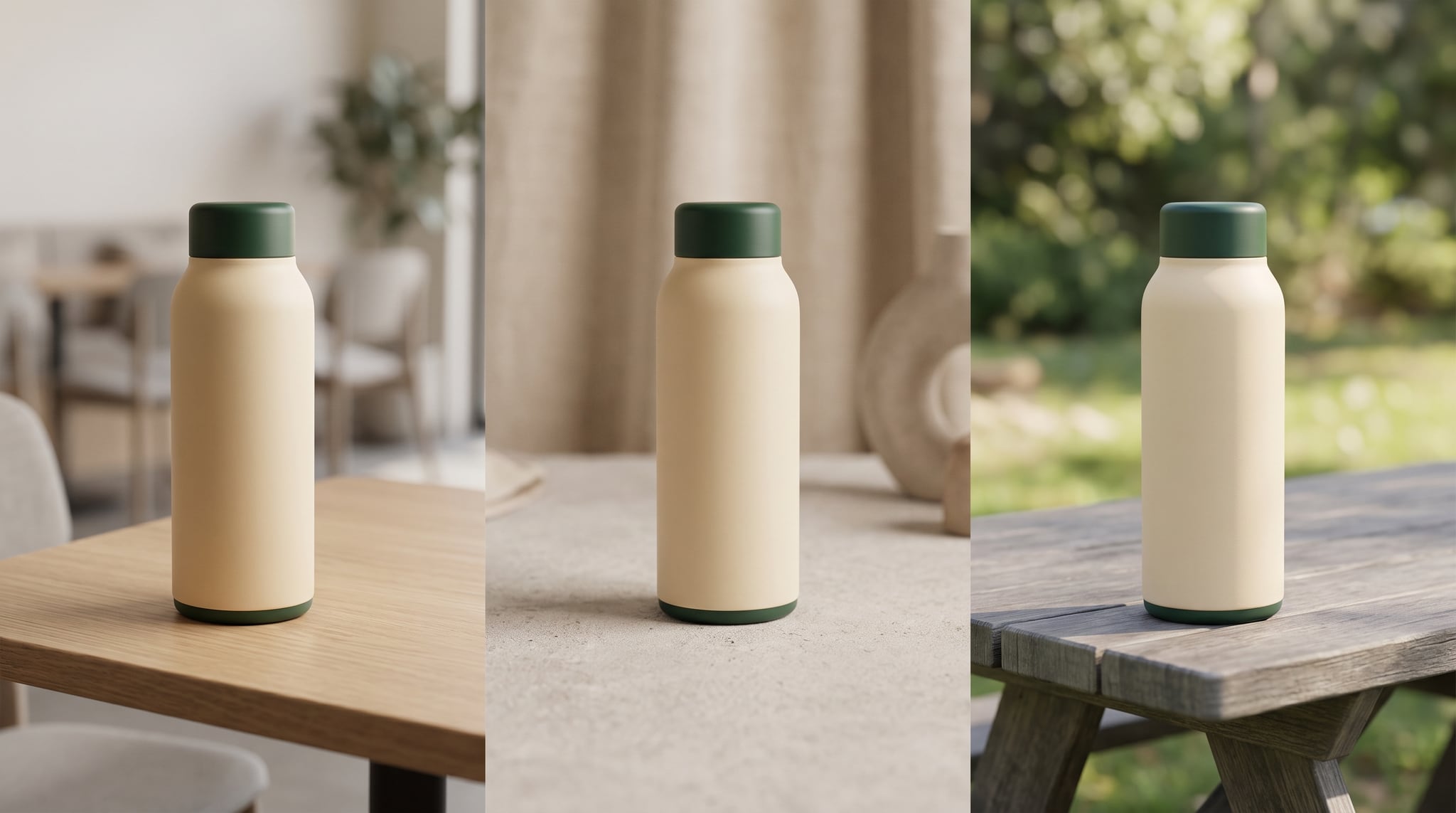

Subscribe to our newsletter
Be the first to hear about new techniques, model updates and ideas on AI generation.