
A bag of coffee surrounded by chocolate pieces and orange slices makes an attractive image. It also leaves a question: are those ingredients, tasting notes, or something to serve with the coffee? AI coffee product photos work better when you answer that question before choosing the props.
For a roaster selling beans online, the useful creative challenge is translating an invisible sensory experience into a clear visual story. A generator can arrange fruit around a pouch; it cannot determine what your coffee tastes like. This guide explains how to brief three complementary images: what the customer buys, how the roaster describes its taste, and one way to prepare or serve it.
The workflow below is an editorial recommendation, not a tested conversion formula. All product examples are hypothetical. For the wider production process, see our AI product photography guide.
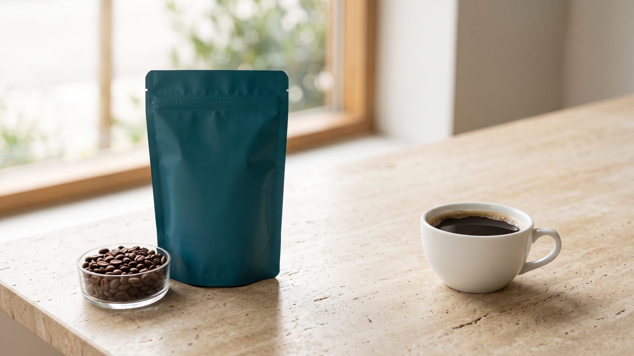
The cover is an AI-generated conceptual illustration of a fictional coffee package and serving arrangement. It does not depict an actual customer product or product test.
First, separate tasting notes from ingredients
A tasting note describes a sensory association. It does not, by itself, identify an ingredient added to the product.
Counter Culture explains that customers sometimes interpret its chocolate or fruit notes as added flavoring, although the company does not flavor its coffees. Its team selects descriptors through tasting. That is a concrete example from one roaster, not evidence that every coffee on the market is unflavored.
The World Coffee Research Sensory Lexicon provides a vocabulary and references for describing coffee's flavor, aroma, and texture. A reference food helps describe a sensation; its appearance in a sensory vocabulary is not a recipe for the contents of a bag.
For art direction, distinguish three relationships:
- In the product: confirmed ingredients or components of the actual item sold
- Reminds the taster of: the roaster's approved sensory descriptors
- Served with or prepared using: additions and equipment used for a particular serving idea
A hazelnut could occupy any of these roles in different campaigns. Decide its role for this SKU before it appears in the frame. Do not let a model choose the relationship simply because “hazelnut coffee” produces appealing results.
This also matters for infused, flavored, or otherwise specially processed coffees. Ask the product owner how the specific coffee is made and described. Neither a tasting-note label nor a fruit-colored background settles that question.
Build AI coffee product photos around three image jobs
A single picture need not explain the entire product. Give each image one main job, and keep the product identity consistent across the set.
Image 1: what the customer receives
Start with the actual pack against a restrained setting. Keep edible props out of this image when they would complicate the purchase. The aim is an immediate answer to “What am I ordering?”
A whole-bean pouch, ground-coffee pouch, capsule box, and ready-to-drink bottle require different supporting references. Use the actual product format rather than a generic coffee scene. A scatter of beans can be attractive but becomes unhelpful beside a ground-coffee product when it obscures what ships.
Photograph the current pack and keep a clean source image. Our packaging and label accuracy guide covers preserving the printed information. Here, the separate task is deciding what the objects around that package mean.
Image 2: how the roaster describes the taste
Use approved tasting notes to guide the palette and composition. You do not need to illustrate every noun with a literal food.
For a hypothetical coffee described as orange, cocoa, and caramel, try a warm amber surface, a cocoa-brown backdrop, and an uncluttered arrangement around the real pack. These are art-direction choices, not a universal visual language: amber does not scientifically mean caramel, and a brown background does not verify cocoa notes.
If literal foods are necessary, place them in a distinct editorial area rather than spilling from the bag or entering the cup. Add a visible explanation such as “Tasting notes: orange, cocoa, caramel” in the page layout or external design editor. Even then, review the whole image; separation and a caption can help but cannot guarantee how every viewer understands it.
Image 3: one specific serving or preparation idea
Choose a real preparation the brand wants to show. Photograph that drink, or obtain an approved reference from the product team. Explain what has been added: milk, ice, syrup, or a food pairing.
A latte beside a bag of beans illustrates a prepared drink. It does not show the contents of the bag. Keep that distinction visible through wording such as “Serving idea: brewed with milk,” when accurate. A recipe with orange peel belongs in this image, not in an unexplained tasting-note composition.
This image is also where equipment earns its place. A dripper, espresso machine, or grinder should support the demonstrated preparation. Do not use impressive equipment merely to imply a preparation or product format that the image does not actually explain.
Use this decision tree before adding edible props
For each fruit, nut, chocolate piece, or splash, ask these questions in order:
- Is it actually part of the sold product? Confirm against the current product information. If yes, decide whether the proposed scene represents that ingredient accurately. If uncertain, stop and ask the product owner.
- Is it an approved tasting descriptor instead? Keep it in a clearly explained sensory composition. Prefer color and material cues when a literal food would make the distinction harder.
- Is it added during preparation or served alongside? Move it to a specific serving image and explain the addition or pairing.
- Is it only decoration? Remove it if a non-food prop can create the same composition without raising a new product question.
Then ask one final question: Would the image still make sense if its caption disappeared? If not, limit it to placements that retain the explanation, or redesign it. A social crop, shopping thumbnail, and product-page gallery do not always carry the same supporting text.
Treat allergen questions separately. Do not infer allergen status, absence of additives, or safety from a photo or tasting note. Stumptown's own support page explicitly explains its products and use of tasting notes; another brand needs its own verified information. Refer customer questions to that brand's current labeling and product team.
Turn the decisions into a usable creative brief
Collect a small source pack before generating backgrounds:
- The current package photograph and exact product format
- The product team's approved tasting-note wording
- Confirmation of whether any flavoring or other ingredients are added
- A real preparation photograph for the serving image
- The image's destination and the caption that will remain visible there
Keep those inputs distinct. The tasting notes guide the visual mood; the pack photograph establishes appearance; the preparation reference establishes the depicted drink. A beautiful campaign reference does not replace any of them.
Here is a hypothetical brief for an unflavored whole-bean coffee whose product team has approved orange, cocoa, and caramel notes:
Purchase image: the real closed pouch on a neutral surface. No orange, chocolate, milk, or prepared drink. Retain room around the pack for flexible cropping.
Taste image: the same pack with amber and dark-brown geometric surfaces. No food entering or leaving the pouch. Reserve a plain area for manually typeset tasting-note copy. If the palette feels too abstract, use one separated sensory-reference arrangement rather than a pile of ingredients.
Serving image: a real photograph of this coffee prepared as a black filter brew, with the approved cup and dripper. Add a serving caption in the layout. Keep the drink photograph if generation changes its appearance or preparation details.
You can explore these background and composition directions in the Oxava studio with a suitable reference-capable image model. If the pack or drink must remain photographic, generate the setting and combine it with the original in an external editor. This is a production option, not a promise that a prompt will lock every product pixel.
Ask for one compositional change at a time: more breathing room, a simpler surface, or a different light direction. Rewriting the entire scene to fix one misplaced fruit can introduce a different drink or change the package. Return to the real source rather than treating the last generated image as the new truth.
Review meaning before polishing the scene
The most useful review is not simply “Does this look appetizing?” Ask someone who did not write the brief to describe the offer using the final image and its actual surrounding copy.
Use three questions:
- What do you think is inside the package?
- What do you think the chocolate, fruit, or other food represents?
- What would you need to add or do to make the drink shown?
This is a practical comprehension check, not a statistically valid consumer study. If the reviewer describes a flavored product when you sell unflavored beans, change the scene before adjusting the shadows. More realism will not repair the wrong interpretation.
Review the final crop as well as the full-size composition. A separated fruit arrangement can look like a garnish after a tight crop. Copy that explained a tasting note can disappear behind a platform overlay. Do not rely on alt text to carry an essential explanation that should be visible to everyone.
Use a short release checklist:
- The pack and displayed product format match the item sold
- Every edible prop has one explicit role
- Tasting descriptions come from the product team, not the model
- The prepared drink follows the documented serving idea
- No caption implies an unverified ingredient or absence claim
- Necessary explanations remain visible in the final placement
- The final composition has been compared with its real references
For the broader visual environment around a pack, our lifestyle product image guide covers scene planning. Keep this coffee-specific meaning check alongside that styling work.
Three revisions that solve different problems
Chocolate floating out of an unflavored coffee bag: remove the literal chocolate from the purchase image. For the taste image, use a separate sensory composition or a brown palette with explicit tasting-note copy. The problem is the implied contents, not the quality of the chocolate rendering.
An orange slice on the rim of a black coffee: decide whether this is an actual serving recipe. If it is, show and explain that recipe. If it only represents citrus notes, move it away from the drink or use a non-food visual cue.
A milk drink used to describe the beans' tasting profile: keep it as a serving image if that is the intended preparation. Use the approved tasting descriptors separately, and avoid presenting the illustrated milk drink as proof of how the beans taste on their own.
These are hypothetical editing decisions, not results from an Oxava product test.
Frequently Asked Questions
Do tasting notes mean a coffee has added flavors?
Not necessarily. They can describe sensory associations in an unflavored coffee. Check the specific brand's product information, because flavored and infused products also exist; the words alone do not establish composition.
Can I put fruit or chocolate beside a coffee bag?
Yes, but decide whether it represents an ingredient, a tasting note, or a pairing. Make that role clear in the composition and visible wording. If the explanation cannot travel with the image, a simpler composition is often easier to use.
Can AI decide which tasting notes my coffee has?
An image generator cannot establish your coffee's sensory profile. Obtain approved descriptors from the roaster or product team. Use AI to explore how to present those descriptors, rather than to invent product facts.
Is “serving suggestion” enough to explain every food prop?
It only describes a serving context; it does not explain all possible relationships between a prop and the product. A tasting-note reference needs a tasting-note explanation, and an ingredient question needs verified product information. Review the whole presentation rather than treating one phrase as a universal fix.
Make the coffee easy to understand
Strong AI coffee product photos give the customer a clear route from package to taste description to preparation. Keep those three jobs distinct, then use a consistent palette and lighting direction to make the set feel connected.
Start with your real package, approved tasting notes, and one real serving reference. Explore a restrained coffee scene in Oxava, then choose the version that communicates the right product as clearly as it presents it.
Oxava Team
Egemen Küpçü is the founder of Oxava, with 10+ years of hands-on experience in 3D and visual production. He writes about the craft of generating product, brand and campaign visuals with AI.
Related Articles
ALL POSTS
Subscribe to our newsletter
Be the first to hear about new techniques, model updates and ideas on AI generation.