
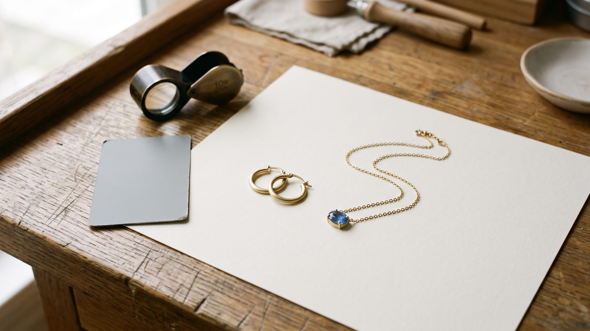
Cover image: AI-generated conceptual illustration of fictional jewelry. It is not a photograph of actual inventory and does not verify any real item’s color, finish, or scale.
AI jewelry product photos can make a small pendant feel desirable, but they can also make it look larger, smoother, or more intensely colored than the piece in your stockroom. The difficult decision is whether the image still gives a shopper reliable information about that particular item.
A gemstone close-up, a styled campaign image, and an earring shown on a person answer different questions. They should not all receive the same approval simply because the lighting looks convincing.
This guide uses three checks: gemstone appearance, metal finish, and on-model scale. Each leads to a practical outcome: accept the image, repair the edit, or return to a real photograph. For the broader capture-to-edit process, start with our AI product photography guide. Here, the focus is the evidence a jewelry buyer needs before choosing a piece.
Decide what your AI jewelry product photos must prove
Before choosing an editing method, write the shopper's question beside the planned image. “What color is this stone?” needs different evidence from “Would this pendant work with an evening outfit?”
Use these assignments as a starting point:
- Stone color and visible condition: use a clear photograph of the actual item, with a record of the viewing conditions.
- Metal texture, setting, and construction: use a real detail image, or an edit that retains those details and can be checked against the source.
- Styling and atmosphere: consider a new background around photographed jewelry, provided the composite does not change how its color or finish reads.
- Size and placement when worn: use measured dimensions alongside a verified worn reference. Review any generated person or placement separately.
- A missing back, clasp, or side view: photograph that view rather than asking generation to supply evidence you do not have.
A composite places photographed jewelry into another image. It can reduce how much of the item must be reconstructed, but it still needs review. Edges, contact shadows, reflected surroundings, and apparent size can all become misleading even when much of the jewelry remains unchanged.
The goal is a complementary image set. Let real detail photographs establish what the item is, then use additional scenes to help shoppers imagine wearing it. One attractive image does not have to perform every job.
Gate 1: Does the gemstone still represent the actual stone?
Start with a comparison you can repeat. Keep the original photograph, note the light used, and compare the candidate with the item under similar viewing conditions. Otherwise, you may mistake a change in illumination for an editing improvement.
GIA's gem photography guidance recommends avoiding mixed light sources and explains how diffusion, direct light, and camera position change the appearance of gems. That matters when evaluating an edit: a dramatic highlight and a faithful record of body color are different objectives.
Compare appearance without inventing quality
Review the stone at a similar size in both images. Ask whether the edit has changed its hue, apparent transparency, visible color variation, or recognizable internal features. Has a pale stone become richly saturated? Has a visible inclusion disappeared? Has a restrained highlight become an opaque white patch that hides the setting?
These are review questions, not instructions to diagnose or grade a gemstone from a picture. GIA's explanation of colored-stone analysis describes controlled color comparisons and specialized testing for identification and treatment analysis. A generated image cannot replace that evidence.
Avoid asking an editor to make a stone look “higher grade” or “flawless” when you are illustrating real stock. Those requests can replace the item's actual characteristics with an imagined improvement. Describe the scene you want, then judge the stone against the reference you have.
Give unusual appearances their own real references
If a stone genuinely changes appearance between lighting conditions, photograph those appearances and describe the conditions. Do not generate a second color state because the listing says the material can exhibit one.
For a one-of-a-kind piece, keep the exact item's images associated with its listing. A beautiful photograph of another stone from the same material category does not document this stone's particular appearance.
Decision: accept only when the image remains a fair representation for its intended use. Repair a background or color cast when you can verify the correction. Return to the real photograph if the edit changes or conceals characteristics you cannot reliably restore.
Gate 2: Did the edit preserve the metal finish?
The question is not simply whether yellow gold still looks yellow. A satin hoop, a polished hoop, and a hammered hoop can share a broad color while communicating very different surfaces.
Write down the finish before editing. Use the item's actual description, such as polished, brushed, satin, hammered, or intentionally oxidized. Then compare the candidate with the physical piece and its detail photograph.
Check these features separately:
- Surface texture: does brushing retain its direction, and does hammering retain its uneven pattern?
- Highlight character: has a soft finish acquired a mirrorlike band of light that makes it read as polished?
- Edges and relief: are engraved grooves, raised borders, and setting edges still distinct?
- Color relationships: do different metals or plated areas remain distinguishable where they are in the source?
- Actual condition: have wear, patina, or handmade irregularities belonging to this item been removed?
Cleaning dust from a background and erasing wear from a vintage ring are different decisions. For a used or one-off item, visible condition is part of what the shopper is evaluating. Do not smooth it away merely because the image looks more luxurious afterward.
A changed background also deserves attention. A warm scene can make a neutral metal appear warmer; a dark setting can make bright reflections more prominent. Retaining original product pixels is useful, but it does not eliminate the need to judge the finished composition.
Our reflective-product photography guide covers lighting and reflection control. Use those techniques when the problem is how the surface is shown. If the surface itself has changed in the image, improving the scene alone will not fix it.
Decision: repair when the problem is a separable background, crop, or distracting reflection. Reject a candidate that turns one finish into another. If you cannot tell whether a mark is dirt, damage, or intentional texture, inspect the item before editing it away.
Gate 3: Is the on-model image credible about size and placement?
On-model jewelry images carry an additional responsibility: they imply how the piece occupies space on a body. An earring can keep its outline while becoming too large relative to an ear. A pendant can retain its stone arrangement while sitting on an invented chain length.
The need for explicit scale handling is also recognized in research. The September 2026 JewelTry preprint treats jewelry appearance, dimensions, and placement as distinct challenges. It is a research proposal, not evidence that a general image generator measures jewelry correctly.
Record the relevant dimensions before reviewing a worn image:
- Earrings: outer width or diameter, total drop, and attachment position.
- Pendants: pendant width and height, plus the chain length used in the reference.
- Rings: face dimensions, band width, and the actual ring size being photographed.
- Bracelets: width and the relevant length or internal dimensions for that design.
Use the same units throughout your review. Written measurements do not calibrate a generated image, but they give you facts against which to check your decisions.
Inspect how the jewelry meets the body
Look beyond the size of the central object. Does an earring connect at a plausible point? Does the chain pass behind the neck rather than merging into it? Are the visible and hidden sections consistent? Does a ring sit around the finger, or appear embedded in the skin?
A real worn reference helps establish these relationships. Shopify's jewelry photography guide recommends complementary views, including necklace drape, individual earring details, and ring profiles. Those views provide different information; a single dramatic portrait cannot substitute for all of them.
Do not treat an unfamiliar generated hand or ear as a standard ruler. People vary, and perspective changes apparent proportions. For the underlying measurement problem, see our product image scale guide.
Decision: accept an on-model image only for the claims you can support. If scale or placement remains uncertain, it should not serve as size or fit evidence. Use a verified real worn shot and clear dimensions instead. A disclaimer does not repair a visibly incorrect product representation.
Three worked accept, repair, or reshoot decisions
The examples below are hypothetical review exercises, not results from an Oxava test or a claim about a particular model's failure rate.
A brushed hoop becomes mirror polished
The source shows a softly textured hoop. The candidate retains its shape but gives the entire surface a sharp, mirrorlike shine.
Decision: repair the method, then review again. Keep the photographed finish and change less of the product area. If you cannot separate the scene edit from the altered surface, use the original image. Asking for “less shine” may help exploration, but the next candidate still needs comparison with the real hoop.
A sapphire becomes bluer and loses a visible feature
The candidate looks striking, but its color is more saturated and a recognizable inclusion is missing. Neither change is supported by the original reference.
Decision: use the real close-up. That image's job is to show this stone. You can still explore a styled background for a separate image, but do not let the attractive candidate replace the factual detail view. If the source itself is unreliable, reshoot under recorded conditions rather than treating generation as recovery of unknown detail.
A pendant stays intact and passes the worn-reference check
The source supplies a clear pendant image, measurements, and a real worn reference. A candidate changes the surrounding styling while its pendant dimensions, visible chain path, attachment, and placement remain consistent with the reference on inspection.
Decision: accept for the planned styling placement. Keep the verified dimensions and real detail images in the product set. Approval of this candidate does not establish that every other body, crop, or chain length will remain accurate. Review the next variation on its own.
Once you have chosen the image's role, you can explore a restrained scene in the Oxava studio. Start with a clear reference and one specific change, then apply all three checks before selecting the result.
Keep a short decision record for each selected image
You do not need an elaborate scoring system. A few facts make it easier to understand why an image was approved and what to revisit after a revision.
- Item: the exact SKU or unique piece shown.
- Purpose: color detail, finish detail, styling, or worn context.
- Reference: the original photographs and relevant viewing conditions.
- Measurements: the dimensions relevant to this view.
- Checks: gemstone appearance, finish integrity, and worn scale or placement where applicable.
- Outcome: accept, repair a specific element, or reshoot/use the original.
Keep a failure specific: “pendant enlarged relative to worn reference” is more useful than “looks wrong.” Recheck the product after any repair. An edit intended to fix a background can introduce a new problem elsewhere.
Frequently Asked Questions
Can AI make gemstone colors completely accurate?
A convincing color is not a certificate of accuracy. Compare the image with the actual item and dependable references under recorded conditions. Keep real photographs for color-critical details, and do not use generated imagery as gemstone grading evidence.
Can I change gold to silver to show another variant?
Treat the other variant as a separate product that needs verification. A recolor does not establish its real finish, surface behavior, or construction. Use a reference of the actual variant rather than approving it because the edited color looks plausible.
Does putting a measurement in the prompt fix on-model scale?
No. A measurement communicates intent, but it does not prove the output is calibrated. Compare with a verified worn reference and retain actual dimensions in the listing; use a real worn photograph when size cannot be established confidently.
Should every jewelry image be a real photograph?
Different images can have different roles. A carefully reviewed scene or composite can provide styling context, while real photographs document color, finish, construction, and condition. Choose the method according to what the image needs to show and what you can verify.
Make the buying decision clearer
Useful AI jewelry product photos help shoppers understand a real piece. Keep gemstone appearance anchored to evidence, preserve the metal's actual finish, and review worn scale separately from visual appeal.
Bring a clear reference to the Oxava studio, explore one scene, and compare the result with the item before publishing. Accept the image when it does its assigned job; repair or reshoot when it asks the shopper to believe something you cannot support.
Oxava Team
Egemen Küpçü is the founder of Oxava, with 10+ years of hands-on experience in 3D and visual production. He writes about the craft of generating product, brand and campaign visuals with AI.
Related Articles
ALL POSTS
Subscribe to our newsletter
Be the first to hear about new techniques, model updates and ideas on AI generation.