
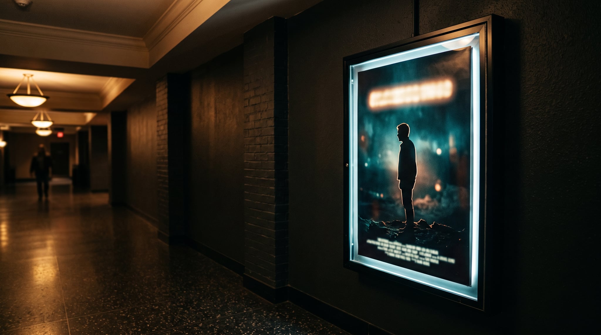
Your feed is full of people starring in films that don't exist. A friend headlining a moody indie drama. A coworker on a horror one-sheet with a tagline that's frankly too good. That's the AI movie poster trend, climbing since August 2026 across TikTok, Facebook, and X.
The recipe is simple: feed your photo into an AI movie poster generator, name a genre, and get back a fake theatrical poster with a dramatic title, a tagline, a fictional release date, and that tiny strip of credits at the bottom. TechRepublic groups it with the wave of AI photo-editing trends built on the same ingredients — cinematic shadows, film grain, elegant title typography, moody color grade.
But most of these posters read as AI from across the room. Below: the anatomy of a real one-sheet, six copy-paste genre formulas, and a workflow that keeps your actual face.
What is an AI movie poster generator?
It's a photo-to-poster remix. Upload one clear picture of yourself, prompt a model to rebuild it as a one-sheet for a movie nobody made. The genres that keep going viral:
- Rom-com — warm grade, subject mid-laugh, playful hand-lettered title
- Horror — deep shadows, negative space, small distressed serif title
- Anime epic — cel-shaded key visual, windswept coat, metallic lettering
- Arthouse indie — muted grade, heavy grain, tiny off-center sans-serif title
- Bollywood action — amber-and-teal contrast, embossed gold title, stacked cast names
- 90s action-thriller — chrome-beveled title, orange-and-blue explosions, airbrushed feel
Most people run these through ChatGPT's image model or Gemini's Nano Banana family, copying prompts out of comment sections — which is why so many results share the same three flaws.
Why real posters look real (and most AI ones don't)
A theatrical one-sheet is a designed object with rules. Break them and the eye catches it before the brain does.
The format. A real one-sheet is 27 × 40 inches — a 2:3 ratio. Most people generate at 9:16 because they're posting to Stories, and that one choice makes the result feel like a phone wallpaper instead of something that hung in a lobby.
The title treatment. Real titles are one typographic idea: one font, one effect, one position. AI posters stack three fonts, two glows, and a bevel.
The billing block. That dense credits strip is the biggest tell. As Chargefield's breakdown of billing block anatomy explains, it follows a fixed order — presentation, distribution, production company, cast, crew, writers, director — in an extremely condensed font, traditionally around 15% of the title's size. Models render it as alphabet soup.
The tagline. Real ones run 5 to 10 words and imply a story. Leave it out and you get "A JOURNEY OF DISCOVERY AND FRIENDSHIP AND HOPE."
So: wrong ratio, gibberish credits, drifting face. All three are fixable.
Genre prompt formulas (copy these)
Each AI movie poster prompt here pairs with a reference photo, never text alone. Swap in your own title and tagline, and keep the face-preservation line — it's load-bearing.
Rom-com:
Theatrical movie poster, 2:3 one-sheet, golden-hour rooftop, subject mid-laugh, soft pastel grade, playful hand-lettered title "LAST TRAIN TO ANYWHERE" across the lower third, tagline "Love has terrible timing" above it, small condensed billing block and fictional release date at the bottom. Keep the exact face and features from the reference photo unchanged.
Horror:
Theatrical horror one-sheet, 2:3 vertical, single figure in a lit doorway at the end of a dark hallway, cold desaturated grade, heavy negative space, distressed serif title "THE QUIET HOUR" set small near the top, tagline "Some doors listen back", tiny condensed billing block at the bottom edge, 35mm grain. Keep the exact face from the reference photo unchanged.
Anime epic:
Anime theatrical key visual, 2:3 poster, cel-shaded character in a windswept coat on a cliff above a glowing city, dramatic sky, strong rim light, bold vertical title "SKYFALL ENGINE" in metallic gradient lettering, tagline "The last signal is human", small credits block along the bottom. Keep the exact facial structure from the reference photo, stylized as anime.
Arthouse indie:
Minimalist indie film poster, 2:3 one-sheet, one small figure in a wide empty frame, washed-out muted grade, heavy grain, generous negative space, thin modern sans-serif title "WE WERE HERE IN AUGUST" small and off-center, one short critic-style pull quote above it, condensed billing block at the bottom.
Bollywood action:
Bollywood action poster, 2:3 vertical, hero mid-stride against a dusty skyline, high-contrast amber and teal grade, dramatic god rays, embossed metallic title "IRON MONSOON" in beveled gold lettering, tagline "The city owes him one night", stacked names in caps above the title, condensed billing block below. Keep the exact face from the reference photo unchanged.
90s action-thriller:
1990s action thriller one-sheet, 2:3, low-angle hero portrait with helicopter silhouettes and fire behind, orange-and-blue grade, airbrushed illustration feel, huge chrome-beveled title "ZERO CONTACT" filling the lower third, tagline "One call. No backup.", condensed caps stacked above the title, billing block at the very bottom.
Building your own instead of borrowing? Our guide on how to write image prompts covers the structure underneath all six, and the style prompt library has the vocabulary for grades and rendering styles.
Do it in Oxava: step-by-step
To make an AI movie poster of yourself without losing your face, open the Oxava studio and work in this order.
- Upload your photo. Hit Add reference (JPG or PNG). Use a sharp, well-lit shot with one clearly visible face — blurry group photos are where face drift starts.
- Pick a model that takes references. GPT Image 2, Ideogram V4, Seedream 5 Pro, Nano Banana 2, and Nano Banana Pro all accept one. Skip the reference-free models (Ideogram V4 Fast/Instant, Nano Banana 2 Lite, Recraft V4.1 Pro, FLUX schnell) — without your photo you get a stranger's poster.
- Set Ratio to 2:3. The setting most people get wrong. Render at 2:3, then make a 9:16 Story version after — our aspect ratio guide explains why format drives composition.
- Paste a formula and edit the title, tagline, and date. Leave the face-preservation sentence intact.
- Tune Edit strength — how much of the reference changes. Low protects your face; higher suits heavy stylization like the anime formula. In Ideogram V4 the same slider is Reference fidelity: left faithful, right free.
- Turn on AI Enhance (+1 credit) if your prompt is short and you want the model to fill in the scene.
Model picking: GPT Image 2 is first choice when legible type is the whole point — a medium-quality render costs 8 credits. Ideogram V4 is the typography specialist and the cheapest way to iterate at 2 credits on Balanced. Seedream 5 Pro handles photoreal skin plus dense layouts; Nano Banana Pro is the flagship for premium type at 15 credits. Nano Banana 2 holds likeness best but is weaker at text.
The two-stage trick: generate the scene with Nano Banana 2 so the face stays yours, then feed that output into GPT Image 2 as a reference and prompt only the typography. Likeness from one model, clean lettering from the other — same logic as our Seedream 5 Pro poster and text walkthrough.
Common mistakes and quick fixes
Gibberish billing block. Shrink it ("a thin condensed credits strip along the bottom edge") or ask for it slightly blurred on purpose — at normal viewing distance a soft block reads correct, garbled sharp letters don't. Otherwise switch to a text-strong model.
Your face changed. Lower Edit strength, re-add the "keep the exact face" line, start from a sharper single-face photo. The character consistency guide goes deeper.
It looks like a wallpaper. You rendered at 9:16. Re-run at 2:3.
Too much happening. Cut one element. Real posters are one subject, one light source, one typographic idea.
Copyright — don't skip this. No real studio logos, no real film titles, no real actors' names, and don't attribute a fake pull quote to a real publication. Your photo, an invented title, an unattributed quote. A poster for a film that doesn't exist is a joke; one borrowing a real brand is a problem.
Frequently Asked Questions
What size should an AI movie poster be?
A theatrical one-sheet is 27 × 40 inches, a 2:3 ratio — use that in the studio. For Stories or Reels, render 2:3 first and make a 9:16 version after, so the composition survives the crop.
Can I use a real actor's name or studio logo?
No. Real names, logos, and film titles carry trademark and likeness risk, and platforms act on them quickly. Use your own name in the cast line and a fictional title.
Which model renders poster text best?
GPT Image 2 and Ideogram V4 are the strongest starting points for legible titles and taglines, with Nano Banana Pro for premium multi-element typography. If likeness matters more than lettering, start with Nano Banana 2 and add the type in a second pass.
This trend will burn out like the flash filter did — poster literacy won't. Once you know what a real one-sheet is made of, any AI movie poster generator will follow your lead instead of guessing.
Open the Oxava studio, upload one photo, set the ratio to 2:3, and paste a formula. Your fictional film premieres in about a minute.
Egemen Küpçü
Egemen Küpçü is the founder of Oxava, with 10+ years of hands-on experience in 3D and visual production. He writes about the craft of generating product, brand and campaign visuals with AI.
Related Articles
ALL POSTS


Subscribe to our newsletter
Be the first to hear about new techniques, model updates and ideas on AI generation.