
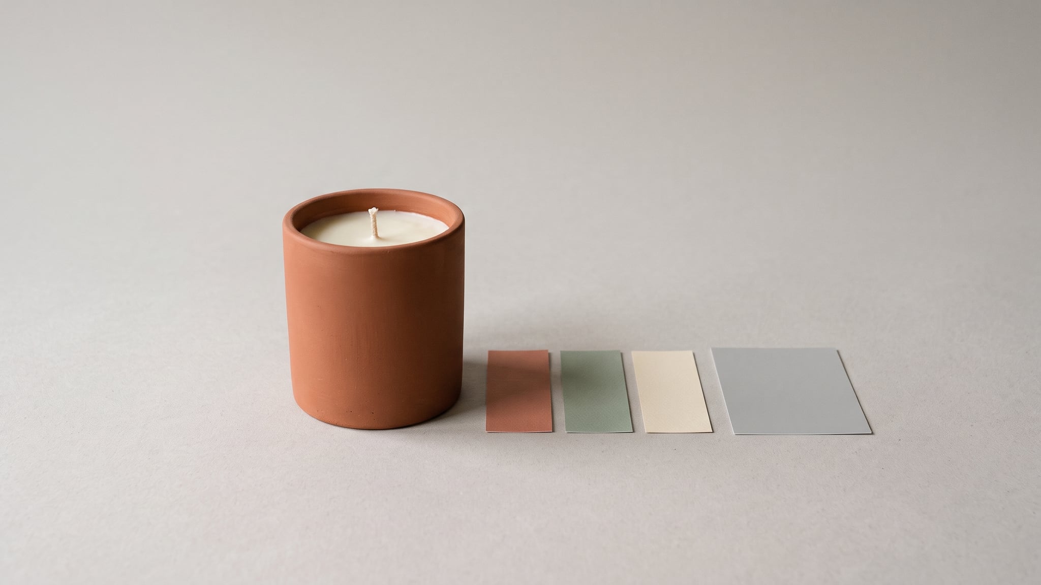
Your candle jar looks terracotta in the approved image, then pale pink on the store. Before increasing saturation or generating another picture, find out why the product photo colors look washed out after upload. The source, export, delivered file, and viewing screen are separate checkpoints. A correction made at the wrong checkpoint can turn an accurate product image into an inaccurate one.
This guide offers a troubleshooting sequence for photographed, rendered, and AI-assisted product visuals. It is not a claim that every color change has one cause, or that every customer's screen can look identical. The candle, coffee tin, and speaker examples below are hypothetical, not results of an Oxava or storefront experiment.
Cover: a conceptual AI illustration of a fictional matte terracotta candle jar and color cards. It is not a real calibration exercise, color measurement, or test result.
Start With the Approved Product, Not a More Vivid Picture
First establish what you are trying to preserve. Keep the approved product reference and the working image together. Record the SKU, color variant, source filename, and approval version. For a glazed jar, include the surface finish as well as the color: making a matte product look glossy is not a successful color correction.
Ask the reviewer to name the discrepancy. “Looks worse” is difficult to diagnose. “The red lid becomes orange only on the collection card” points to a specific comparison. “The whole image is lighter on one phone” points somewhere else.
Separate two questions:
- Product accuracy: Did the image depict the correct item before export?
- Delivery consistency: Did that approved depiction change on its way to the viewer?
An export fix cannot make an AI-invented shade accurate. If the original image already shows the wrong jar, return to product review. Our AI product photography guide provides the broader creation context; this article begins at the finishing and delivery stage.
You can explore a scene in the Oxava studio, then review the downloaded result against the real product. The color-profile diagnosis described here belongs in a suitable external editor and the destination storefront tools; it is not an automatic color-certification feature of Oxava.
Find the First Checkpoint That Changes
Use one product image and one destination first. Do not troubleshoot an entire catalog by changing several export settings at once. Our suggested sequence is a small diagnostic exercise, not a validated performance test.
1. Compare the master with the export in the same editor
Open the approved master and the actual upload file in a color-managed editor. Compare the same crop and relevant details, using a consistent viewing size. Do not compare a tiny thumbnail with a zoomed-in master and immediately conclude that the color data changed.
If the difference is already present here, stop before uploading. Review the export's profile, adjustments, and source version. Confirm that you exported the intended file rather than an older intermediate.
2. Compare the upload file with the delivered file
After upload, identify the image actually used by the problematic storefront view. Open or retrieve that image rather than relying only on the admin preview. If necessary, ask the theme owner to identify the requested image URL. Record the URL and check time alongside the local export.
Then compare those two files in the same editor. This is more informative than comparing two photographs of different screens. A difference found here narrows the investigation to the handoff, while a matching pair suggests checking the page or viewing environment next.
3. Compare the image alone with its page presentation
Check the product gallery and collection card separately. Confirm that both show the correct SKU and intended image version. If the standalone image looks acceptable but one placement does not, ask the site owner to inspect that placement's image selection and visual styling before editing the product file.
If a color variant is simply displaying the wrong asset, follow our wrong-variant image checklist. A new color export will not repair an incorrect image assignment.
4. Check another viewing environment
Use a second available device or browser as a diagnostic comparison, not as a vote on which version is “true.” Write down where the difference appears. A file that shifts on one screen requires a different investigation from an export that shifts everywhere you inspect it.
Stop rule: Until you can name the first failing comparison, do not batch-replace approved product images or compensate by increasing saturation across the catalog.
Convert a Profile; Do Not Just Relabel It
A color profile describes how image values should be interpreted. The name of the file format does not tell you the whole color workflow. Before changing anything, inspect the actual document profile in your editor and record what it reports, including an untagged or unknown state.
Adobe distinguishes assigning a profile from converting to one. Assignment leaves color values unchanged but changes their interpretation; the appearance can change substantially. Conversion prepares colors for a different profile. These are not interchangeable “make it web-ready” buttons.
For a correctly tagged master, create a separate web copy. Do not select a different profile simply because its preview looks more attractive. If the source profile is missing, look for the original export settings or ask the photographer or designer. Guessing from the file extension or choosing whichever profile looks vivid is not reliable evidence.
In Photoshop, Adobe's current online-viewing guidance gives this conversion path:
- Work on a copy and open Edit > Convert to Profile.
- Select sRGB IEC61966-2.1 as the destination.
- Review the conversion options; Adobe's walkthrough uses its ACE engine, Relative Colorimetric intent, and Black Point Compensation.
- Preview, apply, and save a web-appropriate export such as JPEG or PNG.
Reopen the resulting file and compare it with the approved reference. Treat conversion as an output step, not permission to overwrite a reusable master or skip product review. If the result still materially misrepresents the item, hold it for review rather than labeling the problem solved because a checkbox was enabled.
On a Mac, Apple's ColorSync Utility instructions offer another documented route: open a duplicate, choose Match to Profile, select the target profile and intent, then apply. Apple explains that Match to Profile changes pixel data; Assign Profile does not. Apply saves the changes, so duplicate the file first. This is a Mac utility workflow, not an instruction for an iPhone app.
Understand What Shopify Documents—and Verify Your Own File
Shopify's image guidance says that color profiles are removed when images are displayed on the online store, and that browsers assume sRGB for uploads without a profile. It also describes automatic storefront optimization and advises uploading high-quality images without manual precompression.
Do not translate that into “strip everything from every image.” Prepare the color values for the destination deliberately, retain the master, and examine the actual delivered result. Removing a profile is not the same operation as converting a correctly tagged source to sRGB.
Keep this distinction in the handoff record:
- Color-profile check: What profile does the editor report for this exact file?
- Appearance check: Does the file preserve the approved depiction in the controlled comparison?
- Other metadata check: What source information must survive this particular publishing workflow?
Passing one check does not establish the others. Our image export and metadata guide covers the broader format, size, and source-information handoff. Do not treat a platform's statement about ICC profiles as evidence about every other metadata field.
Do Not “Correct” the Product to Match One Screen
Adobe's monitor-calibration guidance warns that an inaccurate display profile can lead to unnecessary image corrections. Its recommendations include stable viewing conditions and hardware-assisted calibration for color-critical work.
For this troubleshooting exercise, keep a written note of the display and viewing conditions used for approval. Avoid changing the image while moving between a bright window, a dim room, and several unrecorded display modes. If one device is the outlier, investigate it before altering the file for every customer.
This does not mean dismissing customer complaints as “their screen.” Ask which product, variant, page, and device they used. Inspect the relevant asset and its source. A screenshot can help locate the affected page or show the reported symptom, but keep the actual files for the color investigation.
Do not promise exact cross-device color matching. The practical objective is an accountable, controlled handoff that avoids introducing an unsupported product change.
Three Hypothetical Decisions
The following are illustrative decision records. No files, devices, or storefronts were tested to produce these examples.
A terracotta candle jar looks pink only after export
The approved master and export differ in the same editor. The operator finds that the export was produced from the wrong intermediate file.
Decision: Export again from the approved version, keeping the original intact. Compare the result before upload. Do not use a saturation adjustment to disguise a version-control mistake. The release remains on hold until the intended source and output agree sufficiently for product approval.
A coffee tin looks acceptable alone but wrong on one card
The local export and retrieved storefront image appear consistent in the controlled comparison. The collection card still looks different from the gallery.
Decision: Ask the storefront owner to inspect that card's chosen asset and presentation. Keep the approved file unchanged while investigating. Record whether the final fix concerns image selection or page styling; do not record “profile fixed” without evidence.
A blue speaker differs on one phone
The master, export, and delivered file pass the team's comparison, but one phone displays the scene differently.
Decision: Document the phone and viewing settings, then investigate that environment. Do not automatically recolor the speaker for the entire store. If the product shade remains commercially ambiguous after review, request better reference material or specialist color evaluation before replacing the listing image.
A Reusable Color Handoff Record
Use this compact record for the first affected SKU. Expand it to representative products only after the cause and correction are understood.
- Identity: SKU, variant, view, approved reference, and master version.
- Source state: observed profile, editor, and unresolved source questions.
- Output: export filename, intended destination, conversion performed, and settings.
- Comparison A: master versus export; observed difference or accepted result.
- Comparison B: export versus delivered file; exact URL and check time.
- Presentation: gallery and collection placement checked separately.
- Viewing context: device/browser and relevant display conditions.
- Product review: color and finish accepted, or a named discrepancy to resolve.
- Release: owner, date, approved version, and ready or hold status.
For a batch, include products that challenge the workflow rather than choosing only an easy neutral item. A bright package, a muted ceramic finish, and a dark electronic housing can prompt different review questions. This is a suggested sampling strategy, not a claim that three products validate every SKU.
Keep the failed candidate and the diagnosis with the record. Otherwise, a teammate may later reuse the same export preset or intermediate file without knowing why it was rejected.
Frequently Asked Questions
Why do product photos look washed out after upload?
A profile mismatch is one possible cause, but it should not be assumed from appearance alone. Compare the approved master, export, and delivered file in a consistent environment. Then investigate the page and device where the difference appears.
Is assigning sRGB the same as converting to sRGB?
No. Adobe documents that assignment changes interpretation without changing the stored color values. Use a deliberate conversion for a correctly tagged source; investigate an unknown source profile rather than guessing.
Should I make the image more saturated before uploading?
Not as a first response. That may hide a delivery problem on one screen while misrepresenting the product elsewhere. Identify the failing checkpoint and keep any appearance edit subject to product approval.
Does an sRGB export guarantee the same color on every phone?
No. A suitable export is one part of a controlled workflow, not a guarantee about every viewing environment. Retain your reference, inspect the actual delivered asset, and investigate significant differences instead of promising perfect matching.
Preserve the Product Before Polishing the Presentation
The most useful question is not “Which setting makes it pop?” It is “Where did the approved depiction first change?” Answer that before regenerating a scene, replacing a batch, or editing the product color.
Start your next visual in the Oxava studio, review it against the real item, and keep the approved download. Then use a documented export and storefront check to carry that decision through to publication.
Oxava Team
Egemen Küpçü is the founder of Oxava, with 10+ years of hands-on experience in 3D and visual production. He writes about the craft of generating product, brand and campaign visuals with AI.
Related Articles
ALL POSTS


Subscribe to our newsletter
Be the first to hear about new techniques, model updates and ideas on AI generation.