
Velvet upholstery product photos can make one chair look like two color variants. A seat appears pale beside a dark backrest; a second camera position makes the same fabric look richer. Before correcting the color, establish whether the difference belongs to the material, the capture, or a later edit.
The useful goal is a documented appearance, not identical color across every upholstered surface. This guide separates those possibilities with controlled comparisons, a panel record and clear reasons to pause an edit.
The workflow is an editorial recommendation. We have not performed physical fabric experiments or paid model tests for this article. All three failure examples are hypothetical, and the checks do not certify fabric quality or determine whether a particular mark is a defect.
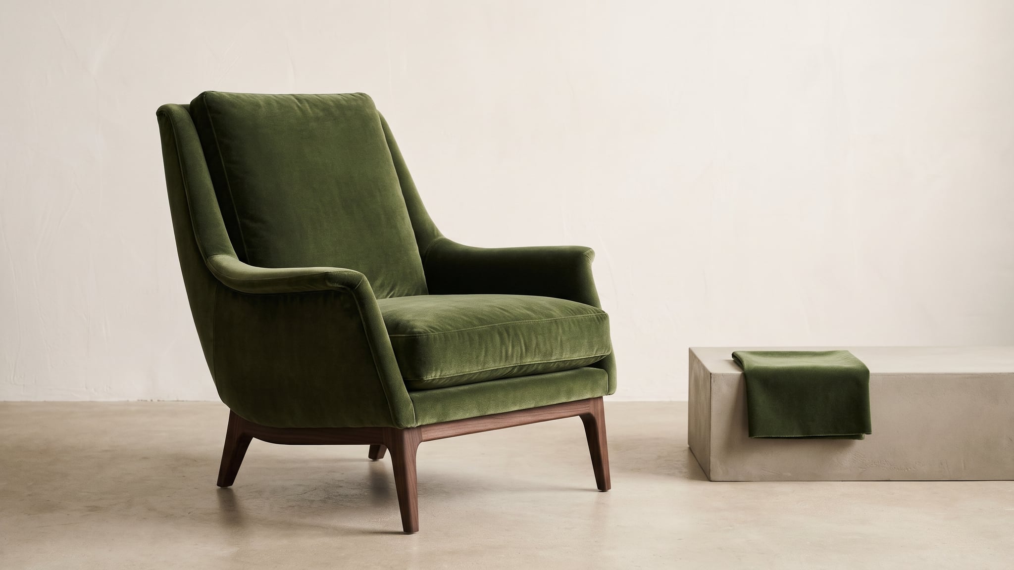
Conceptual AI illustration of a fictional velvet chair and fabric swatch. It does not document a real material, its color accuracy or a controlled comparison of pile direction.
Understand what a color difference might mean
Velvet has a raised pile; nap describes the direction in which it lies. Eternity Modern's velvet material guide describes how a different viewing direction can make its velvet appear lighter and more lustrous, or darker and more matte. That supports investigating orientation before changing a photograph. It does not establish the cause of every uneven patch.
Condition matters too. YOMA's velvet guidance explains that pile compression changes the angle at which light is reflected, producing lighter or darker areas. Record unexplained marks and consult the supplier; do not assume they are harmless or remove them digitally.
Keep lighting changes separate from viewing changes. Datacolor's explanation of metamerism describes illuminant metamerism as two samples matching under one light source but differing under another. It distinguishes this from one sample changing appearance under different lighting. A single swatch looking different when rotated under unchanged light does not, by itself, establish illuminant metamerism.
These distinctions narrow the investigation. A photograph alone cannot reliably identify the textile, its condition or the manufacturing explanation for a mismatch.
Establish the product and each panel before shooting
Collect the SKU, upholstery code, supplier reference and identity of the photographed item. Check whether the swatch actually represents that item. A similar green sample from another collection is useful for mood exploration, not approval.
Cylindo's material-data guidance requests material identification, orientation information and imagery showing material on a product. Its production requirements are specific to its service. For this workflow, the useful principle is to connect the sample with the finished furniture instead of treating a detached square as the whole product record.
Create a simple panel map:
- Identify each seat cushion separately.
- Label the inside and outside of both arms.
- Distinguish the front backrest from the rear upholstery.
- Record known pile direction from supplier information; mark anything uncertain.
Fischbacher 1819's upholstery guidance treats armrests separately from backs, seats and sides when specifying nap orientation. This is a reason to request panel-level information, not to impose one manufacturer's construction instructions on every chair.
The furniture image production guide helps choose photography, AI-assisted concepts or verified 3D for the requested output. Use real product evidence for this material review.
Make three comparisons without mixing the variables
Use the following sequence as a practical observation exercise. It is not a standardized material test. Save the untouched captures and notes so someone else can understand what changed.
1. Rotate a separate swatch under fixed light
Start with an approved loose sample that can be handled safely. Record its face and a reference edge without marking the visible fabric. Keep the light source, light position, camera position, exposure and white-balance settings unchanged.
Photograph the sample, then rotate it 180 degrees in its own plane, keeping the same face toward the camera. Do not turn it over. Return it to the same location and photograph it again. Rotate it back for a third capture to check whether the initial appearance returns.
Name the files by orientation rather than by color: “sample A, reference edge at top” and “sample A, reference edge at bottom.” Note if handling disturbed the surface or if light changed during the sequence. If either happened, the comparison is less informative.
This exercise asks what changes when sample orientation changes. It does not prove that the finished chair's panels share the same construction, condition or material. Never rotate or rearrange attached upholstery to imitate the swatch exercise.
2. Move the viewpoint around the unchanged furniture
Leave the furniture, cushions and lights where they are. Capture a front view and an oblique view, noting camera positions and keeping the capture settings consistent for the comparison.
Refer to the panel map in both frames. Write “left arm appears lighter in view B” rather than “green is wrong.” Check the same area at useful detail and listing size. A real difference deserves a record even if it becomes less obvious in a small thumbnail.
Do not reposition a lamp while moving the camera. That would make it harder to decide which change contributed to the result. If the setup cannot remain stable, describe the limitation instead of labeling the pair controlled.
3. Investigate a different light source separately
If a mismatch appears between the studio and another room, begin a new comparison. Keep the sample orientation and viewpoint fixed as far as practical, and record the source and arrangement of the illumination.
When comparing a supplier swatch with the upholstered product, place both in the same documented viewing conditions. A match under one source and mismatch under another needs a separate material/color investigation; do not explain it automatically as pile direction.
Avoid simultaneous changes to light source, viewing angle and automatic camera adjustments. Where those cannot be separated, ask the photographer or supplier for better references. This guide does not prescribe instrument readings, tolerance thresholds or a pass/fail textile test.
Velvet upholstery product photos: follow the decision tree
Start with the earliest trustworthy evidence, then move toward the published file.
- Is the exact material or product identity uncertain? Pause approval. Resolve the SKU, sample and panel relationship before editing.
- Does the physical item show the difference under the recorded conditions? Keep it in the reference set. Ask the supplier about unresolved condition or construction questions. Continue with orientation and viewpoint comparisons.
- Does the difference appear only in the capture? Review exposure, white balance, lighting and processing with the photographer before retouching individual panels.
- Does the original look supported, but the edited version changes a panel? Return to the source and inspect the edit history. Hold that output until the product appearance is restored and reviewed.
- Does the approved export change only after upload? Investigate delivery separately. Do not recolor the furniture to compensate for an unexplained storefront change.
For white balance, Adobe's Camera Raw guidance uses objects intended to be neutral and cautions that not every color cast comes from white balance. Include a suitable neutral reference in the capture workflow. A shiny patch on colored velvet is not a reliable substitute.
If blur, clipped highlights or deep shadows hide the pile in the original, return to capture before approving a material close-up. Adjust the setup and photograph the actual area again. Generated texture or stronger sharpening cannot establish details absent from the reference.
If the trail reaches export or delivery, use the washed-out product photo troubleshooting guide. Keep those file checks distinct from observations made on the physical upholstery.
Use symptoms to choose the next check
| Observation | Next comparison | Approval boundary |
|---|---|---|
| Swatch changes after rotation | Original, rotated and returned orientations | Do not infer finished-panel identity from the swatch alone |
| Arm and back differ in a real capture | Panel map, supplier information and alternate view | Do not flatten both to one tone by default |
| Neutral reference and upholstery both shift | Capture settings and processing history | Do not diagnose from the velvet highlight alone |
| Only the generated edit has a pale cushion | Untouched source beside edited version | Reject unsupported material changes |
| Export looks acceptable; listing differs | Exact export and delivered asset | Investigate the handoff before changing the master |
| A local patch remains unexplained | Actual item and supplier review | Hold the frame; do not label or conceal the condition |
Several causes can coexist. A documented directional effect does not excuse an unrelated export error or prove that a persistent mark is acceptable.
Preserve evidence while editing and presenting the views
Give the editor a specific brief: retain the approved panel appearance, visible texture and observed relationships in this frame. Avoid “make all the green match,” which leaves the desired correction undefined.
Review the complete chair first, then each named panel. Check whether seams remain in place and whether a lighter arm has become a flat painted area. Compare texture with the original at a useful scale. The fabric-detail photography guide offers a related reference-first approach, although garment construction is a separate subject.
You can explore room and background concepts in Oxava while keeping these material references separate. A generated result is a scene candidate, not evidence that a fabric has been identified or verified. A human reviewer must compare the product with real references; do not assume generation locks its pixels or preserves its sheen.
When two photographs genuinely document different appearances of the same item, consider showing both in the same SKU gallery. Label them by view, such as “front view” and “side view,” rather than inventing lighter and darker color variants. Use the same verified material name.
Choose a representative lead image, then include the alternate view where shoppers can find it. A short note can explain that the photographs show the same upholstery from different directions. It cannot excuse inaccurate imagery or replace investigation of an unexplained mismatch.
Three hypothetical failures and the decisions they require
A pale arm is repainted to match the back
Situation: A fictional green chair has an approved front photograph and a second oblique capture. The arm appears lighter than the back in one view. An editor selects both and applies one uniform tone for catalog consistency.
What fails: The result removes an appearance documented by the reference set. A smoother contact sheet has become the approval criterion.
Decision: Restore the supported frame and review it with the panel map. If both views are approved, retain them as alternate views of the same SKU. If the panel relationship remains unexplained, hold the images for supplier review.
Boundary: Neither the lighter arm nor its persistence across frames establishes a defect or harmless variation by itself.
A room change is mislabeled as a pile-direction problem
Situation: A fictional supplier swatch and sofa appear close in the studio, but look different under another room's lighting. The team also changes the camera angle and enables automatic white balance between photographs.
What fails: Several variables changed together. Calling the difference “normal velvet” skips the unresolved sample-to-product match.
Decision: Separate the viewpoint comparison from the light-source comparison. Confirm the sample identity and obtain photographs with recorded conditions. Escalate the remaining mismatch to the material supplier rather than trying to average the two colors in an editor.
Boundary: These observations do not establish metamerism. They identify a question needing better evidence, not a license to dismiss the discrepancy.
A generated room quietly changes one cushion
Situation: A fictional lounge-chair reference shows a textured cushion and a distinct seam. A generated lifestyle candidate looks persuasive, but the cushion becomes uniformly matte and its seam partly disappears. The surrounding room receives approval first.
What fails: The new background distracts from an unsupported change to the product. The candidate no longer agrees with the source used to approve that view.
Decision: Reject the candidate as a product photograph. Reuse the verified real capture in a suitably controlled editing workflow, or photograph a different scene. Recheck the entire chair after any replacement.
Boundary: An attractive result and a reference upload do not demonstrate fabric fidelity. The unchanged-looking backrest does not validate the altered seat.
Save a capture-to-approval record
Use one record per view, with links to the shared product information. This template is a proposed production aid, not an industry standard.
| Field | Record |
|---|---|
| Product | SKU, material code, item photographed and supplier |
| Sample | Swatch identity, relationship to product and unresolved uncertainty |
| Panels | Cushion, arm and back labels; confirmed or unknown directions |
| Capture | Source filenames, camera/view position, settings and lighting |
| Comparison | What changed, what stayed fixed and observed limitations |
| Condition | Unexplained marks and supplier response |
| Edit | Working version, changed areas and retained source |
| Delivery | Export filename, gallery position and destination URL |
| Approval | Reviewer, date, supported use and outstanding questions |
Write observations before conclusions. “Arm lighter in frame B; lamp unchanged; supplier review pending” is more useful than “velvet issue fixed.” Keep rejected candidates distinguishable from approved exports.
The SKU image quality-control guide covers assignment and review across a catalog. Here, the extra responsibility is keeping each approved view connected to its capture conditions and panel record.
Publish the documented appearance, then check delivery
Open the actual product page after upload. Confirm that both views belong to the correct SKU and that crops still show the areas described. Compare the delivered images with the approved exports before treating a discrepancy as a new material problem.
Do not use this photography workflow as fabric-care advice. Any cleaning, surface treatment or handling intended to change a mark should follow the product manufacturer's guidance. Photographing a questionable area is different from knowing how to treat it.
Reliable velvet upholstery product photos preserve supported differences and investigate unsupported ones. The broader AI product photography guide provides scene-creation context. Once the material record is ready, develop surrounding scene ideas in Oxava, keeping final product approval with the people and references that can support it.
Frequently Asked Questions
Why does velvet look like different colors in product photos?
Pile orientation, viewpoint and lighting can affect its appearance, while capture or editing errors can also change the image. Compare the actual item and recorded source files before deciding which explanation applies.
Should every upholstered panel match in brightness?
Do not force that result without product evidence. Review cushions, arms and backs separately against approved references, and ask the supplier about unexplained differences instead of assigning one tone to every panel.
Does rotating a swatch diagnose metamerism?
No. Rotating one swatch under unchanged light examines orientation-dependent appearance. Illuminant metamerism concerns two samples that match under one light source but not another; the proposed photo comparisons do not certify a diagnosis.
Can AI verify that a generated chair has accurate velvet?
A convincing image does not establish the fabric or its physical behavior. Use real references and human review, and reject generated changes that the source material cannot support.
Oxava Team
Egemen Küpçü is the founder of Oxava, with 10+ years of hands-on experience in 3D and visual production. He writes about the craft of generating product, brand and campaign visuals with AI.
Related Articles
ALL POSTS
Subscribe to our newsletter
Be the first to hear about new techniques, model updates and ideas on AI generation.