
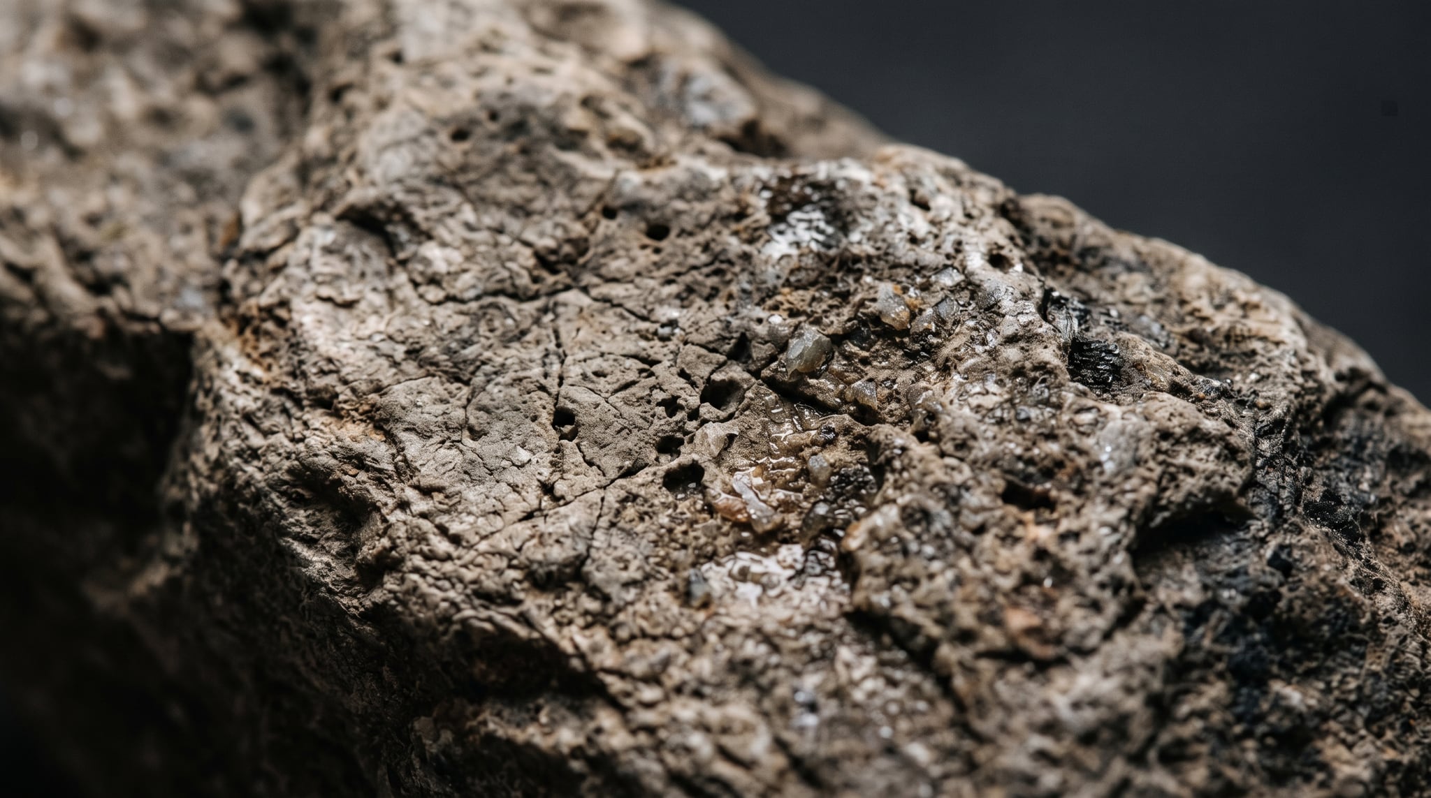
A flat photo of a brick wall stretched across a model isn't a material. It's a picture of a wall lit by a sun that isn't in your scene, and every light you add makes that more obvious. The reason to generate PBR textures with AI instead is that a real material isn't one image — it's a stack of them, each answering a different question the renderer asks about the surface: what color is it, which way does it face, how rough is it, is it metal, how deep are its grooves.
This guide is about surface, not shape. It doesn't cover generating the mesh — our image-to-3D walkthrough does that, and the game asset guide covers topology, LODs, and engine import. Here we stay on the skin: what a PBR set contains, why seamlessness is non-negotiable, where AI-generated maps genuinely fail, and the three import settings that silently ruin a good texture the moment it lands in Blender, Unity, or Unreal.
What a PBR Texture Set Actually Is (and Why Flat Color Photos Don't Cut It)
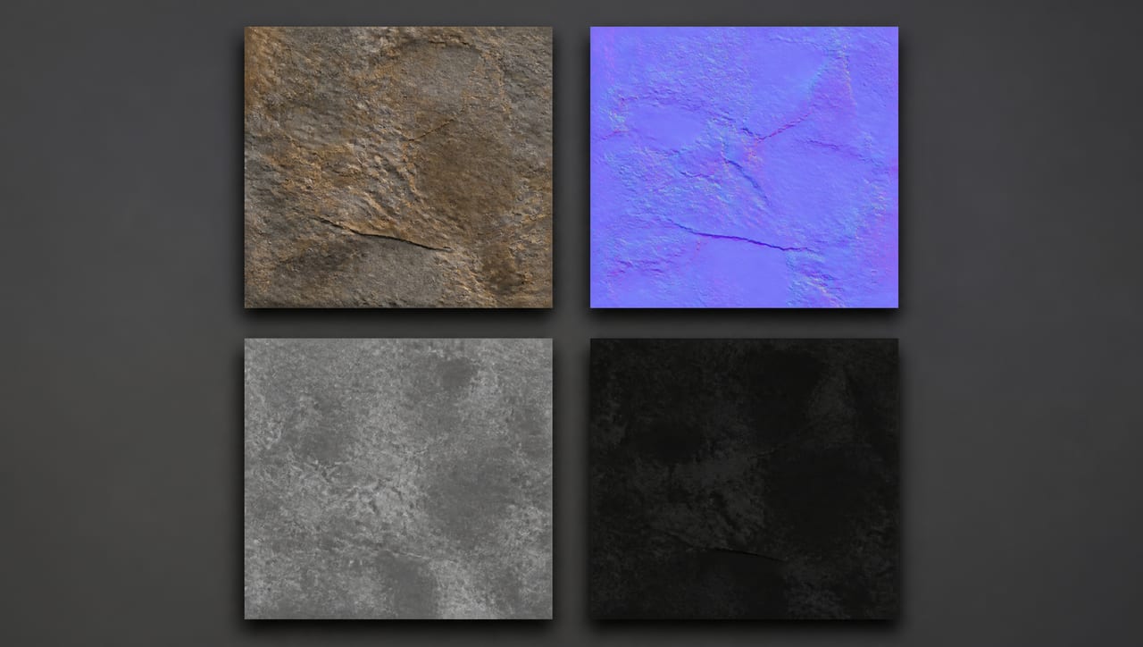
PBR — physically based rendering — describes a surface through separated properties instead of an artist painting the highlights in by hand. Because they're separated, the light can move and the surface reacts correctly. Six maps do the work.
Base color (albedo) is the pure color of the surface with zero lighting in it. No highlights, no shadows. It's the hardest map to get right from a photograph, because a photograph is color and light already mixed. When it's wrong: the engine stacks its own shadows onto the painted-in ones, the surface goes muddy, and the fake shadow never moves when the light does — the most recognizable tell of a texture ripped from a photo.
Normal encodes which way each pixel faces, stored as a lavender-blue image whose RGB values are really an XYZ direction. It fakes mortar grooves, fabric weave, and scratches on flat geometry. When it's missing: the surface goes glassy-flat under a moving light.
Roughness is how scattered the reflection is — 0 is a mirror, 1 is chalk. More than color, this is what makes a material read as a material: polished wear on the raised parts of a floor, dull grime in the recesses. When it's wrong: one flat uniform value across the surface, which is exactly what "AI texture" looks like at a glance. The eye reads uneven wear before it reads color.
Metallic is effectively a classification: metal or not. Real materials sit near 0 or near 1, with intermediate values reserved for transitions like a rust edge. When it's wrong: metals read as gray plastic toys, and non-metals go dark and reflective in a way nothing in the scene explains.
Height (displacement) is a grayscale depth map. Depending on the shader it either offsets sampling to fake parallax or actually moves geometry — real depth you can see at the silhouette, which is exactly where a normal map's illusion collapses.
Ambient occlusion (AO) darkens crevices ambient light can't reach: the contact shadow inside a mortar line or a fabric fold.
One honest note on that last one: AO is very often not generated at all. It's cheap to derive from height with a cavity calculation, which is what Oxava does — the model returns five maps, and AO is computed in your browser from the real height data with a free, adjustable strength slider. That's not a shortcut being hidden from you: AO derived from a true height map beats a hallucinated one that disagrees with the geometry it describes.
Why "Seamless" Isn't Optional for Game or 3D Surfaces
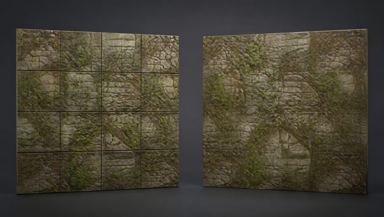
A hero object gets a unique texture: one unwrap, one image, painted for that object alone. A surface doesn't work that way. A forty-meter floor can't be one 2K image — at that size it would be a smeared blur — so the material repeats. UV coordinates run past 1.0, wrap around, and the same square gets drawn over and over.
That's tiling, and it only survives inspection if the texture is seamless: the right edge continues into the left, the top into the bottom, with no break in pattern, color, or brightness. Otherwise every repeat draws a line, and those lines form a grid across your floor that no lighting hides.
Two failure modes get lumped together here, and they have different fixes:
- Seams — hard lines at tile boundaries, caused by edges that don't match. Binary: either the texture is seamless or it isn't.
- Repetition — no seams, but the eye still catches the loop, usually anchored to one distinctive feature: a bright pebble or a long crack that reappears every four meters like wallpaper. Fixed by keeping unique high-contrast landmarks out of the source, or by breaking it up in-engine with decals and macro variation.
There's a subtler trap for anyone deriving their own maps: a seamless base color does not give you seamless derived maps. Generate a normal or AO map from it with a filter that clamps at the image border — which is what a standard blur or edge-detect does — and the filter invents a gradient at the edges. The color tiles perfectly while the relief shows a grid. Any derivation on a tiling texture has to wrap around the edges instead of stopping at them.
Check the seam before you build anything on it
Look at the texture repeated at least 4×4, never as a single square. A single square always looks fine; seams only exist at boundaries. Oxava has a flat tiling preview for exactly this — if you can see lines between the tiles, the texture isn't seamless and nothing downstream fixes it. Do this before you spend time tuning roughness or exporting.
How to Generate PBR Textures with AI (Photo or Prompt to a Full Set)
Three inputs cover the practical cases:
- Prompt — the surface doesn't exist yet, or isn't worth photographing.
- Photo — you need one specific real wall or fabric.
- Existing image — the artwork must stay exactly as it is, and you only need the physical channels generated for it.
That last one is the most useful in a real pipeline and the one people overlook — a brand pattern or a scanned material shouldn't be repainted, just described physically.
What a model infers from 2D input is a lot: shading gradients hint at depth, highlights hint at gloss, and it has seen enough wood to know what grain implies about roughness. What it fundamentally cannot know is just as specific. It saw one lighting setup from one angle. It can't measure reflectance, and it can't prove which dark pixels are shadow and which are pigment. Base color and metallic are estimates, not measurements — which sets up the next section.
Where AI-Generated Textures Actually Break (the Honest Limits)
None of this makes AI texturing not worth doing. Each defect has a symptom you can spot in under a minute and a fix faster than authoring the map by hand.
Baked-in shadows
The most common defect, and the one that survives into a shipped build because it looks fine in a still. A photo taken in directional light contains shadows, and shadow is not albedo. If it survives into base color, the engine's lighting stacks on top: contact areas go double-dark, and the shadows refuse to move when the light does.
Symptom test: orbit the light or the object in preview. Dark regions welded to the same pixels are painted in, not shaded.
Prevention at capture: shoot the source in flat, diffuse light — overcast, open shade, a large soft source, never raking sun. Shoot perpendicular to the surface so you aren't fighting a brightness gradient across the frame, and check that your own shadow isn't in the shot. If your only reference has hard lighting, flatten the shadows in an image editor first. It's the same discipline that governs good product capture, covered on the 2D side in our AI product photography guide: even light preserves information, hard light destroys it.
Metallic misprediction
Classifying metal from a single image is genuinely hard. Gray-painted steel, brushed aluminium, and gray plastic look nearly identical in one lighting condition — the difference lives in how they reflect the environment, which one photo barely records.
Symptom: metal that reads as a matte gray toy, or a non-metal that goes dark and mirror-like in the engine. Inspect the map too: one full of mid-grays is suspicious, since most materials should be near black or near white with thin transitions.
Fix: the cheapest correction in the set. Entirely non-metal? Override metallic with a constant 0 and delete the map. Entirely metal? Constant 1. Only genuinely mixed surfaces — rusted iron, chipped enamel — need the texture at all.
Tiling and resolution artifacts
Upscaling adds pixels, not information. A 4× upscale of a 2K map produces an 8K file whose fine detail was interpolated rather than observed. That's often what you want — an 8K map across a large floor still resolves better than a 2K one stretched the same distance — but don't expect it to reveal grain that was never captured. Real detail comes from the source: a sharp, straight-on photo, or a prompt describing detail at the right scale. Note too that a tighter tile means more repeats in the same area, so the loop shows sooner.
Map disagreement
The subtle one, and the reason a technically correct set still looks fake. Every feature in base color should have a counterpart elsewhere. A scratch visible in the color map that the normal map is flat across isn't a scratch — it's a photograph of a scratch printed on a smooth surface, and the eye catches it the moment a light sweeps past.
Symptom test: temporarily replace base color with flat mid-gray and look at the surface with only normal, roughness, and AO active. It should still read as the material. If it goes featureless, all your detail lives in the color map and the material has no substance.
Before you ship a texture, check
- Base color has no visible shadow or highlight gradient.
- A 4×4 tiling view shows no seams and no obvious repeating landmark.
- Metallic is near-binary and matches what the material actually is.
- Turning base color off still leaves a surface with structure.
- Roughness varies — wear where wear would be, not one flat value.
- Every map is the same resolution and aligned to the same pixel grid.
Using Your PBR Set Correctly in Blender, Unity, and Unreal
You can do all of the above right and still get a broken material, because three import conventions have nothing to do with the texture's quality.
Color space: the single most common mistake
Base color and emissive are sRGB. Everything else is not. Normal, roughness, metallic, AO, and height are data — numbers the shader does math on — and pushing them through a gamma curve built for human perception corrupts those numbers silently.
- Blender: set the Image Texture node's Color Space to Non-Color for every map except base color.
- Unity: uncheck sRGB (Color Texture) on data and mask maps; set normal maps to the Normal map texture type.
- Unreal: uncheck sRGB on the texture asset and let normal maps use normal-map compression.
The symptom is frustratingly vague: nothing looks broken, the surface is just subtly too bright, too flat, or too shiny everywhere, and you end up blaming your lighting. When a material is "almost right but plastic," check color space first.
DirectX vs OpenGL: the normal map green channel
Two conventions exist for what green means. OpenGL has +Y pointing up; DirectX has it pointing down. One inverted channel, and it splits the industry in half:
| Convention | Green channel | Typical hosts |
|---|---|---|
| OpenGL (+Y) | Y up | Blender, Maya, glTF, most web and three.js viewers |
| DirectX (−Y) | Y down | Unity, Unreal |
The symptom is unusually diagnostic, so learn it once: vertical detail looks inverted while horizontal detail looks correct. Bumps read as dents along one axis only, because only one channel is flipped. If everything looks inverted, that's a different problem.
The fix is one operation — invert the green channel in an image editor before import, or use the engine switch, such as Unreal's Flip Green Channel on the texture asset. Note the direction of travel: maps that preview correctly in a glTF or browser-based viewer and in Blender are OpenGL-convention, so plan on flipping green when that set goes to Unity or Unreal.
Channel packing (ORM) and why engines want it
Roughness, metallic, and AO are all grayscale. Shipping three RGB textures to store three grayscale values wastes two-thirds of each one. So engines pack them into the R, G, and B channels of a single texture: one file, one sampler, one fetch in the shader instead of three, and roughly a third of the VRAM. The layouts aren't the same, which is where people lose an afternoon:
| Target | R | G | B | A |
|---|---|---|---|---|
| Unreal (ORM) | Ambient occlusion | Roughness | Metallic | — |
| Unity mask map | Metallic | Ambient occlusion | Detail mask | Smoothness |
Two traps live in that table. First, Unity's alpha is smoothness — the inverse of roughness — so copying a roughness map straight in turns matte concrete into a mirror. Second, and this is the critical one: never import a packed map as sRGB. It holds three unrelated numbers, not a color; gamma-correcting it corrupts all three at once, and no slider will fix the result.
This is a real, everyday chore rather than an exotic edge case. Oxava's browser preview has to solve the same problem — the web renderer expects roughness and metallic in a single texture's G and B channels while the model returns them as separate images, so the preview packs an ORM texture in a background worker before it can show you anything. The downloaded ZIP keeps the maps separate, which is the right default given that every engine wants a different layout. Packing for your target is a one-minute job in any image editor, and it's yours to do.
Generating a Clean, Game-Ready PBR Set with Oxava
Texture generation lives in the Texture tab of the 3D studio at /app/3d — same page as mesh generation, separate tab. All three generation modes are available on every plan, Starter included.
| Mode | Input | What it does |
|---|---|---|
| From text | Prompt only | Turns a described surface into a seamless material plus its PBR maps |
| From photo | Image + prompt | Lifts a surface out of a photo and makes it tile in every direction |
| Maps only | Image only | Produces PBR maps for an image you already have — it does not change the texture |
Maps, resolution, and upscale
Five maps come from the model: base color, normal, roughness, metallic, and height. You pick how many to generate, from one to five, and price scales with the count — if you only need normal and roughness for an existing surface, don't pay for the rest. AO is derived in the browser from the real height map, with a strength slider, and recomputing it is free.
Base resolution is 1K (1024²) or 2K (2048²), always square, because a rectangular texture distorts when it tiles. On top of that, a seamless map upscale of 2× or 4× is available for From text and From photo — so 2K base plus 4× gives you 8K maps. Those aren't rendered in the browser; they go into the download. Maps only has no resolution picker at all: output matches the image you upload, so upload it at the size you want out. Reference images are JPG, PNG, or WEBP up to 8MB, with a reference fidelity control from 0.1 to 0.95 (default 0.6) deciding how much of the source survives.
Preview it as a real render
Four preview modes, all genuinely lit and shaded rather than a flat mockup: sphere, panel, cube, and flat tile. The sphere shows how the material behaves across a curve with a moving highlight, the panel is the closest thing to seeing it on a wall, and the flat tile is your seam check.
Height works as real displacement here, not a shading trick: the mesh is actually deformed, so depth shows at the silhouette. It runs on the sphere and panel only (displacing a cube would split its adjacent faces apart) and is off by default, since subdividing geometry live is heavy on modest hardware. Tiling frequency, bump, roughness, AO, and metallic sliders affect the preview instantly and never trigger a new generation, so tuning the look costs nothing.
Downloads, timing, and cost
The ZIP contains texture.png, every selected map as its own PNG (basecolor.png,
normal.png, roughness.png, metalness.png, height.png), the derived ao.png, and a
meta.json recording the prompt, mode, credit cost, map list, and material settings —
useful six months later when you need a matching surface. Maps download individually too.
A 2K material takes roughly five minutes. The panel waits up to 25 minutes; past that nothing is cancelled — the generation finishes on its own and appears in the My textures strip below, prompt preserved and reusable. Pricing is deterministic and shown up front:
| Mode | 1K, all 5 maps | 2K, all 5 maps | 2K, 5 maps, 4× upscale |
|---|---|---|---|
| From text | 8 credits | 29 credits | 61 credits |
| From photo | 17 credits | 38 credits | 70 credits |
| Maps only | 6 credits | 21 credits | not available |
Fewer maps costs meaningfully less — a single map from text at 1K is 4 credits — so iterating at 1K with two maps and committing to a full 2K set only once you like the look is the cheap way to work.
Writing a material prompt
Material prompts are not image prompts, and that distinction is the whole game. Describe the surface, not a scene: no camera, no time of day, no mood. Ask for "golden hour" and you'll get golden hour baked into base color — precisely the defect we spent a section avoiding. A formula that holds up:
[surface] + [material] + [condition/wear] + [scale cue] + [finish]
✅ "weathered oak floorboards, narrow planks, fine straight grain, small dark knots, light wear along the plank edges, matte satin finish"
❌ "beautiful wooden floor in a cozy room, warm evening light"
The second names a room and a light, so you get both — a floor with its own private sunset painted on. For vocabulary that separates finishes, materials, and surface conditions precisely, our AI style prompt guide is the reference, and the prompt-writing walkthrough covers the layered structure this formula is built on.
Frequently Asked Questions
Can AI generate seamless textures from one photo?
Yes — a photo-based material mode lifts the surface out of the image and makes it tile in every direction rather than copying the photo. Quality depends almost entirely on the input. A straight-on shot in flat, diffuse light with no brightness gradient and no unique landmark feature tiles cleanly; a raking-light photo shot at an angle gives you a texture with a built-in shadow and a repeating bright spot. Verify with a 4×4 tiling view.
What resolution do I need for game-ready PBR textures?
The number that matters isn't map size, it's texel density — how many pixels land on a real-world meter of surface. A 2K map tiling every half meter carries far more apparent detail than a 4K map stretched across ten meters. Practically: 1K suits background surfaces the camera never approaches, 2K is the common working default for surfaces players stand next to, and upscaled 4K–8K is for hero surfaces under close inspection. Every extra map multiplies memory cost, which is exactly why channel packing exists.
Do I need to manually fix AI-generated normal maps?
Usually not the map, but nearly always its conventions: set color space to Non-Color/linear, and flip the green channel when moving from an OpenGL-convention tool like Blender into Unity or Unreal. Beyond that, two edits are worth making — dialing normal strength down when relief looks exaggerated, and checking that detail in the normal map matches what base color shows. A scratch in one map but not the other is what makes a surface look printed rather than real.
PBR vs a simple diffuse texture — what's the real difference?
A diffuse texture is one image with lighting already inside it, so it looks correct in exactly one lighting condition: the one the photo was shot in. A PBR set separates color from geometry from reflectivity, so the renderer computes lighting itself. The highlight travels across a wet floor as you walk past, metal reflects the room it's in, worn edges catch light differently than recesses. If the camera and lights never move, a diffuse texture is honestly fine. If either moves, PBR is the difference between a material and a photograph of one.
Can I texture a 3D model I already generated?
That's the natural pairing, but treat it as two steps. Generate the mesh first — the image-to-3D guide covers that end to end — then produce the surface separately and apply it. Textures generated this way are tiling materials, so they suit surfaces (walls, floors, fabric, terrain, panels) rather than uniquely unwrapped hero objects like a character's face. Whatever you produce still has to survive an engine import; scale, pivots, collision, and LODs are all in the game asset guide.
The Bottom Line
The gap between a picture of a surface and an actual material is a short, learnable list: separate the channels, keep lighting out of base color, make it tile, keep the maps in agreement, and get color space and the green channel right on import. Once you can generate PBR textures with AI instead of authoring five maps by hand — a job that used to eat an afternoon — the slow part of that list disappears, and the judgment calls stay yours, which is the right split.
The fastest way to find the real limits is one round trip. Open the Texture tab in the studio at /app, generate a surface you'd genuinely use at 1K first, check it in the flat tiling preview, turn on displacement to see whether the height map holds up, then take the ZIP into your engine with the color spaces set correctly. The one map that surprises you will teach more than any checklist — and once the workflow is muscle memory, a full game-ready PBR set is about five minutes of work.
Egemen Küpçü
Egemen Küpçü is the founder of Oxava, with 10+ years of hands-on experience in 3D and visual production. He writes about the craft of generating product, brand and campaign visuals with AI.
Related Articles
ALL POSTS
Subscribe to our newsletter
Be the first to hear about new techniques, model updates and ideas on AI generation.