

The request always arrives with a deadline attached. A recruiter wants an updated profile before Thursday's interview. Your company relaunches its About page and needs eleven people to look like they were photographed on the same afternoon, in the same room, by the same person. A conference asks for a speaker photo at print resolution by tomorrow morning. And the most recent decent picture of you is a cropped wedding photo with somebody else's shoulder still in the frame.
Learning how to make a professional headshot with AI solves that in about ten minutes, from one selfie, with no studio and no photographer. What it does not do is solve it automatically. The distance between an AI headshot that passes for a studio portrait and one that quietly announces itself comes down to four decisions: which source photo you feed it, how you describe the light, how tightly you crop, and how much retouching you refuse.
This guide is the working version of that process — the source photo checklist, a five-part prompt formula, copy-paste templates for a white-background portrait and two alternatives, the crops each platform actually wants, and the tells that give a generated face away.
Why an AI Headshot — and When You Still Need a Photographer
The case for generating one is mostly about friction. A studio session costs real money and, more importantly, a calendar slot: you book, you travel, you shoot, you wait for the edit. If your interview is Thursday, that timeline is the whole problem. Generating gives you a usable portrait tonight, and — the underrated part — lets you produce five variations of it. Different background, different wardrobe weight, a warmer version for your personal site and a cooler one for the corporate directory.
It's also the only sane answer for distributed teams. Getting eleven people in four cities into one studio is a logistics project; giving eleven people one prompt block and one background specification is an email. Every portrait comes back with the same light direction, the same backdrop tone, the same crop — which is exactly the "photographed on the same afternoon" effect you were paying the studio for. That's a brand systems problem more than a portrait problem, and our AI brand visual consistency guide covers building the reusable style block that keeps a whole team's imagery matching.
Now the honest half. There are jobs a real photographer still wins outright.
| Situation | Reach for AI | Book a photographer |
|---|---|---|
| LinkedIn, CV, team page, speaker bio | Yes — this is the sweet spot | Optional |
| Deadline is days away | Yes | Rarely possible |
| Distributed team needing one consistent look | Yes | Expensive and slow |
| Actor, model, or performer headshot | No | Yes — the industry expects a real, verifiable shoot |
| Passport, visa, official ID | Never — generated images are not accepted | Yes |
| Press kit, editorial feature, journalism | Risky — authenticity may be contractual | Yes |
| Full-body, environmental, or personal-brand shoot | Weak — long shots drift most | Yes |
| You need many angles and expressions from one look | Workable but laborious | Yes |
Read the pattern: AI is strongest where the photo is a professional formality and weakest where the photo is a claim about the shoot itself. A LinkedIn avatar is the former. An actor's headshot, which a casting director reads as evidence of how you look on a real set under real light, is the latter.
Choosing Your Source Selfie: This Decides Everything
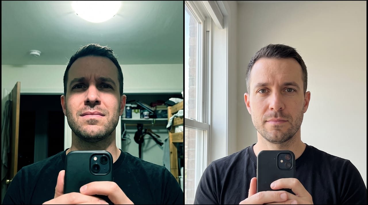
Here's the principle that governs the entire workflow: every part of your face the model can't see clearly in the source, it invents. Reference-supported models preserve identity from what you give them. Feed them a shadowed eye socket and they'll build an eye socket that fits the surrounding data — plausible, symmetrical, and not yours. That's the mechanism behind almost every "it looks like my cousin" result, and it is a source photo problem, not a prompt problem.
What a good source photo looks like
- Front-on, looking straight into the lens. Three-quarter angles are harder to convert into a straight-on portrait; the model has to guess the hidden side.
- Camera at eye level. Held low, the phone widens your jaw and shows the underside of your nose. Held high, it shrinks your chin. Both distortions get baked in as if they were your face.
- Soft, even light — face a window. An overcast day is a free softbox. Even illumination across both sides of the face gives the model complete information.
- High resolution and genuinely sharp. Not a crop from a group photo, not a screenshot, not a heavily compressed message attachment.
- A plain, uncluttered background with some distance between you and the wall.
- Nothing covering the face. No sunglasses, no hat brim shadow, hair off the forehead and eyes.
- Recent. The portrait should look like you at the interview, not you in 2019.
What quietly ruins it
Overhead lighting is the most common failure — a ceiling downlight drops your eye sockets into shadow and the model reconstructs the most expressive part of your face from scratch. Backlighting does the same thing to everything at once. A beauty filter already applied is the sneakiest one: the model smooths an already-smoothed face and you land in mannequin territory before you've written a single word of prompt. And low resolution on the face specifically matters more than the file's total pixel count — a 12 MP photo where your head occupies 300 pixels is a low-resolution portrait.
One reassurance before the workflow: you do not need a training set. No LoRA, no fine-tune, no folder of twenty photos, no waiting for a model to bake. A single clean reference image is the whole input.
How to Make a Professional Headshot with AI, Step by Step
The loop is short enough to run several times in a coffee break.
- Open the Oxava studio and stay on the Image side.
- Pick a reference-capable model. Nano Banana 2 is open on every plan and starts at 6 credits; Nano Banana Pro is the flagship and requires a Pro plan or above, starting at 15 credits. Higher-resolution output tiers cost more on both — the numbers above are the entry rung.
- Upload your selfie as the reference image. This is the identity anchor, and it's the reason the workflow needs no training step at all.
- Write the prompt using the five-part formula below. This is where most of your quality comes from.
- Set the aspect ratio before you generate — 1:1 for a profile avatar, 4:5 or 3:4 for a CV block, 3:2 for print. Choose the shape rather than cropping into it later.
- Set the resolution to the highest tier you'll actually use. Print needs the pixels; a 512 px avatar does not.
- Generate a small batch and compare. Faces vary run to run, and the difference between the second and fourth variant is often the whole job.
- Judge similarity first, quality second. A gorgeous portrait of someone else is a failed generation.
Worth stating plainly so you can plan around it: the prompt is the only control surface. There's no saved "model of you" to reuse, no retouch slider, no fine-tuning step. If the skin is too smooth or the collar is wrong, you change the words and generate again. That's why the next part is worth getting right the first time.
The five-part prompt formula
Every strong headshot prompt names the same five things, in roughly this order. Drop one and the model fills the gap with its default — which is usually a glossy, over-lit stock portrait.
- Subject and framing — who, plus how much of them is in frame.
- Wardrobe — garment, color, and fabric weight.
- Background — color and finish, stated as a surface, not a vibe.
- Lighting — key direction, softness, and fill.
- Expression, plus the identity lock — the clause that tells the model to preserve the reference face rather than improve it.
That fifth part does the heaviest lifting and is the one people leave out. Without an explicit instruction to preserve your features, models drift toward an idealized average: symmetrical, younger, smoother, thinner. It's the same locking-phrase discipline covered in our guide to writing AI image prompts — say what must not change before you say what should.
This structure is also what independent testing keeps landing on. The Rundown's write-up of testing twenty headshot prompts concludes what its own title gives away: there's no magic string, there's a strategy. Prompt libraries like BetterPic's breakdown of headshot prompts converge on the same components — name the light and the framing explicitly instead of hoping "professional" implies them.
Background, Wardrobe and Framing Decisions
Backgrounds
The professional headshot white background look is the default for a reason: it's neutral, it drops cleanly into any layout, and it survives being resized to a 16 px favicon. But it isn't automatically the right call.
| Background | Reads as | Best for | Watch out for |
|---|---|---|---|
| Pure white seamless | Clean, corporate, catalogue | Team grids, CVs, anywhere consistency matters | Light hair and white collars merge into it — ask for edge separation |
| Light grey, soft falloff | Classic studio portrait | LinkedIn, most corporate use | Gradients can band at low resolution |
| Charcoal or deep navy | Senior, editorial, confident | Speaker bios, finance, legal | Dark hair disappears — ask for a hair light |
| Muted blue or brand tint | Approachable corporate | Team pages tied to a brand color | The tint casting onto skin |
| Blurred office or window bokeh | In-context, warm, human | Sales, consultants, About pages | The most likely to look fake — bokeh with impossible geometry |
If you only make one, make the light grey or white version. It's the one that works in every context you haven't thought of yet.
Wardrobe
Solid mid-tone garments outperform patterns by a wide margin. Fine stripes, checks, and dense weaves are where models produce visible nonsense — stripes that bend around a shoulder seam, a placket that doesn't line up with itself, buttonholes that stop halfway down. Structured collars hold their shape better than draped knits, and a garment that contrasts with your background keeps your silhouette from dissolving into it. Skip busy jewelry and anything with a logo.
Framing
Framing is where amateur portraits and professional ones separate most visibly, and the rules are boring and reliable:
- Your face should occupy roughly 60–70% of the frame height. Too small reads as a snapshot; too large reads as a passport photo.
- Head and shoulders, plus a little chest. Cut at mid-chest, never at the neck.
- Eyes on the upper third. This is the single most common fix — most people center their face vertically, which leaves too much space above the head.
- Small headroom. A strip above the hair, not a landscape.
- Shoulders slightly angled, face front-on. Square-on shoulders read like an ID photo.
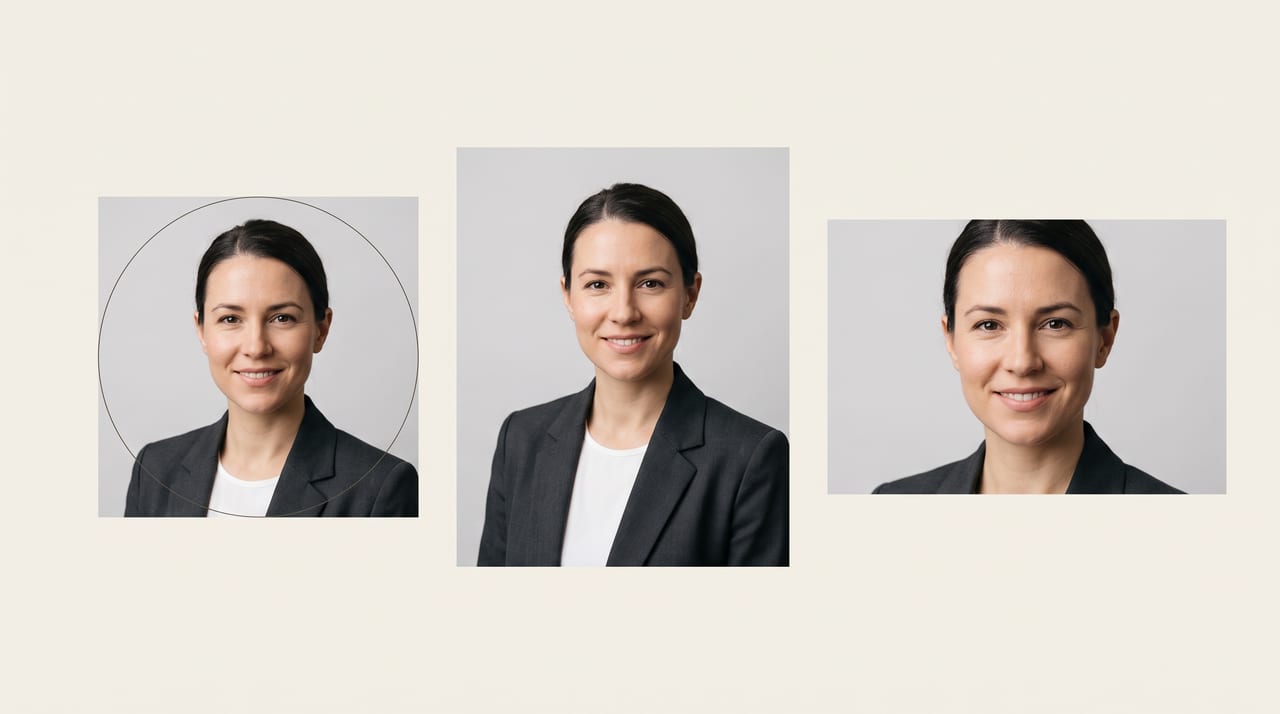
- Leave margin at the edges. LinkedIn crops your photo into a circle, so anything near a corner is already gone.
That circular crop is a genuine design constraint rather than a detail, and platform-photo walkthroughs like this LinkedIn profile photo guide are worth skimming for the conventions of the specific network you're posting to.
Reusable Prompt Templates and Platform Crops
Three templates below. Replace the bracketed parts, keep the identity lock exactly as written, and run each with your selfie attached as the reference image.
1. Classic white-background corporate headshot
Professional corporate headshot of the person in the reference image. Head and
shoulders, front-on, camera at eye level, face filling about two thirds of the
frame, cut at mid-chest, small headroom, eyes on the upper third. Wearing a
[charcoal blazer over a plain white shirt, no pattern]. Clean pure white seamless
studio background with a subtle soft grey falloff behind the shoulders so the
head separates clearly from the backdrop. Large soft key light from front left at
45 degrees, gentle fill on the right, soft catchlights in both eyes, no harsh
shadows. Neutral confident expression with a very slight smile, mouth closed,
looking directly at the camera. Preserve the exact facial features, bone
structure, skin tone, skin texture, hairline, and eye color of the reference
image; do not beautify, slim, smooth, or alter the face in any way. Natural
visible skin texture with pores and fine lines, photorealistic, shot on an 85mm
lens at f/4, sharp focus on the eyes. No text, no lettering, no logos.
2. Soft grey studio portrait, warmer and more editorial
Editorial professional portrait of the person in the reference image. Head and
shoulders, shoulders angled slightly away from camera, face turned front-on to
the lens, eye level, mid-chest crop. Wearing a [soft mid-grey merino crew-neck
sweater]. Smooth light grey studio backdrop with a gentle vignette falloff toward
the corners. Soft window-style key light from the left, subtle rim light on the
right shoulder and hair to separate the subject from the background, warm neutral
color grade. Relaxed, approachable expression, natural closed-mouth smile, eyes
engaged with the camera. Preserve the exact facial features, bone structure, skin
tone, skin texture, hairline, and eye color of the reference image; do not
beautify or alter the face. Realistic skin with visible texture, no retouching
gloss, photorealistic, 85mm lens, shallow depth of field. No text, no lettering,
no logos.
3. Environmental office headshot
Professional environmental headshot of the person in the reference image, standing
in a bright modern office. Head and shoulders, front-on, eye level, subject
positioned slightly left of center, cut at mid-chest. Wearing a [navy blazer over
a light blue shirt]. Background is a softly blurred office interior with large
windows and neutral daylight, heavy natural bokeh, no readable signage, no
recognizable brand elements. Soft daylight key from the windows at frame left,
gentle bounce fill on the shadow side, natural color temperature. Confident,
friendly expression, slight smile. Preserve the exact facial features, bone
structure, skin tone, skin texture, hairline, and eye color of the reference
image; do not beautify or alter the face. Photorealistic, natural skin texture,
85mm lens at f/2.8, sharp focus on the eyes, background genuinely out of focus.
No text, no lettering, no logos.
Then the shapes. Generate the ratio you need rather than cropping a square down to a banner — a crop throws away framing you already paid for, and a headshot composed for a circle rarely survives being squeezed into a wide signature strip.
| Where it goes | Ratio | Notes |
|---|---|---|
| LinkedIn, X, avatars | 1:1 | Displayed as a circle — keep clear margin at every edge; 800 × 800 or larger stays crisp on retina screens |
| CV / resume header | 4:5 or 3:4 | A little more chest; usually sits top-left, so leave the gaze room to look into the page |
| Corporate About page grid | 1:1 or 4:5 | Same ratio, background, and crop for everyone — that's the whole point |
| Email signature | 3:2 or 16:9 | Displays tiny; crop tighter than you think so the face still reads |
| Conference / press use | 3:2 | Generate at the highest resolution available and keep the original |
Both Nano Banana 2 and Nano Banana Pro cover this full set of ratios, so you can generate the LinkedIn square and the CV portrait as separate runs from the same reference and prompt rather than resizing one into the other. If you want the underlying theory of why composing for a shape beats cropping into it, our aspect ratio and composition guide is the map.
One Headshot Versus a Whole Set of You
Worth separating two jobs that look similar and aren't. This guide is about producing one excellent portrait (and its crops). Keeping the same person recognizable across a dozen different scenes — you at a desk, you presenting, you in a thumbnail, all clearly one human — is a harder, ongoing discipline with its own techniques for anchoring identity run after run. If your content plan needs that, our guide to AI character consistency without training is the deeper method. Start here, then go there when one portrait stops being enough.
Common Mistakes, and the Line You Shouldn't Cross
Generated portraits fail in a small number of predictable ways. Once you know them, you spot them in two seconds.
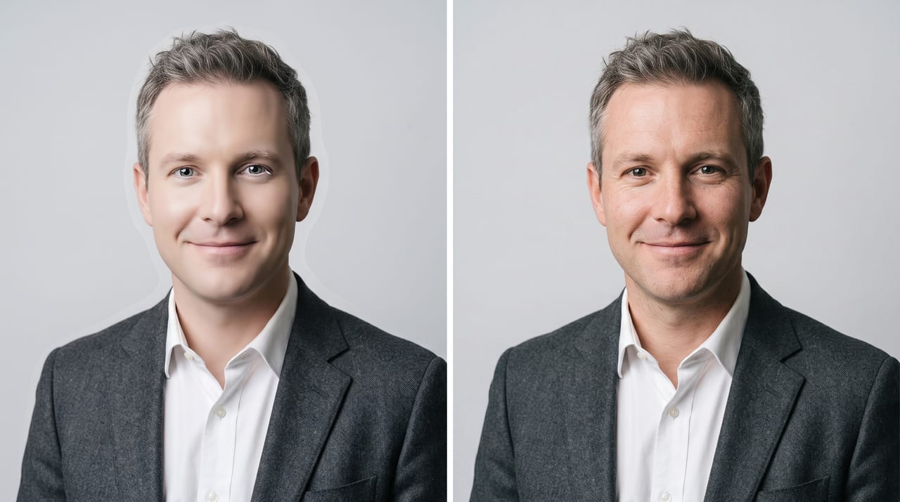
- Waxy skin. The single biggest tell. Real skin has pores, fine lines, and uneven tone. If your face looks airbrushed to porcelain, add "natural visible skin texture, pores and fine lines visible, no retouching" and regenerate.
- The grafted head. The face is sharp and the collar is soft, or the neck lighting doesn't match the face lighting. Usually fixed by describing one lighting setup for the whole subject rather than only for the face.
- Glassy or mismatched eyes. Catchlights should agree with your stated key light — same side, same shape, both eyes. Two different catchlights is the uncanny-valley trigger most people feel without being able to name.
- The background halo. A pale outline around hair against a white backdrop, from a compositing seam that isn't really there. Asking for a soft grey falloff behind the shoulders usually removes it.
- Glasses. The hardest accessory by far. Frames change thickness across the face, arms fail to connect to the ears, reflections land at impossible angles. Check them at full size, every time.
- Teeth. Open smiles are where generated faces still lose. Closed-mouth expressions are more reliable and, for a corporate headshot, usually better.
And the line, stated once and clearly: the portrait has to look like you. Not an improved you — a younger jaw, a slimmer face, a different nose. The whole purpose of a headshot is that someone recognizes you when you walk into the interview, the meeting, or the conference hall. A portrait that flatters you into a stranger doesn't just fail; it costs you trust in the exact moment you need it, and there's no good way to explain the gap. The practical test is blunt: show the result to someone who knows you and don't tell them why. If they hesitate, regenerate.
There's a separate check worth running too — some employers, platforms, and industries have their own policies on AI-generated profile imagery. Nothing in this guide overrides those, and official identity documents are simply out of scope.
Final Checklist and Getting It Print-Ready
Before you upload anything, run this at full size on a real screen, not a phone thumbnail:
- It looks like me — same bone structure, same age, same features.
- Eyes — both sharp, catchlights matching, gaze on the lens.
- Skin — visible texture, no wax, no plastic sheen.
- Neck and collar — lighting and sharpness match the face.
- Hair edges — no halo, no strands melting into the backdrop.
- Glasses and jewelry — geometry holds up under scrutiny.
- Framing — eyes on the upper third, small headroom, cut at mid-chest.
- Background — even, no banding, no stray artifacts in the corners.
- Edges — nothing important sitting where a circular crop will cut.
- Resolution — enough pixels for the largest place it will appear.
That last item is the one people discover too late. Screen use is forgiving; print is not. A conference program, a printed badge, or a press kit wants far more resolution than a web avatar, so generate at the highest tier your model offers before you consider enlarging anything. If you do need more, image upscaling on Oxava requires a Pro plan or higher — and our AI image upscaling guide covers doing it without smearing the skin texture you worked to keep. Portraits are unforgiving here: a bad upscale attacks exactly the fine detail that makes a face look real.
Frequently Asked Questions
Will an AI headshot actually look like me?
It can, and whether it does is decided mostly by your source photo and one prompt clause. Reference-supported models preserve identity from the image you upload, so a sharp, evenly lit, front-on selfie gives them everything they need — while a shadowed or filtered one forces them to invent the parts they can't see. Always include an explicit instruction to preserve your exact facial features, bone structure, skin texture, and hairline without beautifying them, since the default drift is toward an idealized average rather than toward you. Then verify with someone who knows your face.
What makes a good source selfie for an AI headshot?
Front-on, camera at eye level, soft even light from a window, sharp focus, high resolution on the face specifically, a plain background, and nothing covering your eyes or forehead. Avoid overhead ceiling light, which shadows your eye sockets; avoid backlighting, which shadows everything; and avoid photos that already have a beauty filter applied, because smoothing an already-smoothed face is how portraits end up looking like mannequins. One good photo is enough — no training set required.
Should the background be white, grey, or an office?
White seamless is the safest default: neutral, layout-friendly, and readable at any size, which is why the professional headshot white background look dominates corporate directories. Light grey is the classic studio alternative and slightly softer for LinkedIn. Blurred office backgrounds feel warmer and more human but are the most likely to look generated, because out-of-focus interiors are where models produce impossible geometry. If you're making one portrait to use everywhere, choose white or light grey.
Can I get my LinkedIn, CV, and email signature crops from one image?
You can, but the better approach is to generate each shape rather than crop one image into three. Run the same reference photo and the same prompt at 1:1 for your profile avatar, 4:5 or 3:4 for a CV block, and 3:2 or 16:9 for a signature strip — each ratio gets composed properly instead of losing framing to a crop. Keep the background, wardrobe, and lighting language identical across the runs and the set will look like one session, because in every way that matters it is one.
Is it ethical to use an AI headshot when applying for a job?
The consensus line is about accuracy rather than technology: a portrait that genuinely looks like you is fine, and one that flatters you into someone else isn't. A headshot exists so people recognize you, so if a recruiter would hesitate when you walk into the room, the image has failed regardless of how it was made. Check your industry's norms too — acting, modeling, journalism, and press photography have stronger expectations of a real shoot, and official identity documents don't permit generated images at all.
Make One This Afternoon
A professional AI headshot is not a prompt you find, it's a short chain of decisions you control. Pick a front-on selfie in soft window light at eye level. Name all five prompt components — framing, wardrobe, background, lighting, expression — and lock your identity explicitly so the model preserves your face instead of improving it. Compose for the shape each platform needs. Then reject the version with waxy skin, no matter how flattering it is.
Do that and you have a portrait that holds up in a team grid, on a CV, and in a conference program — produced in the time it would have taken to find a photographer's availability. If your business needs the rest of its visuals to match, AI marketing visuals without a designer covers the wider set the same way.
Open the Oxava studio, attach your best selfie as a reference image, and paste the white-background template above. Nano Banana 2 is available on every plan, so the first version costs you one prompt and a few minutes — and the second one, with a different background, is a two-word edit away.
Egemen Küpçü
Egemen Küpçü is the founder of Oxava, with 10+ years of hands-on experience in 3D and visual production. He writes about the craft of generating product, brand and campaign visuals with AI.
Related Articles
ALL POSTS
Subscribe to our newsletter
Be the first to hear about new techniques, model updates and ideas on AI generation.